
Quite often in our product, we’ll have celebratory popovers or modals. Congrats. You did the thing! Good job! You got the feature! Hooray!
Over on our design system Stacks, we recently shipped a reusable, portable way to display celebratory confetti.
The first time we needed to show some confetti, we simply included a statically rendered SVG of confetti in the background, did our best to position it out of the way of the text, and moved on with our lives. It looked like this:

Just mere months later, we found this same approach taken 12 times throughout our product. Each iteration was slightly different. Soon we had other variations like confetti-bold.svg.

We ought to be consistent in our approach to confetti that’s reusable, portable, and perhaps most importantly, documented. Time to formalize!
Prior art
As many Stack Overflow users know, the best way to get started is to build off a good example. Thankfully, there are lots of examples of confetti in products across the internet. Apps like Bamboo use it for anniversaries and birthdays. Carta uses confetti to celebrate exercising options.
Some are rendering things in JavaScript, others as animated gifs. There are some that are rendering entire WebGL scenes in Three.JS.
For Stack Overflow, we’d need something as portable as possible and running as close to the native HTML & CSS as we can get. We didn’t want to introduce any dependencies here. We also don’t want to have to initialize some JS every time we want to show these. Relying on extra dependencies disqualified the approaches we saw across the web.
When digging around for solutions to common problems, oftentimes I’ll start at Codepen. This led me to Andy O'Brien's Pen.
This approach is simple and elegant, and the animation loops! It uses Sass-generated CSS to animate individual DOM elements. It also looked very close to our designer Vivian Zhang’s latest iteration on confetti aesthetics.
I forked the Codepen to start understanding the approach. I tweaked the colors and started messing with timing variables. Once I understood the approach, I finalized colors, and placed the confetti element within one of our modals.
But this approach has some problems. In our various contexts, we don't quite have componentization at the scale we want it. This means our engineers would have to copy and paste a baker's dozen confetti-piece divs and make sure to manage the z-index and pointer events of the resulting confetti. This approach also uses absolute positioning and flexbox to distribute the confetti pieces throughout, meaning if you wanted to use it on a wide container, it’d stretch instead of tiling.
We sure liked the aesthetic though.
I bet instead of delivering as DOM elements, we could put all this inside an SVG and deliver as a background image, giving us way greater control over positioning, sizing, and repeating.
SVG Authoring
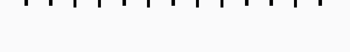
Ok, so SVG as a background image then? Let's give it a shot. First, I’d have to author an SVG element to house the confetti pieces. This is just a matter of distributing some rectangles on a canvas and picking some sizes we like. This is just replacing our DOM that we explored in previous Codepens for portability. I used Figma to draw this out as a time-saver, but this can all be written by hand. Here’s the final output:
<svg width="600" height="90" viewBox="0 0 600 90" fill="none" xmlns="http://www.w3.org/2000/svg">
    <rect x="42" y="0" width="6" height="10"/>
    <rect x="84" y="0" width="6" height="10"/>
    <rect x="126" y="0" width="5" height="13"/>
    <rect x="168" y="0" width="5" height="13"/>
    <rect x="210" y="0" width="6" height="10"/>
    <rect x="252" y="0" width="5" height="13"/>
    <rect x="294" y="0" width="6" height="10"/>
    <rect x="336" y="0" width="5" height="13"/>
    <rect x="378" y="0" width="5" height="13"/>
    <rect x="420" y="0" width="6" height="10"/>
    <rect x="462" y="0" width="6" height="10"/>
    <rect x="504" y="0" width="5" height="13"/>
    <rect x="546" y="0" width="6" height="10"/>
</svg>
Now that I’ve got the SVG element, I can embed CSS into it and the browser will do its thing. Andy’s original approach was to color, rotate, and position various confetti elements using CSS’s nth-child selector. At first, my SVG was structured as such:
<svg>
    <style type="text/css">...</style>
    <rect />
</svg>
Oh! But now the CSS nth-child selectors are all off by one because the CSS is counting the style element as a child. I guess we'll move that to the bottom.
Also, the Sass functions aren’t going to work within our SVG, so we’ll have to compile as CSS and paste it into our SVG. Codepen can handle the compilation for us, and I can copy and paste. This is getting a little weird! 😛
<svg width="600" height="90" viewBox="0 0 600 90" fill="none" xmlns="http://www.w3.org/2000/svg">
    <rect x="42" y="0" width="6" height="10"/>
    <rect x="84" y="0" width="6" height="10"/>
    <rect x="126" y="0" width="5" height="13"/>
    <rect x="168" y="0" width="5" height="13"/>
    <rect x="210" y="0" width="6" height="10"/>
    <rect x="252" y="0" width="5" height="13"/>
    <rect x="294" y="0" width="6" height="10"/>
    <rect x="336" y="0" width="5" height="13"/>
    <rect x="378" y="0" width="5" height="13"/>
    <rect x="420" y="0" width="6" height="10"/>
    <rect x="462" y="0" width="6" height="10"/>
    <rect x="504" y="0" width="5" height="13"/>
    <rect x="546" y="0" width="6" height="10"/>

    <style type="text/css">
        rect {
            opacity: 0;
        }
        rect:nth-child(1) {
            transform: rotate(-145deg);
            animation: blast 700ms infinite ease-out;
            animation-delay: 88ms;
            animation-duration: 631ms;
        }
        rect:nth-child(2) {
            transform: rotate(164deg);
            animation: blast 700ms infinite ease-out;
            animation-delay: 131ms;
            animation-duration: 442ms;
        }
        rect:nth-child(3) {
            transform: rotate(4deg);
            animation: blast 700ms infinite ease-out;
            animation-delay: 92ms;
            animation-duration: 662ms;
        }
        rect:nth-child(4) {
            transform: rotate(-175deg);
            animation: blast 700ms infinite ease-out;
            animation-delay: 17ms;
            animation-duration: 593ms;
        }
        rect:nth-child(5) {
            transform: rotate(-97deg);
            animation: blast 700ms infinite ease-out;
            animation-delay: 122ms;
            animation-duration: 476ms;
        }
        rect:nth-child(6) {
            transform: rotate(57deg);
            animation: blast 700ms infinite ease-out;
            animation-delay: 271ms;
            animation-duration: 381ms;
        }
        rect:nth-child(7) {
            transform: rotate(-46deg);
            animation: blast 700ms infinite ease-out;
            animation-delay: 131ms;
            animation-duration: 619ms;
        }
        rect:nth-child(8) {
            transform: rotate(-65deg);
            animation: blast 700ms infinite ease-out;
            animation-delay: 85ms;
            animation-duration: 668ms;
        }
        rect:nth-child(9) {
            transform: rotate(13deg);
            animation: blast 700ms infinite ease-out;
            animation-delay: 128ms;
            animation-duration: 377ms;
        }
        rect:nth-child(10) {
            transform: rotate(176deg);
            animation: blast 700ms infinite ease-out;
            animation-delay: 311ms;
            animation-duration: 508ms;
        }
        rect:nth-child(11) {
            transform: rotate(108deg);
            animation: blast 700ms infinite ease-out;
            animation-delay: 108ms;
            animation-duration: 595ms;
        }
        rect:nth-child(12) {
            transform: rotate(62deg);
            animation: blast 700ms infinite ease-out;
            animation-delay: 105ms;
            animation-duration: 375ms;
        }
        rect:nth-child(13) {
            transform: rotate(16deg);
            animation: blast 700ms infinite ease-out;
            animation-delay: 149ms;
            animation-duration: 491ms;
        }
        rect:nth-child(odd) {
            fill: #65BB5C;
        }
        rect:nth-child(even) {
            z-index: 1;
            fill: #33AAFF;
        }
        rect:nth-child(4n) {
            animation-duration: 1400ms;
            fill: #F23B14;
        }
        rect:nth-child(3n) {
            animation-duration: 1750ms;
            animation-delay: 700ms;
        }
        rect:nth-child(4n-7) {
            fill: #2A2F6A;
        }
        rect:nth-child(6n) {
            fill: #FBBA23;
        }

        @keyframes blast {
            from {
                opacity: 0;
            }
            20% {
                opacity: 1;
            }
            to {
                transform: translateY(90px);
            }
        }
    </style>
</svg>
Ok, wild! So if you save this as an SVG and open it in your browser, you’ll now see some animated confetti, but something is wrong about the positioning of our confetti pieces. When these were DOM elements, they just worked. Something must be different about SVG. If you guessed that SVG has different transform origins, you were correct. In the DOM, if you rotate something with CSS, it just rotates by default at the center of the element. In SVG the default origin is 0,0, meaning the very top left of our canvas 🤦♂️
I solved this by measuring the distances in Figma and hardcoding some transform origins, e.g. transform-origin: 45px 5px; These origins aren’t the perfect center of the rectangles, but they’re close enough.
<svg width="600" height="90" viewBox="0 0 600 90" fill="none" xmlns="http://www.w3.org/2000/svg">
    <rect x="42" y="0" width="6" height="10"/>
    <rect x="84" y="0" width="6" height="10"/>
    <rect x="126" y="0" width="5" height="13"/>
    <rect x="168" y="0" width="5" height="13"/>
    <rect x="210" y="0" width="6" height="10"/>
    <rect x="252" y="0" width="5" height="13"/>
    <rect x="294" y="0" width="6" height="10"/>
    <rect x="336" y="0" width="5" height="13"/>
    <rect x="378" y="0" width="5" height="13"/>
    <rect x="420" y="0" width="6" height="10"/>
    <rect x="462" y="0" width="6" height="10"/>
    <rect x="504" y="0" width="5" height="13"/>
    <rect x="546" y="0" width="6" height="10"/>

    <style type="text/css">
        rect {
            opacity: 0;
        }
        rect:nth-child(1) {
            transform-origin: 45px 5px;
            transform: rotate(-145deg);
            animation: blast 700ms infinite ease-out;
            animation-delay: 88ms;
            animation-duration: 631ms;
        }
        rect:nth-child(2) {
            transform-origin: 87px 5px;
            transform: rotate(164deg);
            animation: blast 700ms infinite ease-out;
            animation-delay: 131ms;
            animation-duration: 442ms;
        }
        rect:nth-child(3) {
            transform-origin: 128px 6px;
            transform: rotate(4deg);
            animation: blast 700ms infinite ease-out;
            animation-delay: 92ms;
            animation-duration: 662ms;
        }
        rect:nth-child(4) {
            transform-origin: 170px 6px;
            transform: rotate(-175deg);
            animation: blast 700ms infinite ease-out;
            animation-delay: 17ms;
            animation-duration: 593ms;
        }
        rect:nth-child(5) {
            transform-origin: 213px 5px;
            transform: rotate(-97deg);
            animation: blast 700ms infinite ease-out;
            animation-delay: 122ms;
            animation-duration: 476ms;
        }
        rect:nth-child(6) {
            transform-origin: 255px 6px;
            transform: rotate(57deg);
            animation: blast 700ms infinite ease-out;
            animation-delay: 271ms;
            animation-duration: 381ms;
        }
        rect:nth-child(7) {
            transform-origin: 297px 5px;
            transform: rotate(-46deg);
            animation: blast 700ms infinite ease-out;
            animation-delay: 131ms;
            animation-duration: 619ms;
        }
        rect:nth-child(8) {
            transform-origin: 338px 6px;
            transform: rotate(-65deg);
            animation: blast 700ms infinite ease-out;
            animation-delay: 85ms;
            animation-duration: 668ms;
        }
        rect:nth-child(9) {
            transform-origin: 380px 6px;
            transform: rotate(13deg);
            animation: blast 700ms infinite ease-out;
            animation-delay: 128ms;
            animation-duration: 377ms;
        }
        rect:nth-child(10) {
            transform-origin: 423px 5px;
            transform: rotate(176deg);
            animation: blast 700ms infinite ease-out;
            animation-delay: 311ms;
            animation-duration: 508ms;
        }
        rect:nth-child(11) {
            transform-origin: 465px 5px;
            transform: rotate(108deg);
            animation: blast 700ms infinite ease-out;
            animation-delay: 108ms;
            animation-duration: 595ms;
        }
        rect:nth-child(12) {
            transform-origin: 506px 6px;
            transform: rotate(62deg);
            animation: blast 700ms infinite ease-out;
            animation-delay: 105ms;
            animation-duration: 375ms;
        }
        rect:nth-child(13) {
            transform-origin: 549px 5px;
            transform: rotate(16deg);
            animation: blast 700ms infinite ease-out;
            animation-delay: 149ms;
            animation-duration: 491ms;
        }
        rect:nth-child(odd) {
            fill: #65BB5C;
        }
        rect:nth-child(even) {
            z-index: 1;
            fill: #33AAFF;
        }
        rect:nth-child(4n) {
            animation-duration: 1400ms;
            fill: #F23B14;
        }
        rect:nth-child(3n) {
            animation-duration: 1750ms;
            animation-delay: 700ms;
        }
        rect:nth-child(4n-7) {
            fill: #2A2F6A;
        }
        rect:nth-child(6n) {
            fill: #FBBA23;
        }

        @keyframes blast {
            from {
                opacity: 0;
            }
            20% {
                opacity: 1;
            }
            to {
                transform: translateY(90px);
            }
        }
    </style>
</svg>
Just one last bit of finesse. Because the origins are slightly different in SVG, I’m noticing that at the bottom, I’ve got some confetti pieces getting cut off at the end of their animation. We can solve this by jogging our pieces up and off the canvas.
<rect x="42" y="-10" width="6" height="10"/>
<rect x="84" y="-10" width="6" height="10"/>
<rect x="126" y="-13" width="5" height="13"/>
<rect x="168" y="-13" width="5" height="13"/>
<rect x="210" y="-10" width="6" height="10"/>
<rect x="252" y="-13" width="5" height="13"/>
<rect x="294" y="-10" width="6" height="10"/>
<rect x="336" y="-13" width="5" height="13"/>
<rect x="378" y="-13" width="5" height="13"/>
<rect x="420" y="-10" width="6" height="10"/>
<rect x="462" y="-10" width="6" height="10"/>
<rect x="504" y="-13" width="5" height="13"/>
<rect x="546" y="-10" width="6" height="10"/>
Delivery
Great! We’ve got a single SVG file that now handles all the animation, and we now place it as a background image on any element we want. We like our animation timing, colors, and sizing too.
We could stop right here and make sure that each project has this .svg file somewhere on the file system...
OR we could further encapsulate by encoding this entire SVG (with CSS) in our design system’s CSS file. CSS in SVG in CSS? Why not? 🤯
This is as simple as encoding the SVG as a background image like so:
.bg-confetti-animated {
    background-repeat: repeat-x;
    background-position: top -10px center;
    background-image: url("data:image/svg+xml,%3Csvg width='600' height='90' viewBox='0 0 600 90' fill='none' xmlns='http://www.w3.org/2000/svg'%3E%3Crect x='42' y='-10' width='6' height='10'/%3E%3Crect x='84' y='-10' width='6' height='10'/%3E%3Crect x='126' y='-13' width='5' height='13'/%3E%3Crect x='168' y='-13' width='5' height='13'/%3E%3Crect x='210' y='-10' width='6' height='10'/%3E%3Crect x='252' y='-13' width='5' height='13'/%3E%3Crect x='294' y='-10' width='6' height='10'/%3E%3Crect x='336' y='-13' width='5' height='13'/%3E%3Crect x='378' y='-13' width='5' height='13'/%3E%3Crect x='420' y='-10' width='6' height='10'/%3E%3Crect x='462' y='-10' width='6' height='10'/%3E%3Crect x='504' y='-13' width='5' height='13'/%3E%3Crect x='546' y='-10' width='6' height='10'/%3E%3Cstyle type='text/css'%3E rect %7B opacity: 0; %7D rect:nth-child(1) %7B transform-origin: 45px 5px; transform: rotate(-145deg); animation: blast 700ms infinite ease-out; animation-delay: 88ms; animation-duration: 631ms; %7D rect:nth-child(2) %7B transform-origin: 87px 5px; transform: rotate(164deg); animation: blast 700ms infinite ease-out; animation-delay: 131ms; animation-duration: 442ms; %7D rect:nth-child(3) %7B transform-origin: 128px 6px; transform: rotate(4deg); animation: blast 700ms infinite ease-out; animation-delay: 92ms; animation-duration: 662ms; %7D rect:nth-child(4) %7B transform-origin: 170px 6px; transform: rotate(-175deg); animation: blast 700ms infinite ease-out; animation-delay: 17ms; animation-duration: 593ms; %7D rect:nth-child(5) %7B transform-origin: 213px 5px; transform: rotate(-97deg); animation: blast 700ms infinite ease-out; animation-delay: 122ms; animation-duration: 476ms; %7D rect:nth-child(6) %7B transform-origin: 255px 6px; transform: rotate(57deg); animation: blast 700ms infinite ease-out; animation-delay: 271ms; animation-duration: 381ms; %7D rect:nth-child(7) %7B transform-origin: 297px 5px; transform: rotate(-46deg); animation: blast 700ms infinite ease-out; animation-delay: 131ms; animation-duration: 619ms; %7D rect:nth-child(8) %7B transform-origin: 338px 6px; transform: rotate(-65deg); animation: blast 700ms infinite ease-out; animation-delay: 85ms; animation-duration: 668ms; %7D rect:nth-child(9) %7B transform-origin: 380px 6px; transform: rotate(13deg); animation: blast 700ms infinite ease-out; animation-delay: 128ms; animation-duration: 377ms; %7D rect:nth-child(10) %7B transform-origin: 423px 5px; transform: rotate(176deg); animation: blast 700ms infinite ease-out; animation-delay: 311ms; animation-duration: 508ms; %7D rect:nth-child(11) %7B transform-origin: 465px 5px; transform: rotate(108deg); animation: blast 700ms infinite ease-out; animation-delay: 108ms; animation-duration: 595ms; %7D rect:nth-child(12) %7B transform-origin: 506px 6px; transform: rotate(62deg); animation: blast 700ms infinite ease-out; animation-delay: 105ms; animation-duration: 375ms; %7D rect:nth-child(13) %7B transform-origin: 549px 5px; transform: rotate(16deg); animation: blast 700ms infinite ease-out; animation-delay: 149ms; animation-duration: 491ms; %7D rect:nth-child(odd) %7B fill: %2365BB5C; %7D rect:nth-child(even) %7B z-index: 1; fill: %2333AAFF; %7D rect:nth-child(4n) %7B animation-duration: 1400ms; fill: %23F23B14; %7D rect:nth-child(3n) %7B animation-duration: 1750ms; animation-delay: 700ms; %7D rect:nth-child(4n-7) %7B fill: %232A2F6A; %7D rect:nth-child(6n) %7B fill: %23FBBA23; %7D @keyframes blast %7B from %7B opacity: 0; %7D 20%25 %7B opacity: 1; %7D to %7B transform: translateY(90px); %7D %7D %3C/style%3E%3C/svg%3E%0A");
}
I use yoksel's tool whenever I have to encode something like this.
Supporting reduced motion
Some folks have a hard time with animation. Others simply prefer not seeing it at all. Thankfully, our browsers offer a media query for this @media (prefers-reduced-motion). Let’s use it to show a statically-rendered bit of confetti, which is actually the original organic ad-hoc approach we took.
Vivian was kind enough to draw up a static version of the confetti in Figma.

Now it’s just a matter of embedding the static version behind that media query:
.bg-confetti-animated {
    background-repeat: repeat-x;
    background-position: top -10px center;
    background-image: url("data:image/svg+xml,%3Csvg width='600' height='90' viewBox='0 0 600 90' fill='none' xmlns='http://www.w3.org/2000/svg'%3E%3Crect x='42' y='-10' width='6' height='10'/%3E%3Crect x='84' y='-10' width='6' height='10'/%3E%3Crect x='126' y='-13' width='5' height='13'/%3E%3Crect x='168' y='-13' width='5' height='13'/%3E%3Crect x='210' y='-10' width='6' height='10'/%3E%3Crect x='252' y='-13' width='5' height='13'/%3E%3Crect x='294' y='-10' width='6' height='10'/%3E%3Crect x='336' y='-13' width='5' height='13'/%3E%3Crect x='378' y='-13' width='5' height='13'/%3E%3Crect x='420' y='-10' width='6' height='10'/%3E%3Crect x='462' y='-10' width='6' height='10'/%3E%3Crect x='504' y='-13' width='5' height='13'/%3E%3Crect x='546' y='-10' width='6' height='10'/%3E%3Cstyle type='text/css'%3E rect %7B opacity: 0; %7D rect:nth-child(1) %7B transform-origin: 45px 5px; transform: rotate(-145deg); animation: blast 700ms infinite ease-out; animation-delay: 88ms; animation-duration: 631ms; %7D rect:nth-child(2) %7B transform-origin: 87px 5px; transform: rotate(164deg); animation: blast 700ms infinite ease-out; animation-delay: 131ms; animation-duration: 442ms; %7D rect:nth-child(3) %7B transform-origin: 128px 6px; transform: rotate(4deg); animation: blast 700ms infinite ease-out; animation-delay: 92ms; animation-duration: 662ms; %7D rect:nth-child(4) %7B transform-origin: 170px 6px; transform: rotate(-175deg); animation: blast 700ms infinite ease-out; animation-delay: 17ms; animation-duration: 593ms; %7D rect:nth-child(5) %7B transform-origin: 213px 5px; transform: rotate(-97deg); animation: blast 700ms infinite ease-out; animation-delay: 122ms; animation-duration: 476ms; %7D rect:nth-child(6) %7B transform-origin: 255px 6px; transform: rotate(57deg); animation: blast 700ms infinite ease-out; animation-delay: 271ms; animation-duration: 381ms; %7D rect:nth-child(7) %7B transform-origin: 297px 5px; transform: rotate(-46deg); animation: blast 700ms infinite ease-out; animation-delay: 131ms; animation-duration: 619ms; %7D rect:nth-child(8) %7B transform-origin: 338px 6px; transform: rotate(-65deg); animation: blast 700ms infinite ease-out; animation-delay: 85ms; animation-duration: 668ms; %7D rect:nth-child(9) %7B transform-origin: 380px 6px; transform: rotate(13deg); animation: blast 700ms infinite ease-out; animation-delay: 128ms; animation-duration: 377ms; %7D rect:nth-child(10) %7B transform-origin: 423px 5px; transform: rotate(176deg); animation: blast 700ms infinite ease-out; animation-delay: 311ms; animation-duration: 508ms; %7D rect:nth-child(11) %7B transform-origin: 465px 5px; transform: rotate(108deg); animation: blast 700ms infinite ease-out; animation-delay: 108ms; animation-duration: 595ms; %7D rect:nth-child(12) %7B transform-origin: 506px 6px; transform: rotate(62deg); animation: blast 700ms infinite ease-out; animation-delay: 105ms; animation-duration: 375ms; %7D rect:nth-child(13) %7B transform-origin: 549px 5px; transform: rotate(16deg); animation: blast 700ms infinite ease-out; animation-delay: 149ms; animation-duration: 491ms; %7D rect:nth-child(odd) %7B fill: %2365BB5C; %7D rect:nth-child(even) %7B z-index: 1; fill: %2333AAFF; %7D rect:nth-child(4n) %7B animation-duration: 1400ms; fill: %23F23B14; %7D rect:nth-child(3n) %7B animation-duration: 1750ms; animation-delay: 700ms; %7D rect:nth-child(4n-7) %7B fill: %232A2F6A; %7D rect:nth-child(6n) %7B fill: %23FBBA23; %7D @keyframes blast %7B from %7B opacity: 0; %7D 20%25 %7B opacity: 1; %7D to %7B transform: translateY(90px); %7D %7D %3C/style%3E%3C/svg%3E%0A");

    @media (prefers-reduced-motion) {
        background-image: url("data:image/svg+xml,%3Csvg width='574' height='60' viewBox='0 0 574 60' fill='none' xmlns='http://www.w3.org/2000/svg'%3E%3Crect opacity='0.8' x='27.1224' y='20.0458' width='5' height='13' transform='rotate(-139 27.1224 20.0458)' fill='%23F23B14'/%3E%3Crect opacity='0.8' x='118.478' y='7.00201' width='5' height='13' transform='rotate(-38.8114 118.478 7.00201)' fill='%23FBBA23'/%3E%3Crect opacity='0.8' x='504.616' y='25.4479' width='5' height='13' transform='rotate(-60.2734 504.616 25.4479)' fill='%23F23B14'/%3E%3Crect opacity='0.6' x='538.983' y='45.555' width='5' height='13' transform='rotate(16.7826 538.983 45.555)' fill='%232A2F6A'/%3E%3Crect opacity='0.3' x='470.322' y='2.63625' width='5' height='13' transform='rotate(11.295 470.322 2.63625)' fill='%2333AAFF'/%3E%3Crect opacity='0.3' x='190.295' y='4.58138' width='5' height='13' transform='rotate(27.5954 190.295 4.58138)' fill='%23F23B14'/%3E%3Crect opacity='0.8' x='234.303' y='16.3233' width='5' height='13' transform='rotate(-41.8233 234.303 16.3233)' fill='%2365BB5C'/%3E%3Crect opacity='0.6' x='369.702' y='40.9875' width='5' height='13' transform='rotate(-56.419 369.702 40.9875)' fill='%2333AAFF'/%3E%3Crect opacity='0.3' x='402.121' y='31.0848' width='5' height='13' transform='rotate(-17.9234 402.121 31.0848)' fill='%23F23B14'/%3E%3Crect opacity='0.6' x='200.316' y='31.9328' width='5' height='13' transform='rotate(-15.8896 200.316 31.9328)' fill='%232A2F6A'/%3E%3Crect opacity='0.6' x='69.6745' y='23.4725' width='6' height='10' transform='rotate(70.0266 69.6745 23.4725)' fill='%2365BB5C'/%3E%3Crect opacity='0.6' x='291.945' y='7.16931' width='6' height='10' transform='rotate(30.4258 291.945 7.16931)' fill='%23FBBA23'/%3E%3Crect opacity='0.3' x='33.7754' y='38.2208' width='6' height='10' transform='rotate(38.6056 33.7754 38.2208)' fill='%23FBBA23'/%3E%3Crect opacity='0.8' x='109.752' y='31.1743' width='6' height='10' transform='rotate(28.5296 109.752 31.1743)' fill='%2333AAFF'/%3E%3Crect opacity='0.3' x='278.081' y='37.8695' width='6' height='10' transform='rotate(-26.5651 278.081 37.8695)' fill='%23F23B14'/%3E%3Crect opacity='0.8' x='416.294' y='11.5573' width='6' height='10' transform='rotate(-22.8498 416.294 11.5573)' fill='%23FBBA23'/%3E%3Crect opacity='0.3' x='354.667' y='9.32341' width='6' height='10' transform='rotate(17.7506 354.667 9.32341)' fill='%232A2F6A'/%3E%3Crect opacity='0.8' x='532.404' y='16.6372' width='6' height='10' transform='rotate(-75.3432 532.404 16.6372)' fill='%23FBBA23'/%3E%3Crect opacity='0.6' x='460.463' y='39.3557' width='6' height='10' transform='rotate(45.4982 460.463 39.3557)' fill='%2365BB5C'/%3E%3C/svg%3E");
    }
}
We can also provide this as a separate class with .bg-confetti-static:
.bg-confetti-static {
    background-repeat: repeat-x;
    background-position: top -10px center;
    background-image: url("data:image/svg+xml,%3Csvg width='574' height='60' viewBox='0 0 574 60' fill='none' xmlns='http://www.w3.org/2000/svg'%3E%3Crect opacity='0.8' x='27.1224' y='20.0458' width='5' height='13' transform='rotate(-139 27.1224 20.0458)' fill='%23F23B14'/%3E%3Crect opacity='0.8' x='118.478' y='7.00201' width='5' height='13' transform='rotate(-38.8114 118.478 7.00201)' fill='%23FBBA23'/%3E%3Crect opacity='0.8' x='504.616' y='25.4479' width='5' height='13' transform='rotate(-60.2734 504.616 25.4479)' fill='%23F23B14'/%3E%3Crect opacity='0.6' x='538.983' y='45.555' width='5' height='13' transform='rotate(16.7826 538.983 45.555)' fill='%232A2F6A'/%3E%3Crect opacity='0.3' x='470.322' y='2.63625' width='5' height='13' transform='rotate(11.295 470.322 2.63625)' fill='%2333AAFF'/%3E%3Crect opacity='0.3' x='190.295' y='4.58138' width='5' height='13' transform='rotate(27.5954 190.295 4.58138)' fill='%23F23B14'/%3E%3Crect opacity='0.8' x='234.303' y='16.3233' width='5' height='13' transform='rotate(-41.8233 234.303 16.3233)' fill='%2365BB5C'/%3E%3Crect opacity='0.6' x='369.702' y='40.9875' width='5' height='13' transform='rotate(-56.419 369.702 40.9875)' fill='%2333AAFF'/%3E%3Crect opacity='0.3' x='402.121' y='31.0848' width='5' height='13' transform='rotate(-17.9234 402.121 31.0848)' fill='%23F23B14'/%3E%3Crect opacity='0.6' x='200.316' y='31.9328' width='5' height='13' transform='rotate(-15.8896 200.316 31.9328)' fill='%232A2F6A'/%3E%3Crect opacity='0.6' x='69.6745' y='23.4725' width='6' height='10' transform='rotate(70.0266 69.6745 23.4725)' fill='%2365BB5C'/%3E%3Crect opacity='0.6' x='291.945' y='7.16931' width='6' height='10' transform='rotate(30.4258 291.945 7.16931)' fill='%23FBBA23'/%3E%3Crect opacity='0.3' x='33.7754' y='38.2208' width='6' height='10' transform='rotate(38.6056 33.7754 38.2208)' fill='%23FBBA23'/%3E%3Crect opacity='0.8' x='109.752' y='31.1743' width='6' height='10' transform='rotate(28.5296 109.752 31.1743)' fill='%2333AAFF'/%3E%3Crect opacity='0.3' x='278.081' y='37.8695' width='6' height='10' transform='rotate(-26.5651 278.081 37.8695)' fill='%23F23B14'/%3E%3Crect opacity='0.8' x='416.294' y='11.5573' width='6' height='10' transform='rotate(-22.8498 416.294 11.5573)' fill='%23FBBA23'/%3E%3Crect opacity='0.3' x='354.667' y='9.32341' width='6' height='10' transform='rotate(17.7506 354.667 9.32341)' fill='%232A2F6A'/%3E%3Crect opacity='0.8' x='532.404' y='16.6372' width='6' height='10' transform='rotate(-75.3432 532.404 16.6372)' fill='%23FBBA23'/%3E%3Crect opacity='0.6' x='460.463' y='39.3557' width='6' height='10' transform='rotate(45.4982 460.463 39.3557)' fill='%2365BB5C'/%3E%3C/svg%3E");
}
That wraps it up! Now our engineers and designers have a single, portable class of .bg-confetti-animated that they can add to any block level element. You can see the further documentation on our design system, Stacks, and how we extended it to modal styling.
There you have it. CSS in SVG in CSS confetti. 🎉 No additional dependencies, and it’s all just bundled in our CSS.