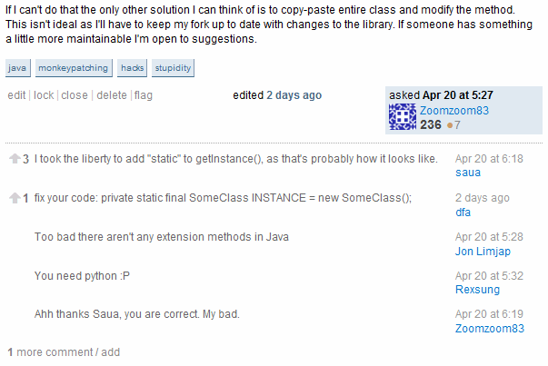
You'll notice that the top 5 comments are now shown under each question or answer.

If you want to see all the comments, or add a comment of your own, clicking will load the rest and reveal the comment entry box. The flagging and voting tools are still there for each comment, but require a Twitter-style mouseover to reveal. We did this to reduce visual clutter.
We laid the groundwork for this change last week with voting, as I alluded to at the bottom of that post.
This is setting the stage for some of the comments to be visible on the page at all times, without having to click the comments button.
There was a grander plan with comment voting, and that plan was to promote some of the best voted comments to the question page. The default sort order is votes, descending, then date; we pick the top 5. Why did we do this?
- There are often important clarifications and addendums left as comments that substantially improve the original post. It seemed a shame that these sort of comments were all locked behind the "expand comments" button, and every reader had to click on that link (or know they should click on it) to get the benefit of those comments. Information was being lost!
- The comments were not being indexed for web search, as they were hidden behind JavaScript and loaded dynamically via AJAX. More relevant search terms on the page means more people can potentially find the answer to their programming questions.
- While I don't want the site to devolve into a one-liner contest, some of the comments are quite witty and still on-topic. Our fellow Stack Overflow users who manage to "edutain" us deserve to have those comments seen and appreciated by a wider audience.
We originally implemented comments as almost an afterthought, with virtually no emphasis placed on them in favor of our core Question and Answer mission. But I've been amazed how useful and relevant the comments have become over time. We don't want to overwhelm the page with dozens of comments, necessarily, but my regular ritual of "open question, expand comments, expand comments, expand comments.." seemed wrong, too. If I cared enough about the question to read it, I always cared enough to see the comments, too.
So we're now promoting the top 5 comments under each post to the question page itself.
It really is top (n), though. The "# of comments initially shown" will be available as a setting on your user page preferences tab soon. If you'd rather click to see comments, never fear. Just set the "# of comments initially shown" to zero, and it'll be back to the old way.
Update:
Based on feedback in this thread, we made the following changes to comments:
- More compact two-column rendering style
- Mouseover now highlights the entire row, if actions are available
- Small border between comments
- Top 5 comments are shown in chronological order
- Removed the arrow shown next to numbers, to reduce clutter
- On questions with >30 answers, only comments of +1 or higher will be shown
We didn't get to the user preference yet, but it's coming.