A while ago, I wrote:
"Individually-branded sites felt more authentic and trustworthy. We thought that letting every Stack Exchange site have its own domain name, visual identity, logo, and brand would help the community feel more coherent. After all, nobody wants to say that they live in Housing Block 2938TC."
Well, funny thing... that didn't quite work out the way I expected... mostly because nobody could think of any good domain names. Believe it or not, "NothingToInstall" was one of the better suggestions. Ack.
We realized that we're trying to build some kind of brand that signifies "Q&A goodness" to as many people as possible, and we couldn't do that if every site had a completely different name.
Think of it this way. I've met a lot of programmers who tell me that when they have a problem, after searching on Google, they scan the results for stackoverflow.com and click on those links first.
If we launch hundreds of Stack Exchange sites each with their own domain name, there will be no way to distinguish the great Stack Exchange answers from the crappy generic forum answers in search engine results. And since 90% or more of our audience comes to us from search engines, that's broken.
– Joel Spolsky
note from Jeff Atwood: I complained to Joel that this felt like half a blog post. We believe the domain name problem is a dead end. So instead of trying to crack the nigh-impossible domain name problem, we're focusing on the elevator pitch. It's a much better starting point that results in more useful ideas. So for the second half of this post, I point you to Robert Cartaino's excellent advice posted on each per-site meta.
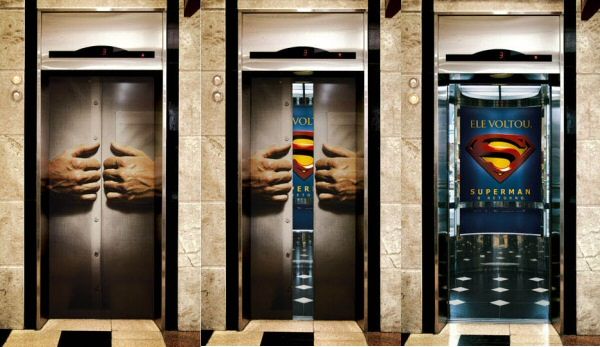
The Elevator Pitch
What is an elevator pitch? I only have a moment, so here's an "elevator pitch" for the elevator pitch: "Who is the site for? What is it about?"
This isn't as easy as it sounds. Imagine a user who will never read your FAQ and you have fifteen seconds to grab their attention. It should be catchy but descriptive. It should be thoroughly clear but painfully concise. Make every... word... count.

Here are some creative examples:
- Gawker: Daily Manhattan media news and gossip. Reporting live from the center of the universe.
- Gizmodo: The gadget guide. So much in love with shiny new toys, it’s unnatural.
- Autoblog: We obsessively cover the auto industry.
- DumbLittleMan: So what do we do here? Well, it’s simple. 15 to 20 times per week we provide tips that will save you money, increase your productivity, or simply keep you sane.
- Needcoffee.com: We are the Internet equivalent of a triple espresso with whipped cream. Mmmm…whipped cream.
Use it as a Tagline
A shorter elevator pitch can be used as a tagline — something you can display in the header at the top of the page. If it doesn't fit, consider shortening it or creating a separate tagline. Here are some great examples:
- Slashdot: News for nerds. Stuff that matters.
- Lifehacker: Don’t live to geek, geek to live!
- The Simple Dollar: Financial talk for the rest of us.
The Motto (don't forget your logo)
A logo begs for it own little, short tagline — like a motto. Maybe the tagline inspires the logo; Maybe it's the other way around. Mottos make good t-shirt, bumper stickers, and other marketing material. Either way, you'll recognize a good motto when you see it:
- Just do it.
- Think Different.
- The Uncola.
- Intel inside.
- Like a rock.
- The king of beers.
…and perhaps all this leads to a proper name and domain for your site… eventually. So let's start from the basics. Come up with a killer elevator pitch, tagline, and/or motto!
– Robert Cartaino