If you've used any Stack Exchange site over the last year, you're probably familiar with "the envelope".
The envelope was a notification system that … sort of … let you know when things happened on the site. As time went on, it became clear that the envelope was a deeply flawed design. I began thinking of it as a curse, as our Windows Vista. Yep. That bad.
What was wrong with the envelope? So many things:
- It was schizophrenic. An envelope implies "things that were addressed to you", and part of its functionality involved replies, but it also folded in revisions to your posts, badges you earned, favorite changes, and reputation. This made zero sense.
- It was unreliable. The envelope was notorious for lighting up unpredictably and arbitrarily. There were literally dozens of meta posts about envelope notification oddities. We couldn't get it right. Yes, partly because we suck, but also in all fairness because the envelope was a horribly flawed concept from the start. You can't build on sand.
- It was obscure. Clicking the envelope took you to this other, private place on the site, divorced from your user page and all other normal locations. It was like moving behind a curtain. This is at odds with the Stack Exchange philosophy of keeping as much public as possible.
- It was not discoverable. As a new user, how would you figure out that this little envelope next to your name lighting up … meant anything at all? It certainly wasn't about email!
- It was partially obsolete. Once we got the Stack Exchange global inbox up and running, that completely subsumed the role of notifying you of replies. But even better, because it notified you of replies not just on the current site, but anywhere on our network of Q&A; sites.
Clearly, the envelope had to be terminated … with extreme prejudice.
We decided to refocus on two things:
- Showing detailed reputation changes
- Improving the core, public user page experience a lot
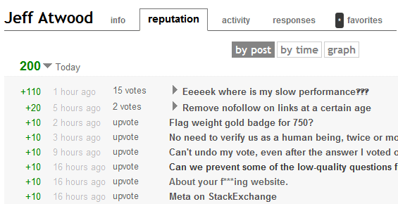
That's why there is a new hover menu on your username. It contains a quick overview of where your reputation (and badges) are coming from, right now. And a handy live UTC clock, too, since all our days are measured in UTC.

It also contains deep links to new, improved top-level tabs in your user profile -- tabs that now have numbers on them indicating how many new things there are since you last checked.
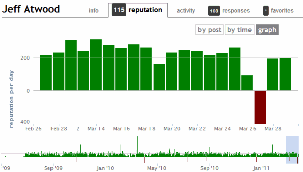
The old reputation graph was boring and honestly kind of useless. It mostly went monotonously up and to the right, with some occasional flat areas if you stopped participating. The redesigned reputation graph is far more practical. You don't need to rely on the graph, either; you can view reputation breakdowns by post or by time in great detail by clicking the appropriate sub-tab.
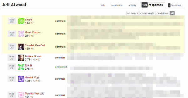
In addition to the counter on the tab, the responses tab and the reputation tab will actively highlight things that are new since the last time you visited that tab.
You may notice that the accounts tab on your user page has improved substantially as well, and is in "natural" order of reputation.
We still have some work to do on the favorites support, but we feel these changes are substantial improvements over what the envelope attempted (and largely failed) to do -- and are much more discoverable.