Hi everyone! I'm the math intern, and I thought I'd introduce myself by sharing a little something from what I've been doing. A little about me: I'm a moderator and frequent contributor at math.SE: In real life, I'm a rising senior at MIT. I have a math blog, Annoying Precision, which unfortunately is not very accessible to non-mathematicians (sorry!). I think using the internet to spread knowledge more effectively is great, so I'm a big fan of the Stack Exchange network. This summer, my job is to look at the Stack Exchange network's data and see if I can find anything interesting.

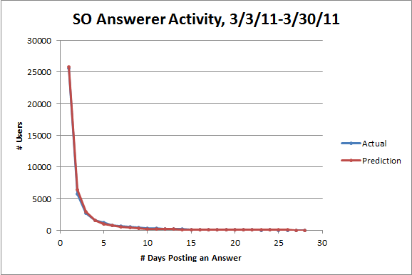
Here's something I thought was interesting. Suppose I told you that about 25,000 Stack Overflow users posted answers on exactly one day between March 3rd and March 30th. How many users would you expect to have posted answers on exactly two days in March? Three? Four? It would make sense for the numbers to be decreasing, but how quickly?
One standard guess is that the numbers satisfy a power law. More formally, you might look at Zipf's law: the number of users who post on n days should be proportional to 1/ns for some value of s. In many of the well-known examples, s is very close to 1, but as it turns out for the specific case of describing the frequency of contributions by individual authors, a special case of Zipf's law called Lotka's law suggests that s should be very close to 2 instead. So you should expect about 6,200 users posting on two days, 2,800 users posting on three days, 1,600 users posting on four days, and so forth.
The actual numbers are 5,761 users posting on two days, 2,709 users posting on three days, and 1,586 users posting on four days. Not bad! Here's a plot of all the actual numbers, together with the predictions from Lotka's law (I chose the proportionality constant so that the total number of users posting on at least two days turned out right):
The fit looks great, but since the numbers decrease so quickly, it's hard to be sure. The standard way to visually check if you've got a power law is to use a logarithmic scale on both axes. If there's a power relationship y = c/ns between two variables, there'll be a linear relationship log y = log c - s log n between their logarithms with slope -s. Here's the same plot again with logarithmic scales:
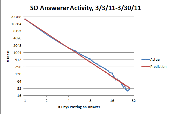
Note that the line from Lotka's law is not a linear regression. It is a bad idea to use linear regression to check for a power law.
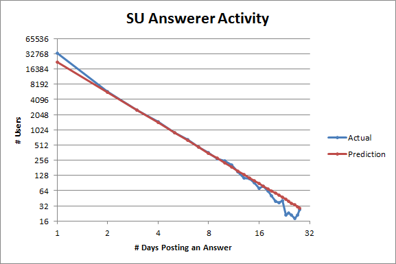
With logarithmic scales, the fit looks good, but not perfect: there are more users posting between five and sixteen days than expected and fewer users posting more than sixteen days than expected. But I think the discrepancies from Lotka's law on a site might tell us something interesting about the site. Here's the same plot for SuperUser:
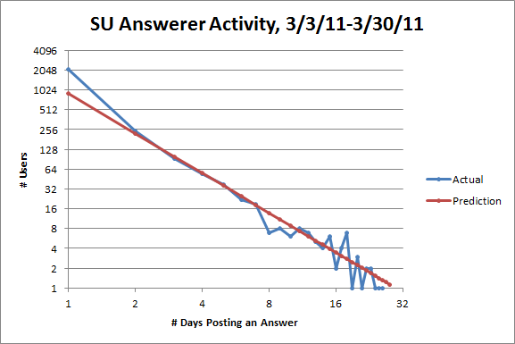
The fit for users posting between two and seven days is quite good, but the discrepancies are different: on SuperUser, there are more users posting on one day than expected and fewer users posting between eight to ten days than expected. So SuperUser has fewer active users than it should, which suggests that it's less healthy than it could be, especially compared to StackOverflow.
As for the former discrepancy, part of the problem is that SuperUser gets a ton of migrations from StackOverflow, and anyone who posted an answer before the question gets migrated counts as posting once, but that user might not ever visit SuperUser. That ends up accounting for about half the extra users posting on one day, but I think it's also just easier to feel like you have something worth posting on SuperUser as opposed to StackOverflow.
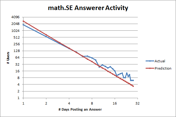
That hypothesis is supported by looking at the same plot for math.SE:
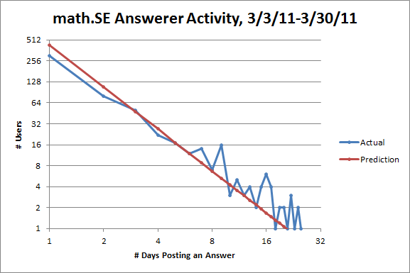
Here there are fewer users posting on one or two days than expected! But it's harder to think that you have the right answer to a math problem than to think that you have the right answer to a question about Windows, for example. Note also that there are more users posting on six or more days than expected. So math.SE has more active users than it should, which suggests to me that it's relatively healthy.
Just for fun, here's the same plot for ServerFault:
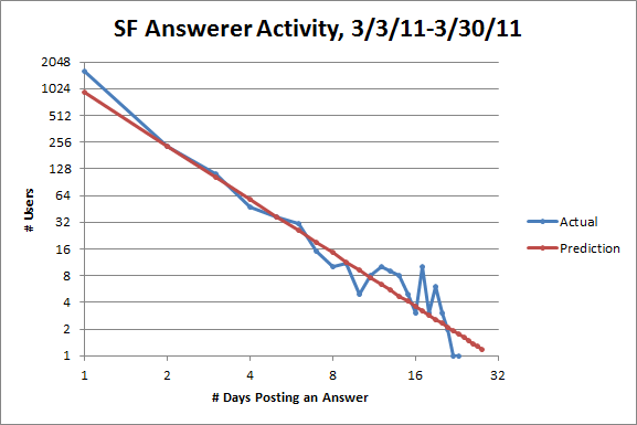
It looks like the SuperUser plot, but a little healthier.
The tails of the last three plots may look weird, but that's because fluctuations caused by small sample size get amplified on a logarithmic scale. To get a larger sample size, let's incorporate data from every 28-day cycle instead of just one (I was using these instead of months so they'd all be the same length):
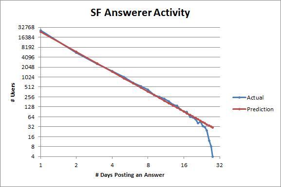
More or less the same patterns as before emerge, although ServerFault looks a little healthier now (and also fits Lotka's law absurdly well). The corresponding plot for StackOverflow looks almost exactly the same, so I'm not including it.
I don't have a good conceptual explanation for Lotka's law. There are certain mathematical reasons why power laws are plausible in certain situations, but I don't know of any good explanations of why certain values of s (like 1 in many examples and 2 here) seem to be preferred. However, given that Lotka's law empirically appears to hold pretty well in this situation, I think looking at how a site deviates from Lotka's law as above can give some useful information about how healthy it is.
Plus, it's just convenient to have a compact description of the expected distribution of user activity. I'll try to describe another interesting thing I'm looking at where it's handy to have Lotka's law around in a later post.