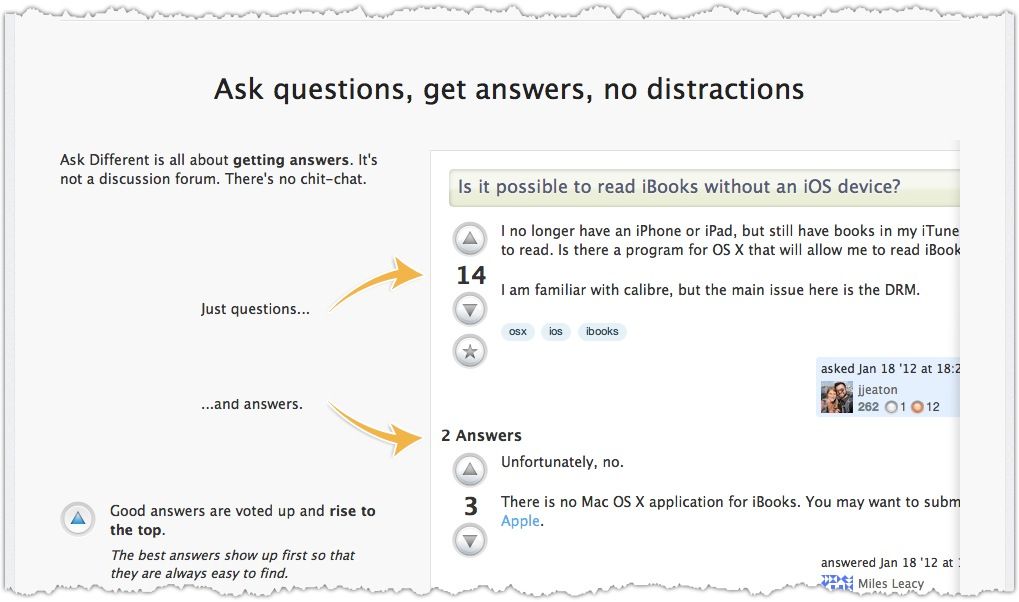
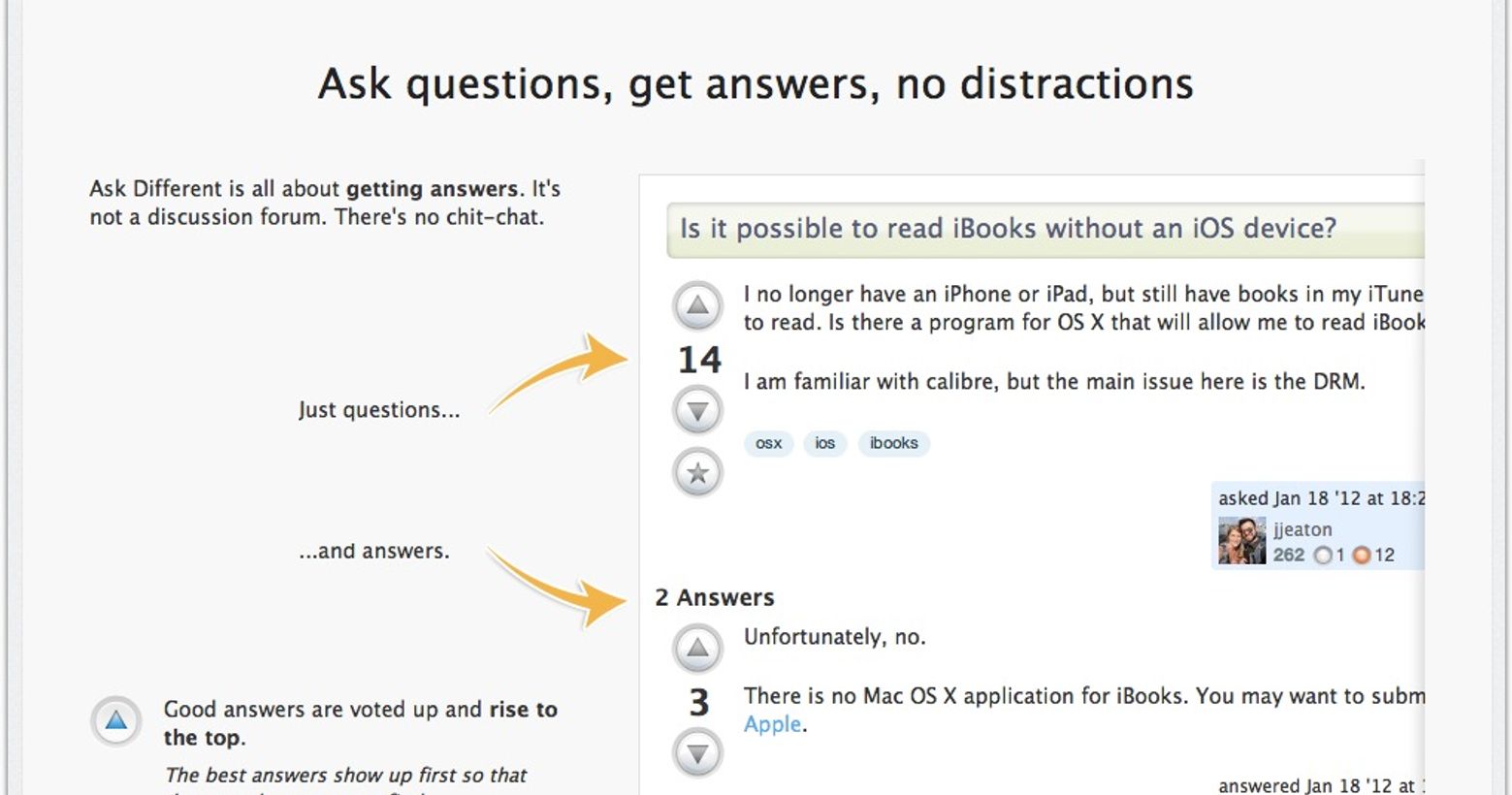
We've just rolled out a new Quick Start guide to help new users learn the basics. Here’s one example, but you can find any site's version by going to sitename.com/about.

Imagine you're visiting a new friend's home and...
"Please, make yourself at home. Oh, actually, could you not sit on that? Yes, it _looks_ like a couch. That’s what makes it so avant-garde. But it’s actually art. Whoah, careful there, too - I see your confusion, as that does _resemble_ a doorknob, but it’s actually a very small furnace. And - I’m sorry, but - could you NOT use a coaster? We’re testing the effects of wet drinks on finished wood, and coaster usage generates noise in our data."
When you're surrounded by familiar things, but using them the way you normally do leads to different, negative outcomes, it's extremely disorienting.
At Stack Exchange, "weird" is a feature, not a bug.
Our sites are different. And that difference is deliberate. The things that confuse folks who are used to forums, or those broad, “ask anything” sites are the very things that we believe make us work better.

For us, different is good. Just like my mommy always told me. But it's still jarring. And when it's too jarring, potentially valuable contributors are put off and leave. They didn’t get help, and we lost an expert. Being jarring came at a high cost.
Easing them into our weirdness.
To mitigate new users' frustration, we need a page that can do three things:
- Describe just the ways that we're different. We don't bother telling users about the things that are similar to the other sites they've used. Instead, we focus on the delta - the things that are likely to be surprises to them. For example:
- Posts are collaboratively edited
- Chit chat and pure discussion are generally not welcome
- Some things that sound a lot like what's on topic are expressly off-topic here, and questions about those things get closed.

Now, obviously, users could just discover these things as they use the site, but however much you do or don’t grok our system, surprises suck. Most of life's surprises fall closer to the kind involving gum discoveries in improbable locations than the ones that come in pony-shaped boxes. Whatever you think about a rule's merit, learning about it after you’ve broken it tends to adversely impact your view of it. There’s a big difference between giving your wife a poem you wrote her, only to receive a red-lined markup, complete with suggestions as to how to be less derivative, and having her edit one that you’re hoping to submit to a journal after she offered to give you feedback.
- Explain why we’re different. If you’re going to make someone think, or god forbid, try to change the way they do something, you damn well better convince them there’s a good reason. If you tell someone you don't allow chit-chat, but you fail to give them the reason, the first time they have their “thank you!” deleted as noise, they're less likely to think about our “answer findability optimization” than our "tendency toward pedantic, manners-hating fascism”.
- Why allow users to edit each other's posts? Because it makes the average quality of our content higher than sites where responses are limited to a single user’s experiences.
- _Why _edit out harmless chit chat? Because we want to make the best answers _more findable__ _than they are in traditional forums.
- Get them to actually read it. Research tells us that pages like this are significantly less effective if no one reads them. The challenge is that, surprisingly, most people who arrive at a website with a problem to solve do not seem to have the following first instinct:
“I wonder if they have any detailed, hopefully exhaustive documentation that covers their rules, best practices and societal mores. I'd just love to read it in its entirety before trying to get help with my problem!"

Now, I do realize that some non-trivial portion of this blog's audience is like us, and is thinking that that's actually exactly what we might do. Which is why we love you so much. But, most people, even most experts, are not like us. Please trust me when I tell you this: Most people do not believe they should need to expand their education in any way whatsoever prior to typing in a box on the internet. They just don’t. So, if you want any shot at getting them to read a primer, you need to make it easy on the eyes, and keep it to a length that respects their time, rather than one that implies that they may need to secure some provisions or sled dogs prior to proceeding. So, we pared it to just those topics that were absolutely necessary for a new user to get started successfully. Which was the hardest part; it’s much easier to be comprehensive than brief. Some of our choices may surprise you, but they all resulted from analysis, testing, and discussion. “Tags? Really?” Yep, we felt the same way. Until we did some user testing and almost every single user on the non-tech sites expressed some variation of the following:
*"You said I had to add a tag. I didn’t even know what a tag WAS, but I used my context clues and I figured it out. And added one. And now it's telling me that I NEED MORE REPUTATION TO CREATE NEW &%$ing tags. I hope a rock falls on you. A heavy one.”**
Tagging may not seem like something a new user needs to be thinking about, but it's actually critical because almost invariably, they get it wrong. The same is true for comments and even editing. The subject-matter experts who do stick around long enough to make a few mistakes will learn, but often after frustrating themselves - and site regulars - in the process. Knowing roughly what to expect going in should help to ease the transition for all involved. Which is good, because we can’t afford to have a site's next Jon Skeet wasting his time casting geologic hexes on me, when we really need him to focus his energy on answering questions. Hopefully, this guide will help.
