At Stack Overflow, we’re committed to making the internet a better place for every single developer. Over the last year, the design team has been working on how we could support that goal by eliminating unnecessary visual, experience, and interactive inconsistencies that exist throughout Stack Overflow and Stack Exchange. Examples of these efforts include updating Stack Overflow, aligning Careers more with Stack Overflow, and standardizing various UI elements across all Stack Exchange communities.
Earlier this year, the Design team and key stakeholders took part in an exercise to explore and better understand our brand. Conducted by Indianapolis-based firm Studio Science, we worked through what we thought Stack Overflow represented, what we wanted Stack Overflow to represent, what you—developers—thought Stack Overflow represented. This process made us confront the fact that our branding efforts weren’t communicating exactly the way we wanted them to.
Many of our brand incongruities sprang from the fact that we lacked a systematic brand approach. How we approached design varied across the company—between products, teams, projects, and even individuals. And you—our community—bore the brunt of this. It fell to our community to figure what was different and why that mattered. These inconsistencies created unnecessary barriers, tensions, and learning curves within our brand and products.
Understanding this, earlier this spring the design team started discussing re-aligning the Stack Overflow brand experience. Our goals were to:
- Evolve our current branding while maintaining our brand essence.
- Create a systematic approach to our branding efforts which would allow us to provide a consistent interaction with developers.
- Focus our brand on the elements that make us who we are, taking what developers know about us and thoughtfully consider how to push that forward.
We took what we had done over the past seven years, pulled it apart, and built it back up. This process tested our small design team. We all care deeply about Stack Overflow and its community. We all want the absolute best for it. And we all had opinions too—strong opinions at times. After many proposals, discussions, and heated disagreements, we started circulating our ideas throughout the organization for further opinions. We gathered feedback and adjusted again.
Two months ago we released our new Stack Overflow brand and we couldn’t be more excited.
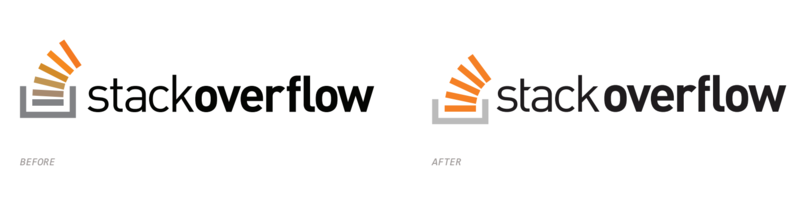
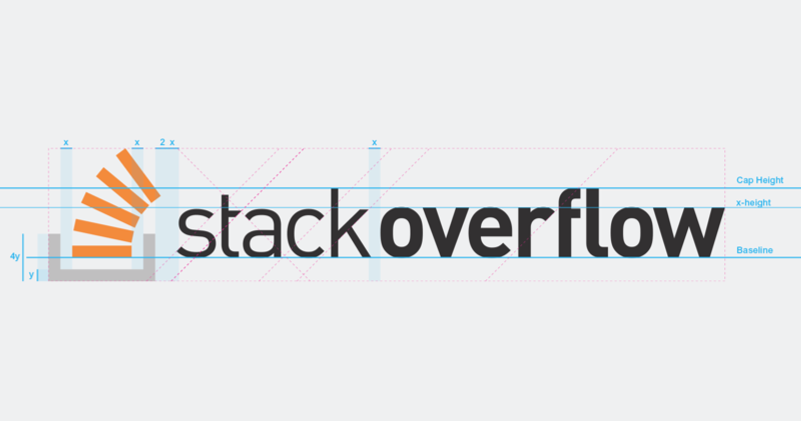
This update may not seem like a huge step forward visually. To most, it’s mostly what I stated it was at the beginning: a brand clean-up. But it’s a big step forward for us. For the first time, we’ve developed a systematic approach to how we can be visually consistent wherever you experience Stack Overflow.
We never explored rebranding Stack Overflow. We never wanted to. We have the great brand foundation already. Instead, we took what everyone knows and worked out how we could make it better. Still updating the brand is but one part of a larger effort internally to make sure that every product, every project, every feature we work on is focused on serving you—developers and the developer community.
We’re extremely proud of this step and what it means for us. We hope you feel the same way.