How Stack Overflow Redesigned the Top Navigation
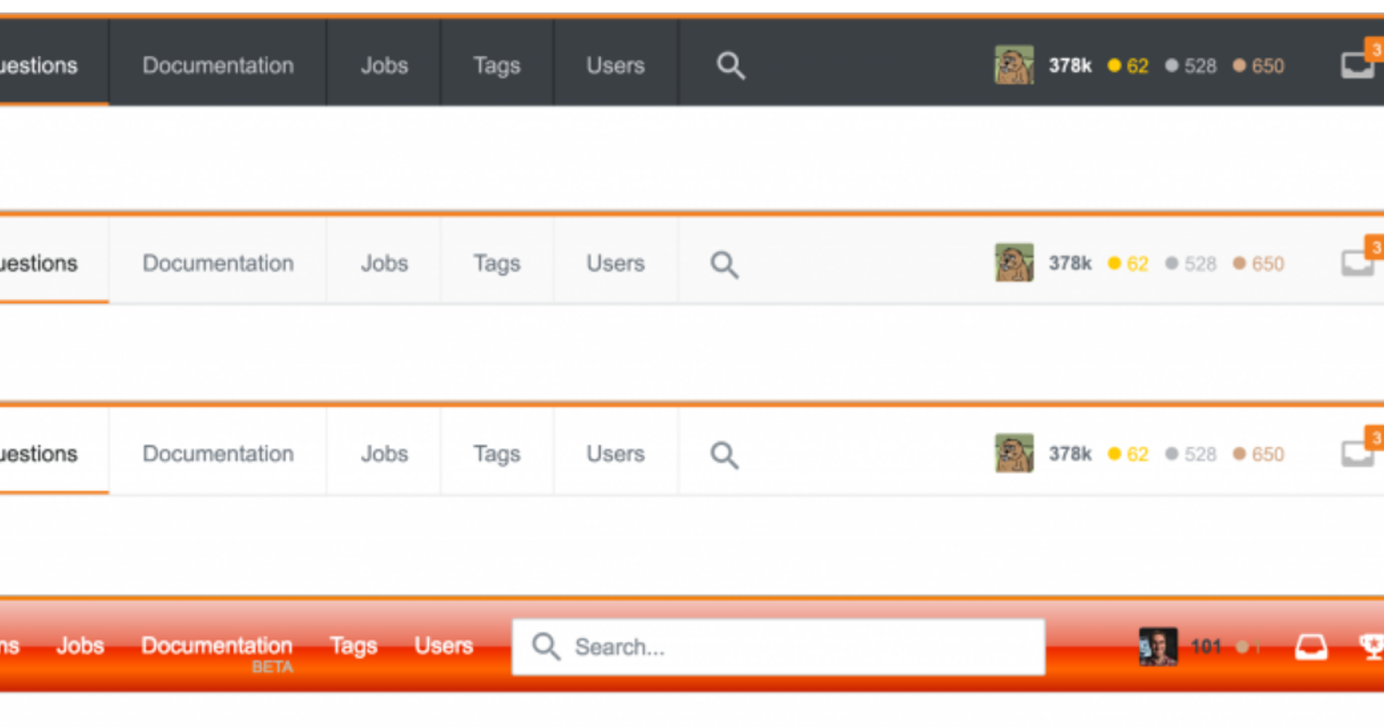
You may have noticed that we’re sporting a new look today.
We launched this update today as part of a series of changes supporting our core mission: Make developers’ lives better. In the past year, we fully integrated our by-developers, for-developers Jobs product. We added a whole new content type — Documentation — to help you find even more solutions to your programming questions. And we added Developer Story to help developers ditch the outdated resume format.
During this time, we also evolved our product development process to include more user research, allowing us to validate ideas earlier and surface more users’ voices. There’s a ton you can learn by watching people try to use a feature — things that don’t get uncovered when directly soliciting feedback. As both product and process expanded, it quickly became apparent that Stack Overflow had outgrown some of our previous design decisions.
A Common Theme
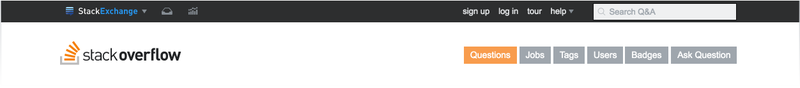
A pattern surfaced when talking to users: even with the addition of Jobs and Documentation to the navigation, many developers weren’t aware of the change. Digging deeper, we discovered that many weren’t really seeing the top bar at all – a “mental block” so effective that most users also couldn’t identify what the icons meant.
Here’s what a few of you said:
“When I come here I’m on a mission; I don’t care about the rest.”
“You’re only there for 1 reason: to find the answer to your question.”
“From my point of view, nothing above the question title exists.”
“I scroll down and read the question.”
The data validated our hypothesis — of the average 9.3 million daily visits to Stack Overflow, we get fewer than 88,000 clicks to the navigation or top bar (this includes inbox, rep, profile, and search.) If you divided each individual click per visit, that’s fewer than 1% of visits navigating anywhere (and far fewer if you counted multiple clicks per visit). Our navigation is not being used by 99% of our users.
The common use case for millions of daily visitors is “come from Google, scroll to middle of the page to a find an answer (without seeing the nav and sometimes evening ignore the question itself), and leave. This workflow makes sense — and we love helping the world’s developers gain programming knowledge quickly — but this also means many visitors don’t benefit from everything that Stack Overflow has to offer. If they’re not aware, then we’re less effective in helping more developers share their knowledge by finding questions to answer, advance their career search, utilize Documentation, or become contributing members of our community.
We hypothesized that a lack of engagement with the nav was due to a combination of browsing habits, visual hierarchy, and the right-hand position of the layout. Based on research about F-shaped reading patterns and how readers’ eyes commonly move down the page, it made sense that our navigation was sub-optimal for most people.
We also hypothesized that the focal point of the page (the logo) caused many users to skip over the small top bar. Plus the nav and top bar quickly scroll out of view when moving down the page.
The product design team then did a design sprint. Each designer created their own design of the top nav and then converged to critique and identify the strongest ideas. The team then combined the best parts of their ideas into one design. The main thinking generated from the sprint:
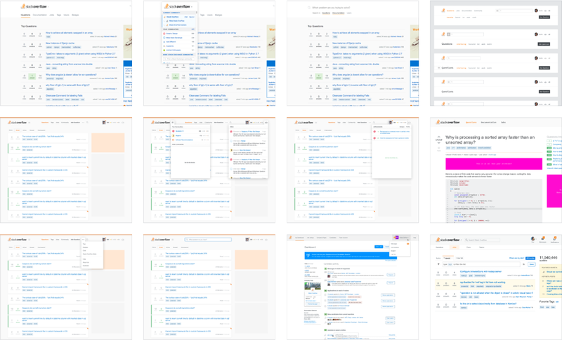
- Remove clutter and group similar information in a way that’s more quickly parsable
- Stick the navigation to the top of the page so that users who are scrolling quickly to answers or arriving from answer or comment links still have access to search or navigate the site
- Use navigation design patterns more commonly found in contemporary web apps
- Design the navigation as shorthand for the Stack Overflow brand
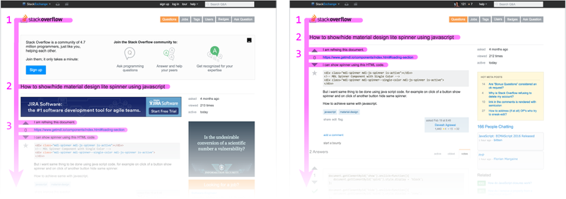
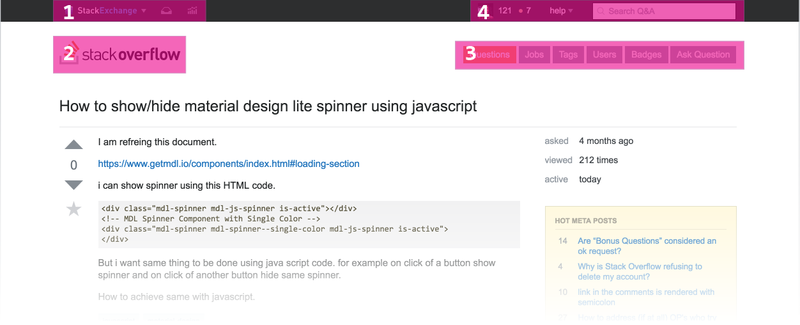
Stack Overflow users compared the new screens against the current navigation in focus groups at three tech companies. Here’s a sampling of what we heard about the current version of the top bar:
“I’m not even sure if the black bar is new.”
“I logically filter out the stuff that I know I’m not looking for.”
“Nav looks like tags — they might filter, but they don’t look like navigation. Makes you question what it is so I don’t click it and instead go back to Google that I’m familiar with.”
“I’m signed in and I still don’t know what those (inbox, achievements) mean.”
“Jumbled stuff at the top that you have to read and decipher.”
“Black bar is kinda… doesn’t look like it belongs, all else is white, grey, orange.”
And the new version:
“On the current nav I didn’t know what the inbox / rep icons were, on the new one I know what every button will do.”
“I know I can search, I know I can go to Jobs.”
“Much more modern, this one.”
“I like the old black bar, but I like that I know what I’m getting myself into on the new one.”
“A lot less noise, more signal.”
“Cleaner, more organized. Instead of jumbled stuff at top you have to read and decipher you can go to this.”
“More standardized position that you’re used to on other sites.”
Project Definition
At this point there was enough info to make the top navigation redesign an actual project. The nav is an area of the site that touches so many different use cases, user types, and metrics; it was important to tightly scope the project and clearly define the goals in advance in order to ship quickly. To mitigate scope creep, feature parity to the current navigation was the defined scope (with a few exceptions).
Primary goals
- Present all the tools we provide for developers in a way that’s consistent with them actually discovering them
- Increase traffic to Jobs and Documentation
- More intuitive, updated visual design
- Increase the number of users who sign up and gain access to more site features
Secondary goals
- Increase in notifications acknowledged
- Increase or no decline in searches
- No decline in questions asked
- And a handful of other important and boring metrics that we simply didn’t want to screw up
The progressive rollout plan to measure success had the following objectives:
- Usability tests on clickable prototype with 6 additional users to catch any major UX and functionality issues and gather qualitative insights about the new design
- A/B test with 5% of anonymous users to measure usage data
- A/B test with 10% of registered users with less than 500 reputation to measure usage data
- Opt-in for all Stack Overflow employees
- Opt-in for all users for Meta feedback and for debugging
Our findings from each…
Usability Tests
These tests were conducted in 1-1 recorded hangouts with 6 users who ranged from having low to high reputation.
While a few participants struggled with identifying two of the icons (which were updated mid-testing), all participants successfully completed all tasks, and all participants preferred the new design over the current.
“Looks really, really good. By far I like the new one — in the current one, you don’t notice the navigation at all, only the top bar. The (sub) tabs catch my eye before the current navigation.”
“In the old, it is weird to me that the two bars exist separately. This one feels more natural.”
“The new one is cleaner. Less wasted space. Things are more compact on the new one and account info is better grouped. Tabs across the top is preferable because a lot of sites have a similar flow. …much prefer the new one.”
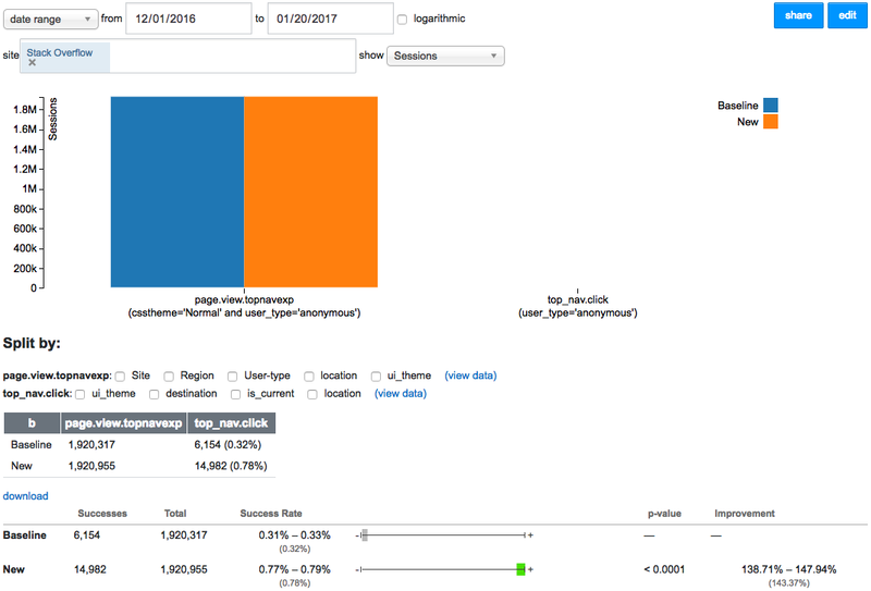
A/B Test with 5% of Anonymous Visitors
This test ran from 2016-12-01 to 2017-01-19 for about 2 million users in each A/B group. Anonymous visitors account for about 97% of all page views but only 61% of the current navigation clicks.
- Signups increased by 7%
- Clicks to Questions increased by 163%
- Clicks to Jobs increased by 160% (an expected 16% increase in overall Jobs traffic)
- Clicks to Documentation increased by 229%
- Clicks to Tags increased by 113%
- Clicks to Users increased by 178%
- Clicks to Ask Question increased by 33%
- Searches decreased by 13%*
*Adjustments to the design between the anonymous test and the registered user test were made that resolved this issue and actually improved the number of searches in the next test.
While some dropoff often happens after launch due to novelty effect, these increases were large enough to make us think that a good portion of the increases would be sustained after launch. Regardless, we’ll continue to measure and monitor the performance of the new top nav.
A/B Test with 10% of Registered Users with Less than 500 Rep
This test ran from 2017-01-18 to 2017-01-30 for about 100k users in each A/B group . Registered user account for about 3% of all page views but about 44% of the current top navigation clicks.
- Inboxes shown increased by 45%
- Achievements shown increased by 11%
- Clicks to Questions increased by 51%
- Clicks to Jobs increased by 99% (an expected 15% increase in overall Jobs traffic)
- Clicks to Documentation increased by 113%
- Clicks to Tags increased by 32%
- Clicks to Users increased by 82%
- Clicks to Ask Question remained the same
- Searches increased by 8%
Opt-in for Stack Overflow Employees
This phase began Tuesday, February 1. About 100 Stack Overflow employees opted in to test the new top nav.
Opt-in for All Users
This phase began 2017-02-07 to 2017-02-14. Around 1600 users opted in.
Feedback from the Meta community has been extremely helpful. Thank you to everyone who participated! A number of bugs were fixed during this period, some feature requests were implemented and others considered or planned. For a more complete list of updates, see Des’s most recent post.
Next Steps
There’s a running list of ideas we’d like to try in the near future. We plan on iterating upon the design and functionality of our new top nav in a series of A/B tests. There are also early-phase explorations into how this might roll out to international and other Stack Exchange community sites.
The design team is working on a cohesive design language in order to create consistent experiences across all our product areas. Some of these changes have already rolled out, and more are coming in the near future. Special thanks to Paweł Ludwiczak’s and Oded Coster’s hard work designing and implementing the new top navigation.
As always, we appreciate your feedback. If you have a bug or feature request — post it on Meta.
228 Comments
i am sure this will grow on me, the colours mix well and it seems to flow nicely, not had a notification yet so i am hoping it will stand out nicely.
I liked the new top navigation.
I would suggest to include the complete logo of stackoverflow (including stackoverflow text), because new users will see and remember the logo. People seldom notice the address bar, but if the logo is complete it will get registered in their mind. Just a thought.
The full logo is present for anonymous users, but condenses when logged in.
I’d still rather see the full logo than the 4 links beside it, those 4 links are mostly useless. Questions is redundant (if you want newest, there’s a tab for that when you click the logo) The Documentation landing page is awful (and documentation in general is an unsearchable underregulated mess, we dont need more people that don’t understand it going there…) Users… not sure why someone would go there, and Tags i can see being useful… sometimes? maybe? The logo is what i click the most because it gives me the list of questions i’m looking for.
Otherwise, I do like the new nav, once sticky is disabled.
That’s great, just noticed after logout.
Wow, that’s a really good idea. It’s amazing learning about the amount of work / attention to detail and use-cases that are done by the design teams. Thanks for the welcome improvements.
Looks really fresh, I like it. Nice contrast, color usage and layout. I am not so sure about the icons in the top right though. I still had to scroll over some of them to understand where they exactly lead. I guess that will stay hard to improve upon though.
Well done.
”
The common use case for millions of daily visitors is “come from
Google, scroll to middle of the page to a find an answer (without seeing
the nav and sometimes evening ignore the question itself), and leave.
This workflow makes sense — and we love helping the world’s developers
gain programming knowledge quickly — but this also means many visitors
don’t benefit from everything that Stack Overflow has to offer. If
they’re not aware, then we’re less effective in helping more developers
share their knowledge by finding questions to answer, advance their
career search, utilize Documentation, or become contributing members of
our community.
”
So in other words, this is an exercise in grabbing readers’ attention. Marketing. Your navbar is deliberately annoying: it’s designed to get in the way, diverting people’s attention when they have a job to do.
I’ve had block it until the next spin of the UX Fashionable Ideas Merry-Go-Round. Hopefully the next one your designers come up with doesn’t steal screen space. Now I won’t be able use your company’s other products at all, even if I wanted to.
By the way, do your statistics on improved attention-grabbing include the case where your users remember the old bar, and are irritated by the unannounced change to their workflow?
There’s an option to disable the sticky navigation if you prefer.
This is nice, and partially addresses the concern raised, but it would be particularly user-friendly if it used an in-context option (like a “Pin”), because:
1. If you hadn’t provided this answer, I would never have looked for a “Preferences” section hidden under my profile and two further links/sections, and would have been left with an impression of a “meh, never mind the users, they have enough screen space, we’re a business and we need more eyeballs on our profitable features” attitude – as Adam seemingly was.
2. Even *with* your answer, I had a pretty hard time finding the option in question – “Fixed navigation” is not how I would have described the annoying floating bar that wants to pull me to places that Google doesn’t take me (because they don’t match my goals/intent). It also doesn’t match how *you* described it right here!
It’s your site, your business, your prerogative – but StackOverflow now looks that little bit more like Quora, which (in my opinion) is not a good thing.
Agreed!!! Most users wouldn’t know there is an option to disable the navigation stickyness.
That is <Profile page>, “Edit Profile & Settings” → “Site settings”, “Preferences” → “Navigation”, “Disable stickyness”.
“Disable stickyness” = it scrolls off the top of the screen (it does not disappear)
There’s more usable screen space now than with the old version. Bit hypocritical of a viewpoint, tbh.
If you liked the old design more, here’s my CSS to make the bar thinner, disable the search animation and rearrange some buttons, amongst other things. A sort of pro-bar if you will, moving the inbox and such to the top left for easier access.
A better top nav bar for Stack Overflow
It’s closer to the original design, but wasn’t created solely for that purpose. It keeps most of the new design elements.
I really like the new top bar design and thanks for the insights sharing.
I’m surprised “Increase traffic to Documentation” is a primary goal.
Wouldn’t you prefer people arriving to a documentation page directly
from Google, as a search result?
Besides, the landing page of
Documentation is not very inviting – nothing particularly interesting
(just a list of popular tags, no code), and nothing relating to the
question you came from.
Plans are in the works to make updates here in the near future.
6 users, plus three focus groups, plus about 2 million users in the ‘B’ group of the A/B test, plus we received a lot of feedback from the Meta community.
I’m referring to the testimonials given above which come from a sample size of six.
The A/B testing was good.
That’s a common sample size for a qualitative usability test.
Alright then 🙂
FWIW I think the design of the new bar is pretty good. I have a few issues with the motivation and subsequent stickiness decisions (Adam touched on this below), BG colour (which is covered elsewhere), review notification (ditto) and inconsistency (other sites not using this yet)… but otherwise I’m happy.
You can unsticky it in preferences (user settings). BG colour and review notification are good points.
Indeed – changed it yesterday 🙂 As I stated my problem was with the motivation and decisions, but Adam has explained that below.
ugh that’s all you need… In fact 5 works just fine.
I’m on the blog page. Now this thread seems to have forked itself? Don’t understand what’s going on! Meh.
Edit – when I go on via the Disqus page it’s one thread. If I look at it via the SO blog, I.. dunno. Something odd. Oh well.
Disqus has a weird system, it allows basically infinite forks, and if you access it through Disqus, it only loads the fork in question.
Anyway I apologize for getting annoyed. There are typically so many trolls that I’ve become jaded and assume people are trying to be a**holes.
Edit re your edit: That is the opposite behavior that I’ve seen, lol. Though imho it’s still a more reliable comment system than Facebook.
Strange.
Anyway no problem and me too 🙂
Can you elaborate a bit on some of the statistics provided? Was the goal to increase clicks to “Users” and “Tags”? If so, for what purpose?
Can you also elaborate on how this fits in with other initiatives, such as the quality project the Tim Post in involved in? I ask this question because of these stats:
“Clicks to Ask Question increased by 33%” for anonymous users. This seems to be directly contrary to improving quality. However, you do mention that you fixed the search between the anonymous testing and regular using testing. That doesn’t seem to have helped much when clicks to “Ask Question” remain the same even though the number of searches increased by 8%.
That’s a really good question for meta SO if you care to post it? There’s other testing we completed when looking at overhauling the ask question page, which ties into this. The size of the funnel isn’t as much of an issue, it’s what we do *after* people click that button that really stands to make a sustainable difference. A hint: Most people *do* search prior to asking (some through Google, some using our own search, some both). In most cases, they just had no idea what they should have been searching for in the first place.
Thanks for the feedback. We’re discussing this. It’s likely we’ll make some sort of adjustment in the near future.
You can un-sticky it. There’s a “Disable fixed site navigation” checkbox under “Edit Profile & Settings” -> Preferences, reachable from your user profile.
Why is it only on Stack Overflow? Why not also on other Stack Exchange sites?
Quack!
There’s a plan to roll out at least part of the update eventually on other Stack Exchange sites. The reason the changes weren’t made in tandem is that there are just so many custom header designs on all of the sites.
I really like the new nav bar. Also, the “logarithmic” checkbox in one of your analytics screenshots make me feel good. Someone knows statistics and visual information.
I considered checking logarithmic before posting the screenshot, but thought it might at a glance look like our conversion rates for the events were greater than they actual are.
My first impression is very positive. I disagree with the opinion that it’s “deliberately annoying.” I think it’s the opposite. Much more subtle than the big black bar.
My only negative response to the new bar is that the gray text in the search bar is a bit too light. My 53-year-old eyes would like to see a little more contrast there. (But at least it’s not gray-on-gray. Thanks for that.) Of course it’s entirely possible that it was the same shade of gray in the previous bar. But today I’m paying particular attention.
http://i.stack.imgur.com/WbFVC.jpg
Indeed. Is it a coincidence that it happened at about the same time?
This was not planned, but it is possible there are hidden forces of the universe at work here.
It’s about middle of first quarter 2017…that probably explains it.
Current state of Stack.
1- I liked the black new nav bar more
2- the nav bar is not responsive
3- generally, I feel it is better now
Is there a way to remove the numbers from the review icon. It’s too disturbing seeing that always there. https://uploads.disquscdn.com/images/ee4ede1f7ad020ab0e21f51098bc63c0bd21ed5a50faa292c3e00312af34eca6.png
There’s a plan to make an update to the review section. More details are mentioned in this post: http://meta.stackoverflow.com/questions/343653/top-navigation-update#343779
simply we need an option to hide that counter, it is confused with notifications and constantly changes as things get reviewed or not.
It’d be great to be able to choose which queues populate that number per user, but I understand that designers/engineers don’t want to do that because of the stigma of giving users a choice.
That actually has little to do with Stigma and everything to do with performance. We simply can’t calculate those numbers per user, they’re incredibly complex queries. Selecting which queues show up is a finite set of calculations and isn’t *crazy*, but such a preference system to back a single number wouldn’t be simple either.
I’m certainly not saying I’m happy with how it works – I don’t think the current approach is anywhere near ideal. I’m just generally responsible for making it go fast. Discussions on meta for how it *should* behave are more than welcome. Then we’ll see what we could do to make it work.
IMHO we over-tax people by constantly showing that. No one really complains about it, but it just feels a bit overreaching to be constantly blaring that number to people that have been actively reviewing during their time on the site. Ideas currently float around .. just turning it off for a few hours after you’ve done a certain number of tasks. We wouldn’t take the link away, but we’d stop pestering you by calling on your good nature until the next day. Need to talk about options more, but we’re not comfortable with that either (and one of the reasons why we agreed to provide an unstick option from your profile).
just put a simple dot instead of numbers, that tells it’s something there, but not numbers that change frequently, sometimes 507 next 495 next 601 and so on. It’s disturbing.
adblock it till it’s changed.
Just do all the reviews. 😉
To be honest, now I always feel like the page is stuck in a loading state. It looks like those thin bars that move across the view as the page loads. It’s also orange, and I can always feel it in the top of the window. I preferred the previous layout. Just two cents from an avid user. Thanks!
I agree; were that the notion of a colored top-border animated to display ‘loading progress’ never caught on anywhere… The worst culprit in my frequent usage is YouTube.
Github has a blue loading bar at the top.
Please make it collapse when you scroll down. It’s too much vertical space.
UPDATE: I guess there’s a flag for it. https://stackoverflow.com/users/preferences/current#fixedHeader. But why on Earth isn’t this just the default?
You have option in Profile -> Site Settings -> Preferences -> Disable stickyness
Flip the default.
That would defeat the purpose of the effort, which was to make sure users are more aware of the nav bar, and more often.
Give users an in-context option to change the behavior (eg “Pin” button), rather than hiding it in such a way that only the trollish freaks like myself find out about it, in this blog-followup context.
My 2 cents worth..I think the Navigation needs to be made slightly bold, just to give it a little bit more focus, but not distracting the visitor too much from their real goal(to get an answer).
The top bar shouldn’t be fixed when I scroll down. It distracts me a lot from the question/answer I’m trying to view. Also lesser space on the screen!!!
http://meta.stackoverflow.com/questions/343483/were-adding-a-setting-to-disable-fixed-sticky-navigation
Thanks to the comments here I disabled the stickyness. Should have been the default behavior I feel.
I am reporting a bug: you have tabindex=”1″ on the search field.
I suspect you want it to be the first item a user tabs to on the page, but you can do that just by putting the search box first in the DOM (in the raw HTML).
Why this is a problem for keyboard users: after entering a search term, the next interactive element in the tab order is the logo, not the submit button. Remember, not all users hit the Enter key to immediately submit. I do not; that is how I found this issue.
Why this is a problem for screen reader users: after allowing the screen reader to describe the controls, the search control is not the first item but appears after the navigation items. Once I start tabbing to the control it is not where I expected (the 8th tab stop) and confuses me about where I am on the page. In addition, I cannot tab directly to the submit button (as outlined above).
An additional bug: The search field has no accessible name.
I suggest you either add a (which you can visually hide to maintain your design) or add an aria-label attribute. The placeholder is insufficient and, when pre-populated with a searcch term, confusing.
Thanks for the feedback. Would you mind please posting a bug report on Meta Stack Overflow and tagging it [tob-bar] and [bug].
Heck yes. Will do directly.
Available here (hope I gave you enough detail): http://meta.stackoverflow.com/questions/343808/bug-new-navbar-accessibility-issues
Good catch!
I like the dark bar better…. the contrast gives a better user experience
Flawless work. Thanks SO.
There is 0 contrast between the content on the page, and the navigation bar. Horrible choice in my opinion. Pure white is rather bland.
To be fair, there might be 3% contrast.
You’re using bogus statistics to push through this poor design. You should have separated the ‘sticking’ of the navbar to the top of the site and the bar design change. Come on, do we need to lecture you on separation of concerns and on isolation of dependent variables?
I massively dislike the new design. Don’t really mind the stickyness – if it had been the old bar.
Also, the fact that new design causes registered users to make more inbox clicks and achievement clicks is not necessarily a good thing. I feel the new bar makes me more edgy.
One of the primary goals of the redesign was to increase awareness of (or traffic to) Jobs and Documentation — the post is transparent about that. I’m not sure I understand how making the old bar sticky would have solved this given that the two are separated in the old design.
It would have made “Jobs” and “Documentation” visible all the time on the old-style bar.
Also, you can increase awareness and traffic to Jobs and Documentation by covering the whole screen with two large buttons going to one of those two places… but at the expense of other aspects of the experience of using SO.
That’s very interesting idea, thank you! I will discuss it with team.
StackOverflow should be replaced with a page saying “GO TO JOBS NOW”
Nature loves change.
Sticky bars are never EVER EVER acceptable. I’ve got few enough vertical pixels as it is. If users are too stupid to hit the Home button now and then, well, YCFS. Please don’t violate fundamental window display rules.
https://uploads.disquscdn.com/images/f9b569b987b0bb59420051719c13a1c77b90495b017e14eaaf72af082788c948.png
What are the statistics on the number of people that realize there’s a settings screen, and a preferences screen under that, and where that checkbox is?
Mainly active users who contribute regularly. You can find it by clicking on your avatar then going to “Edit Profile & Settings”.
I didn’t know such a page existed, and created a Stylish theme with “header { position: static !important; }”
So I’ve heard. Do you really think it’s sensible to require everyone (computer-savvy or not) to dig into Prefs tabs just to find out what new “features” are controllable? At the very least, make the default the other way around.
now, when we’ll be able to select from a set of themes as per our preference? … 🙂
The new navbar is great, but please please please do not make it fixed… The first rule of making navbars is they should not be fixed.
No one seems to have told the internet that there are rules for this sort of thing… https://www.google.com/search?q=The+first+rule+of+making+navbars
I thought the first rule was “You do not talk about making navbars.”
You can unfix it deep in the settings.
Yes I figured that out.
That orange bar at the top just asks for becoming a “loading” progress-bar
Agreed. I kept waiting for it to go away when the page loaded.
Strange, Why does the site use a progress bar? My browsers have animations (Firefox, Chrome), when waiting for content. So this is just a duplication of already implemented Browser features…
If the site just uses Javascript to refresh content faster.
Come on, I like dark theme better.
I can’t believe no one has commented about the Hot Dog theme.
This is so weird. Github changed to a messed up dark theme, and StackOverflow changed to a horrible light fat theme. WHAT IS THIS WORLD COMING TO!
2017 Design Trends, I believe…
You mean the option put out there so everyone can think “Well, at least they didn’t stick us with that ugly bar as a default?”
then you should check out Github
What percentage of test users said they did not like the header being black or commented about the color in general, in a way that cast a white nav bar in a better light than a black one?
i mean… only a very small percentage commented at all.
Right, the change from black, high contrast to white, no contrast is a very big one; easily the most noticeable change out of all of the adjustments. I want to know, out of the several million who ultimately tested this, how many (at each stage, ideally) made comments that could be used to argue in favor of a white and/or low contrast nav bar. If it’s a negligible amount, then the design team is on the hook for introducing what ultimately may be a regression without basing it on any solid data. I’m not saying there weren’t any people arguing for this, I just want to see some numbers.
We did not test a dark version of the nav (yet) — the scope of this project was a total redesign and consolidation of two things — the old topbar (which was dark) and the navigation (which was a series of gray boxes plus the logo on white). The design team decided together that the lighter version was less invasive and distracting from the content (which is really why everyone is here), especially given that it’s sticky. We still wanted users to be able to ignore it if they choose. Also the style matched better as a cohesive whole with other elements of our design, so we tested a lighter theme against the old version. We plan on continuing to test iterations in the future, and don’t really consider anything ‘done’. One thing that is difficult to measure is effectiveness vs. distractiveness, (something we do care about.) Regarding preference of dark vs. light, this seems to be fairly subjective. I’ve seen identical remarks both on this design update and GitHub’s recent update that range from “My eyes are bleeding” to “I love it.” The dark theme subject did not come up in conversations in focus groups or user testing, but began coming up we started sharing with the greater Meta community.
I know anecdotes aren’t really data, but with this new redesign, every single time I open SO, my eye is now immediately drawn to the top-right corner, because with the current color scheme, the badge display (especially the gold badge) looks exactly like how my brain has been trained to think an urgent message/warning would look. It’s driving me crazy. >.>
Feels like a justification for change just because you feel it should change and grasping at any excuse that supports it.
Like Microsoft… Office and the Ribbon interface, Windows and the murder of the Start Menu, the tiles-based UX, the violation of the basic usability principle of Nokia and any phone-based UX, Visual Studio 2012+ and the horrid theme & UX contrasts… I could go on
Speaking for myself, the removal of black and contrast just messes a whole lot of things up. Suddenly, it’s no longer “visible”, “seeing” the content that was always instantly recognisable is now hard, it’s like I am lost and I need to figure things.
Please give us an option to revert back to a dark bar or the old theme, regardless of what you want to do with it. If we need that something you want to show off, we will find it.
This literally messed up my day and will most likely leave a mark as Microsoft did when it overhauled things that work, just for the sake of change.
Really like the new top navigation, my initial sense is that it’s a leap forward in usability although it does seem to “get in the way” after a while when I’m using the site.
Was any consideration given for hiding it (or shrinking it to a more compact layout) as the user scrolls down, but then re-displaying (or re-embiggening) it gently if the user scrolls back up more than a couple of lines (a little touch of hysteresis)? (Essentially how the address bar behaves in the Chrome browser on Android)
While the orange stripe at the very top seems nice for branding (especially once this is rolled out across other sites in the Stack Exchange network), it does sort of look like a progress bar, as others have mentioned.
So the one, single, part of the UI that I used – the top left dropdown to get to the stackexchange sites – has now gone – or moved to a hidden place. Yeah…. great improvement. Not.
Can’t win em all. Plus, it isn’t hidden, it’s on the opposite side 😛
How to change it to black back? or at least to very dark gray?
You just ruined my day!
And how you dare to quote `“The new one is cleaner. Less wasted space.` when this one take clearly more space and it even stick on top so that it can take space whenever I scroll!!!
I do agree with you about the sticky bar. I personally find it intrusive. Why not make it like the google search bar? Just leave the design the way it is, but don’t make it sticky. I didn’t realize how much it bugged me and distracted me from what it is really important….the question.
There’s an option in user preferences to disable the sticky nav.
Is there an option to just revert to the old design?
Nope.
new header is combination of navigation and topbar (that dark bar). that being said, new header is smaller than old nav AND topbar combined. It was about 146px before site content, now it’s less than half of it.
Honestly, if the topbar only received 88,000 unique clicks then that is the user base you should be focusing on, because they obviously have more then one brain cell between them.
It would be great to have the dark theme as an option for the entire site, where even the body of the page is a dark grey, with white text.
You can try Stylish plugin…
It looks much more simple and good UI design 😀
Could you add at the -webkit-box + -moz-box flexbox prefixes as well, for older browsers such a Safari 6 and Android < 4.4. That new top nav is covering the site in such browsers and makes the site unusable in them as a result.
Even though we don’t support those browsers, this seems reasonable.
Enough justification, how do I revert the design?
Seriously, it’s like they don’t even understand why their users responded with “You’re only there for 1 reason: to find the answer to your question.”
We understand it. We’ve also heard a lot of developers like jobs once they were aware it exists, and in the new version we think people are more likely to browse for questions to answer. Sure not everyone’s in the mode to do these things all the time and they can ignore the nav (one of the reasons it’s not dark is so it doesn’t overwhelm the content). But when folks want to, it’s good if they’re at least aware. We’re proud of the idea of helping developers find jobs that they love and want to create a platform for more people contribute their programming knowledge to the greater community.
Do you remember the days of internet old, when toolbars took up as much of a third of the screen?
Did it, at no point in the design process, occur to your team that what you were doing is just the teensiest bit analogous?
And no, it’s not page specific. The tools on the so called nav bar are not actually a way for me to interact with the resource that I have requested. It can only serve to redirect me, and since the vast majority of your users have no interest in being redirected, this “update” is no better than a toolbar.
Have you ever gone to a grocery store with the express purpose of getting one particular item and then walked out without the item? A lot of people have a purpose for going somewhere that’s rather specific, but that doesn’t mean they’re not at all interested in other things you have to offer along the way.
Did the thought enter your mind that people don’t click on the new tabs because they just don’t want to? You can’t get people to click on a crappy idea just by tweaking UI design!
In the old version, people specifically said, “Oh, I didn’t realize you added anything.” We heard it many times. Once they did see, most were interested.
“So this time, we made it where they can’t avoid our changes.”
Of course the navigation to different places will go up with a new look. Everyone is looking for where the stuff is and how it looks. But I could not actually find basic navigation elements for several minutes, clicking on everything to see what it does. The placement is totally non-intuitive for a left-to-right person. I don’t expect the things I start with to be all the way to right. I’ve got to move mouse way more and I’ll probably stop using the site altogether as the new look is just too infuriating and the change useless, no options to customize the look or even option to use the old look for a while to get adjusted. Further many of the elements are now smaller than before, making them harder to use, the contrast is worse as well. The white wall is too much, … simply… good bye.
**I am very unhappy with the new interface**. I want to be able to quickly go from stackoverflow to http://programmers.stackexchange.com/ and that is no more easy.
When are you going to roll it out to other sites. I am sick and tired of seeing 30% of my screen devoted to a stupid green decoration on http://raspberrypi.stackexchange.com ?
The horizontally reversed layout is what chaps me. I like the new design, but I also like consistency.
The new “design” eats up my spare vertical space. Well, I have plenty horizontal pixels, but why on planet earth do Webdesigners think that a **fat** navbar supports a better experience? To be honest: Save vertical space! Not everyone has an Apple MacBook UltraXP Plus 3000 HyperHD Nano-Sonic Matrix Display (TM). Please reconsider the fat navbar to make it a small one. Thank you.
Because it worked for Facebook. It all starts and ends with Facebook. They have a hamburger menu, we need that too! It would take a big shift in thinking to get a bunch of sites to start a new paradigm. While I agree with you, screens are getting wider, not taller, I just don’t think it’s gonna happen anytime soon.
You can turn off the sticky navbar. Pretty sure the net result is a *savings* in vertical space.
Wait… You saw people don’t care about navigation too much, so you made it bigger and sticky? Do you think people will care because you decided to stuck it in their face?
Errrr I kinda feel weird with this navigation :S
Will take time to get used to but kudos to the team.
Devs don’t like change do they?!
FWIW I think it’s a change that makes sense, although I would probably shrink it right down scroll.
The orange line on top looks like a progress bar stuck at 99%. Feels like the page is still ‘loading…’. Other than that, I love the new nav bar and am happy to see something new in the UI.
Oh man, now I can’t unsee it.
The fixed header is quite annoying. It takes too much space. Could you make it static?
There is a setting in preferences to allow you to make it static for yourself 🙂
Thank you man! Much better now.
For others looking for how to disable the sticky header. Go to you profile, open ‘Edit Profile & Settings’ tab, click on Preferences under SITE SETTINGS, scroll down and tick ‘Disable stickyness’.
https://uploads.disquscdn.com/images/070ac3e5f85e0ee03a0cfde8ce4a5c00611065c18f6ecffc62dbc77fc1b1ad70.png
Muchos gracias to Paweł and Oded, I know from meta that they have been very interactive with users about the theme changes, which is to be commended, as of course is the work put in to design and implement this.
I like the new icons with the coloured counters and the changes to the drop-down menus. While the bar feels kind of chunky it does alleviate the cramped feeling felt with the old bar.
On the other hand I immediately disabled the stickyness as soon as I was able. Most people are aware that there will be some menu towards the top of a webpage, if they want the menu then the home button is one small finger flex away. Having the menu follow me around taking up vertical space is not going to make me more likely to click on it if it’s not what I need/want. If I go into a shop and they don’t have the pizza I want, I leave again, I do not instead see that they have an advert for toilet cleaner that they *do* have in stock and thus buy that in place of the pizza.
Initially I was not a fan off the loss of contrast in relation to the change from black to near white… but it’s growing on me I guess 🙂
If you happen to use some kind of browser plugin that allows you to overwrite styles: http://pastebin.com/VhADqn5p
This will make it 10px smaller in height, and removes the uber annoying screaming orange line. I can live with it now.
I’m sorry to hear that 🙁
Can we all agree that this person…“I’m signed in and I still don’t know what those (inbox, achievements) mean.” is a complete idiot? If you use the site even just a little bit, those 2 are obvious to anyone.
People couldn’t figure out the standard Search bar with the magnifying glass in it was a Search bar???? I’m curious how only making it larger will suddenly make people understand what its function is? These same buffoons were too timid and afraid to click on a button if they didn’t already know its use…doesn’t sound like developers to me. They sound like lowly end users (the kind that call the help desk after a long weekend because they can’t remember their password.)…and those people won’t change. You can change the UI, they still won’t know what those buttons do unless someone holds their hands while going through it…so I wouldn’t expect to see much change in the usage metrics.
There should be an option to change the colors at least, the black bar was so much better looking, the contrast made it much easier to see. All you had to do was throw a couple more links up there, not this huge redesign.
I’ve been searching this site for years and never participate. I just lurk, get my answers and leave. So yes, I don’t know what any of that stuff is, nor do I really care. But it doesn’t mean I’m an idiot. We’re just different user types.
Yes, I’m just like this. If the answer is not on stack overflow but on X, Y or Z, I don’t care either. I just want to get my answer, fast.
If you don’t participate, what’s the point in making an account? If you participate at all, ask a question, provide an answer…those 2 icons become obvious as soon as you have feedback. I find it almost impossible for anyone who is signed in and done pretty much anything on the site as far as participating, doesn’t have any clue what those mean.
I haven’t made an account. There is no wall to using the site, you don’t have to have one.
One could argue that “takers” who never offer anything in return fall a bit lower on the priority list for UI feature approval. No offense, but that’s only fair.
I see where you’re coming from here, but don’t pat yourself on the back too much.
By your logic, I can’t vote in America because I don’t write my senators weekly?
For all you know I could have a PHD in User Design. None of this is qualified by whether or not I give back.
Yeah… but SO isn’t a democracy. 😛 A better analogy might be a potluck supper. You don’t get to complain if you don’t bring anything.
haha, you act like SO has a roundtable discussion and then says “let’s email that Clint guy and ask what he thinks. He’s commented over 20 times, we better not anger him.”
SO is a business and does whatever the want and benefits them. You honestly have no more voice in it than me, or another million generic IP addresses.
Of course…it’s testing. The point is for the testers to try things out and attempt to break them.
Past the point where users recognize something is new and click on it to see where it goes, I’d guess the clicks will drastically drop off again and people will fall back into their normal patterns. After that we are left with a bar that, from the comments, the people that actually used the bar – like myself – aren’t thrilled about. The people that didn’t use it before most likely still won’t use it.
I don’t want to be accused of just complaining without providing solutions…
I merged the two together, only took about 5 minutes. Still maintains the good visual contrast from the black bar (I had to use Code Review to get a grab of the old style, that’s why it’s blue), doesn’t move everything all around just for the hell of it, Ask a Question is prominent and colored to attract attention…and you can still have Users and Tags up there even though I don’t ever use those myself. If I’m looking for a user, I usually just follow the link from their question or answer.
It’s different but still the same.
https://uploads.disquscdn.com/images/31e6e32bf445cb30fb64c313e6fcbc4ef769c7932172f8139243f57cbf1b6c5a.jpg
Apart from the usability discussion, the major issue for me is that the green reputation+ badge is not as exciting and thrilling as before.
Very True.
Agree 100%!
Can I have the old bar back please?
I found this an open and interesting read. I’m surprised at some of the negative posts below. The redesign had stated objectives and used a sound method to test them. Statistically the approach was validated through the large uplift in the areas the team sought uplift in.
Maybe the design didn’t suit you, maybe it doesn’t suit me but you and I are not the anonymous masses being targeted. We probably already know what we want and where to find it as well as what other services SO offers.
“We plan on iterating upon the design and functionality of our new top nav in a series of A/B tests” sounds great to me.
Personally I love the new fat grey/orange nav but I can imagine it failing AAA Accessibility on contrast grounds.
You don’t sound like a real SO user. You are spewing UI designer/Data analytics lingo right and left. Please leave our websites alone! We don’t care about your silly career!
Cool! What tool have you used for the A/B testing?
It’s our handmade tracker for A/B testing (funnels, etc). Marc Gravell is considering authoring a post about it: https://twitter.com/marcgravell/status/831933723146911745
I like the redesign except for one thing. Having the top navigation bar a contrasting color (i.e., black, like it used to be) gives me a visual reference when I do need to go to the nav bar. Now that it’s white, I find myself searching for the bar when I need it.
Please add a profile option to revert to old design for those who don’t like new design and finds it unusable.
Also an option to revert to the old old design. And the old old old design. And every previous design ever. After all we’re paying customers…
I added “header { position: static !important; }” with Stylish, that alone makes it far less intrusive and annoying.
This new header is too tall for something that’s always visible.
(I’m also considering forcing “display: none” on the Review Queue; the number makes it look like something that pertains to me, like the Rep and Message icons next to it, but it’s not)
Is it possible to change the top navigation’s color?
No, we don’t have that option.
I appreciate you the hard work you have put into this. But when I scroll down I expect the navigation bar to disappear. I want that screen space to be more useful than just show the navigation bar. Maybe I am old school. So what you do with good ole boys like me?
You can toggle the sticky navigation bar (for each site) in your profile settings
The review notification is too intrusive. I know why you as a SO owner would like to have it so big and in my face, but as a regular user it’s too intrusive.
For now I filtered it out with Ublock Origin.
We agree and are planning on making updates soon to make it less intrusive.
Hi Kurtis/ Paweł/ Oded/ someone else on the team, I have three questions related to the search bar:
* Why do you expand the search input field on focus? Is it to encourage people to write longer queries? (I think it’s a nice feature but I’m interested in your argument(s)
* Why don’t you offer autocomplete (a.k.a. query suggestions)? I find it very helpful on other services and am curious as to why it’s not something you support, when most aspects of your site(s) seem very feature complete.
* Why is the ability to search across Stack Exchange given so little significance? I’m aware of stackexchange.com/search, which I’m assuming uses Google Custom Search (CSE), but it’s hard to reach this template, and I can’t find a flow arriving there when starting from the search input field. Personally I have had several questions that span across multiple SE sites, e.g. both SO, Software Recs and Super User. Am I an outlier in this regard?
This is a VERY annoying change as a user and clearly optimized to drive more revenue. This whole “you are the product NOT the customer” thing of the web is really getting annoying.
Sticky header by default is a horrible idea. What about non-logged in users in untrusted networks? You know there’s no way >90% of your visitors are logged in.
I hate the new top bar, I wish it was darker.
Gotta say I dislike the new look. Everything seems too cramped, and the header bar needs to go away when scrolling down.
Okay, found that the header bar is configurable. Still annoying that I had to look though.
How? I see nothing that indicates some sort of settings button.
Edit: found it: profile options. But nothing in the bar indicates that there are options in there, so most people won’t be able to find them.
Plus the only configuration is to make it not sticky. The sticky I like. The size, I don’t. Not sure about the color yet.
I’d actually like it even smaller, the same size as the “One new comment above” notice for Discus. If you must have it be touch accessible, figure out some heuristic to tell that you’re on a touch enabled device. And then do it the right way, where it goes away when you scroll down, but comes back if you scroll up.
I’m so glad I have Stylish installed. How, in all that is holy, does Stackoverflow, a place for coders, manage to botch a redesign in such a way? Not that it’s completely horrible, but it takes up too much space, and has too much whitespace.
Whose genius idea was it to implement a search box that when you click on the text in the search box to edit it, the search bar expands to the left, and the text whizzes off to the left requiring you to reclick on the text to edit it? In addition, the overall look of the new changes is terribly bland. I agree with the previous comments that the constant header bar takes up too much space.
Honestly, this is the only feature of the new design that has really bothered me personally so far. If I see a text field, I expect text field behavior when I click there. I’m probably not the only person who often clicks on a text field without having formulated precisely in my mind what I intend to type. I think it is a bit ridiculous that by clicking in the search field I lose everything else in the nav bar, and even after deleting any text I entered, still have to click away from the search bar to get the nav options back.
You’re using too much whitespace in general with this redesign. The top takes up too much space and should scroll off when I scroll. I don’t want it in my face at all time. Also, the moving search bar is non-standard and obnoxious.
At the very least, provide a static and compact option for those of us who hate modern UI design with all it’s big fonts, widgets and white space.
PS: Disqus really sucks! Please stop using it on your blog!
I like the idea, but it is taking up too much space. You can easily reduce the height like 16px and have it still work.To be honest, it looks like the old bar was sufficient in height to handle everything.
And I agree the search field should not move. That’s only useful if the search field is really small, on really narrow screens. And, in that environment, you should display a search button but no field, and then do what you currently do on a click. It’s much cleaner, and doesn’t have what the person is typing moving.
I like your navigation, but could you make an option, to make it black in user settings, white make my eyes hurt.
It’s funny how you only picked positive commentaries about your new toolbar. Look at the rain of negative ones on meta and tell me they’re irrelevant.
We didn’t have any negative responses during the interviews. Meta is a community that uses our site the most, and we deeply appreciate them. They are also the most change-averse group who will have the strongest muscle memory and likely experience the most difficulty with any UI change. The response on social media has been mostly positive. Also, people are more likely to express a negative opinion than a positive one. It’s been stated in both meta and on this post that we plan to iterate and continue testing in the future.
Question: How Stack Overflow Redesigned the Top Navigation?
Answer: Hideously.
Beauty is in the eye of the beholder.
And Prema van Smuuf is the average beholder.
Well, it doesn’t look that bad, but its too big/tall and I really miss the old black bar, so I did some small changes to it and published the CSS here:
https://userstyles.org/styles/139050/stackoverflow-black-header
Enjoy.
Please do black one ? white bar is too bad.. TY.
Please don’t. Even just to annoy this guy.
Could we potentially have a customize option? Where once you have an account you could use the dark theme? This is just preference, the new bar is really nice but dark feels more at home for me, thanks! 🙂
Also, why can’t I post here with my SO account?…
Totally agree. We are all developers here, we don’t like being restricted without being consulted. I feel like you guys could squelch 80% of the legitimate complaints about the new design by simply giving users the option to opt out of sticky mode, and add a dark theme option, and make them easy to find.
There is an option to turn off the sticky in your user preference, and you can customize the theme using stylish or another browser plugin.
How can we customize the color, i see in the screenshot above that there couple of other colors. Is there any way we can revert to black, or use this dark green instead of white ?
Try this: https://userstyles.org/styles/139050/stackoverflow-black-header
Full disclosure: Yes it is made by me. Yes I posted it 3 posts below… Who cares 😀
This reminds me a lot of the disastrous UI redesign by some new young UI guys at Chowhound. They too took a “screw the content creators we are catering to the airheads coming from Google!” Lots of arrogant comments coming from their UI team at the older content creators who complained about it – they too used metrics and lingo as if that made it OK. They also made comments about older users aversion to change as well. They came really close to losing their content creators.
http://www.eastbayexpress.com/WhatTheFork/archives/2015/09/22/chowhound-in-crisis-an-unpopular-redesign-prompts-longtime-users-to-leave-the-food-discussion-website
I still have the old design up on one of my open pages, comparing it I see it is far superior.. black is a better color, the top scrolls away to give you more space to read on the page, less clutter – documentation is a good link though
p.s. it’s a bit silly to have to sign into the comments when you’ve signed into the site already
Silly yes. But we ran into the same issue on our own projects when switching commenting systems, discus, livefyre, Facebook etc. The only way to allow for single sign-in w/o losing your own auth/members is to host your own commenting solution/platform – as far as I know.
I don’t mind the new look at all, it’s beautiful and clean. however, I hate the search field, I mean the animation, you click on one stop to edit your search enquiry and it animates to the left and you’d have to shift your focus, it is confusing. that’s bad UX right there.
Even I liked the overall clean design. But hated the Search field design. It is really bad design to shift left side, as it requires complete refocus. If I was the UX designer, I would have personally not done this animation. Even if a bigger search box is needed, it is kind of OK to expand right side without changing the height, and look of search box. If it expands right the user will not need refocus.
I felt more comfortable with the old one but as long as SO is doing A/B tests I’m all for it. Just don’t (please don’t) hire a UX team and stop testing like Gmail did a handful of years ago. Great work!
I’m not anti, but seriously dislike killing the functionality of finding/going to other SO sites that was a part of the old version. Not only was it incredibly useful, it was informative: I found out/joined many new sites from that functionality. Please bring this functionality back into the fold. These quotes:
“When I come here I’m on a mission; I don’t care about the rest.”
“You’re only there for 1 reason: to find the answer to your question.”
“From my point of view, nothing above the question title exists.”
“I scroll down and read the question.”
sound like they come from users you should not be optimizing for. Yeah, they may make up most of your traffic, but they sure sound like they aren’t giving back to the community and are only here to copy/pasta.
The function wasn’t killed, it was just moved to the far right under the hamburger menu/Stack Exchange logo. We believe this is a better location given that this is an exit to the current site. There’s a plan to update all of the topbars on the other network sites in the near future so that the site switcher is in a consistent location.
oh wow. well i’m an idiot, and carryon!
This article reads like a novel to me. Exciting! Would like to know more about your choice of A/B tool.
A few remarks:
1. When performing a usability test, DON’T mention which one of the designs is “new” or your desired design. This may have an impact on the results. And do cross-testing, showing another group the new design first.
2. I like the bigger layout as the old icons weren’t visible enough for me. I find the text labels that explain them to pop up slowly though.
Gr,
Peter
1. In the tests we didn’t mention which was new, but most participants were familiar with Stack Overflow so they immediately recognized the change.
2. Good point on the tooltips.
Can you tell more about the AB testing tool are you using here?
How much design, research and development time went in to this? 4 person weeks design, research and dev? (multiple of each working together?)
Want to compare with our teams efforts when
This is hard to gauge because the project went on in the background while a lot of other things were going on. In the beginning the whole product design team spent a few hours on it (6 designers), but then the research fell on one person over a two months, then implementation was a portion of the work week for another designer and developer over a few more months. All the while other work was going on.
This is an example of a business driven design change ie: force users onto your new jobs and documentation sections. It’s not driven by user’s needs or goals, but yours. You state pretty clearly that you understand why your users come to you, how they come to you and what they do when they’re there.
“We hypothesized that a lack of engagement with the nav was due to a…”
Or it might be that people genuinely aren’t interested in that content, and come to SO for answers and nothing more.
Not saying that what you’ve done is wrong per se, but this isn’t a change to benefit users.
It’s a change to benefit yourselves.
I’m not certain that I agree the two are exclusive. I think this is at the intersection of user needs and business goals. We’re not forcing anyone to visit documentation or jobs, but we are making sure they’re aware that they exist in case they could benefit from them. The old design was created before the two areas of the site existed, and was intentionally designed so that it was easily ignored because the contents of the navigation were less important.
You typically don’t have users without a business or a business without users.
The more I see the new look, the more I miss the old one. Especially for the colors of the top bar.
Finally installed Stylish, got the StackOverflow “Black Header” template, tweaked it a little bit, and got back to a nice black header.
How to remove the annoying orange line on top of the page? Feels like some error with account…