Back in May, we shared how we were starting a refresh of our brand—holistically, for the first time. From strategy to product names and beyond. Today, we announced the follow-up with our new vision, mission, naming and product updates. Here I’d like to invite you, our audience, to help us choose the direction we all want to go in from a visual identity perspective.
From the company perspective, we want this new identity to achieve the following:
- Expand the definition of Stack Overflow from programmers and developers to all technology enthusiasts.
- Capture the variety of thought and expression across the network today, but be forward-facing for an expanding role.
- Be welcoming to a new and wider enthusiast audience, while still appealing to our core audience of subject matter experts.
Option 1
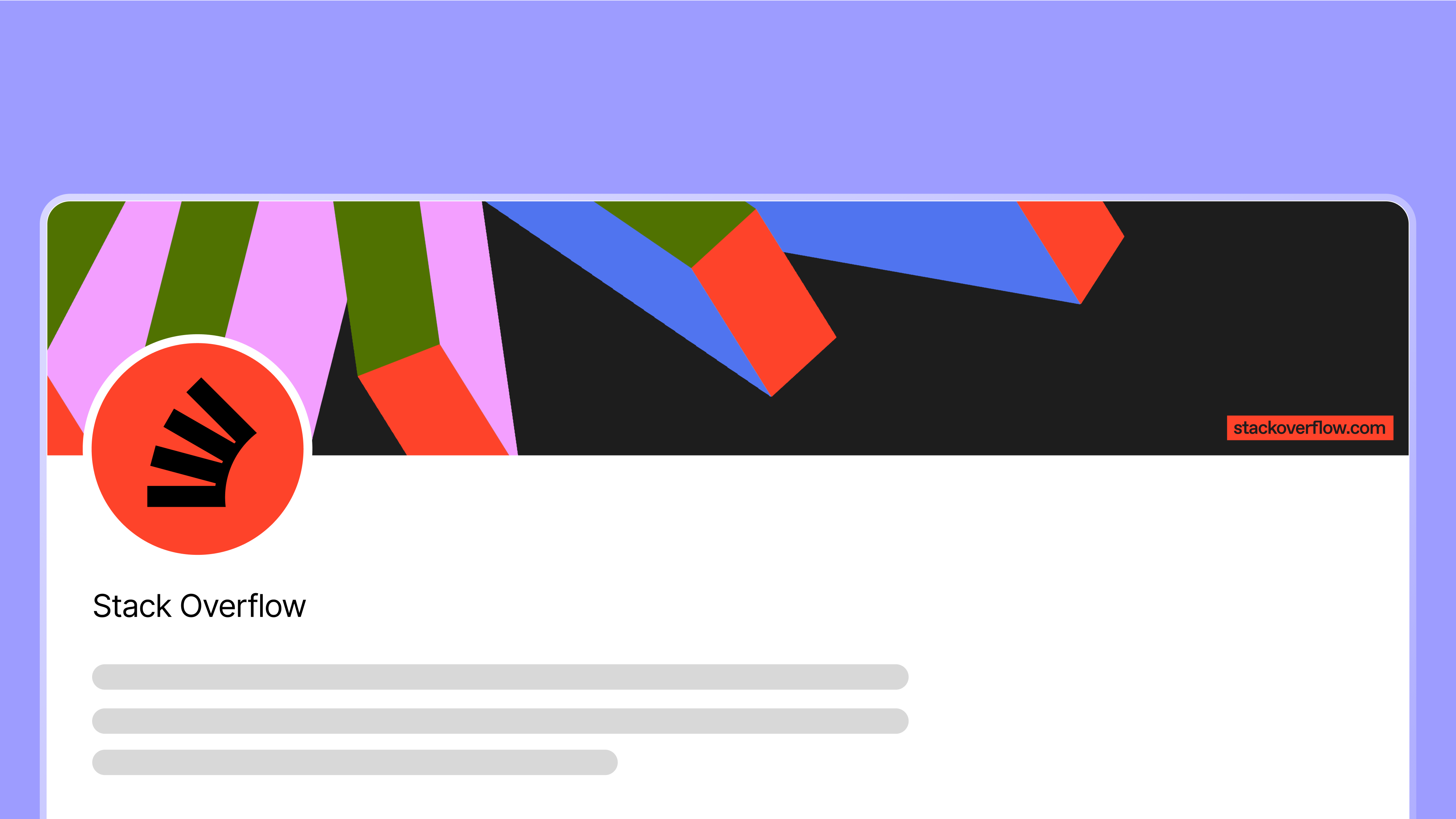
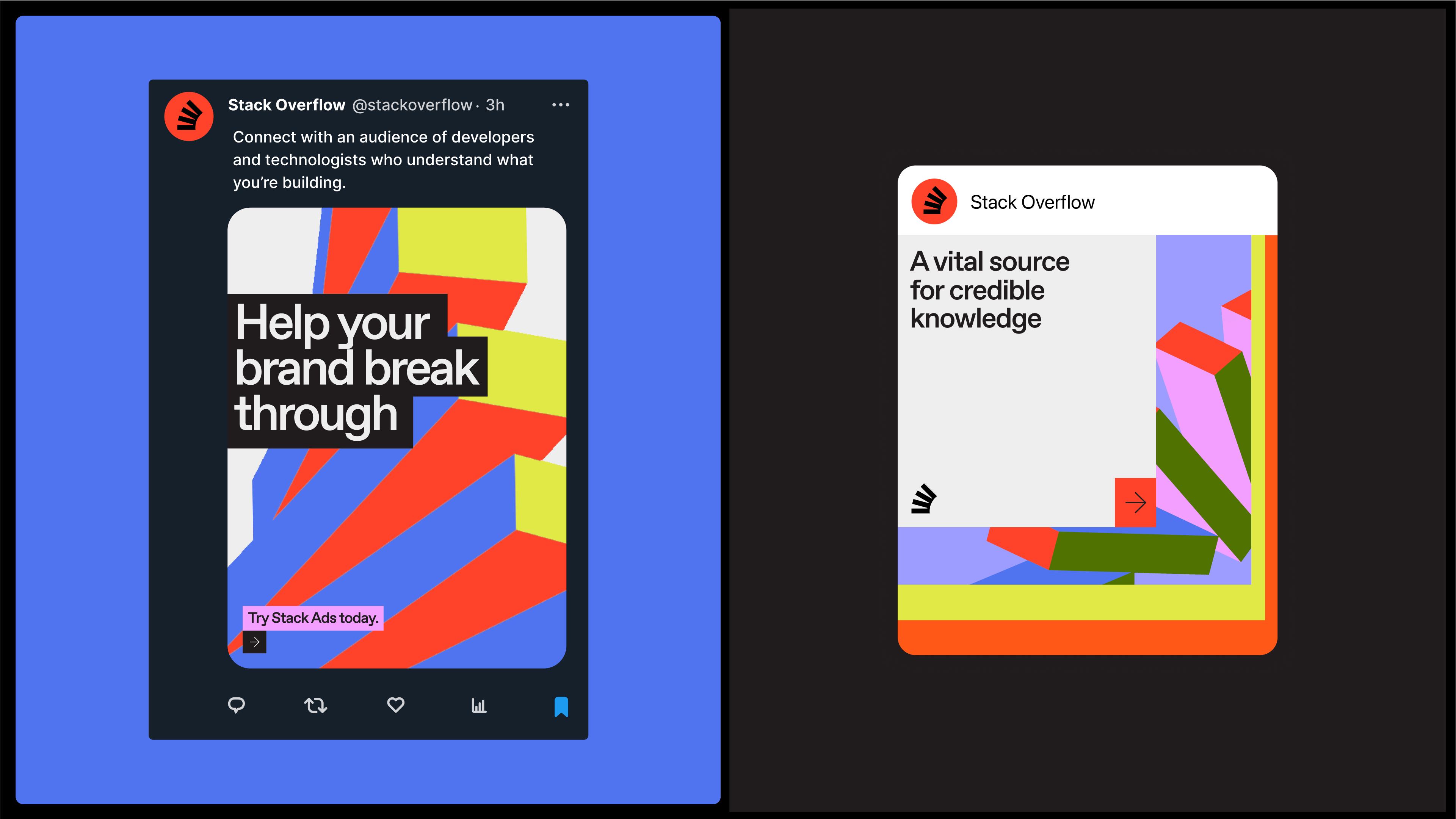
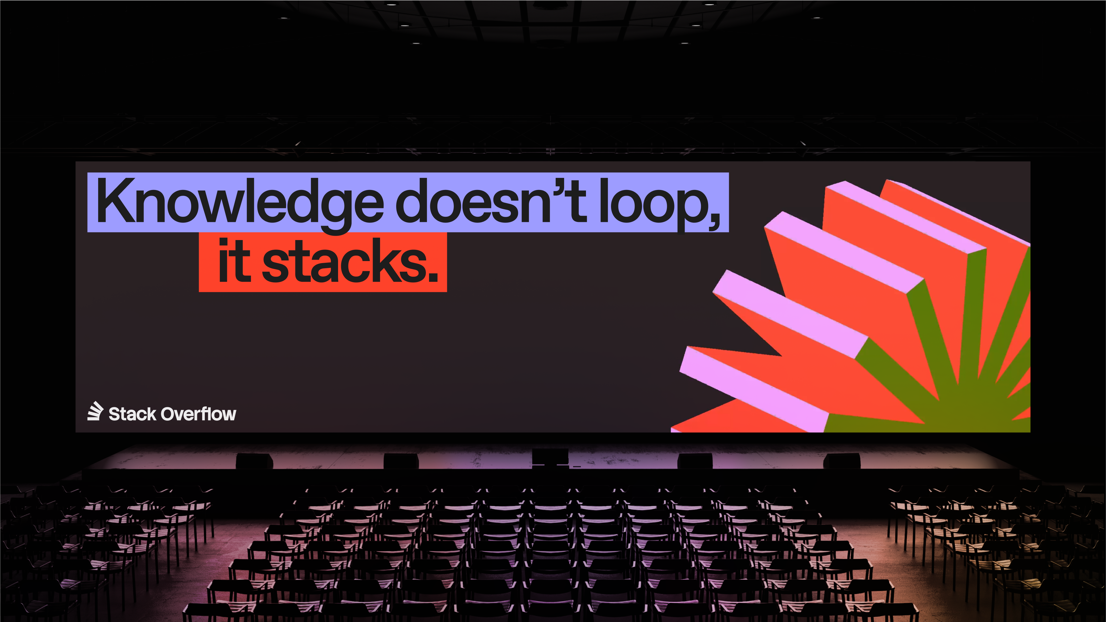
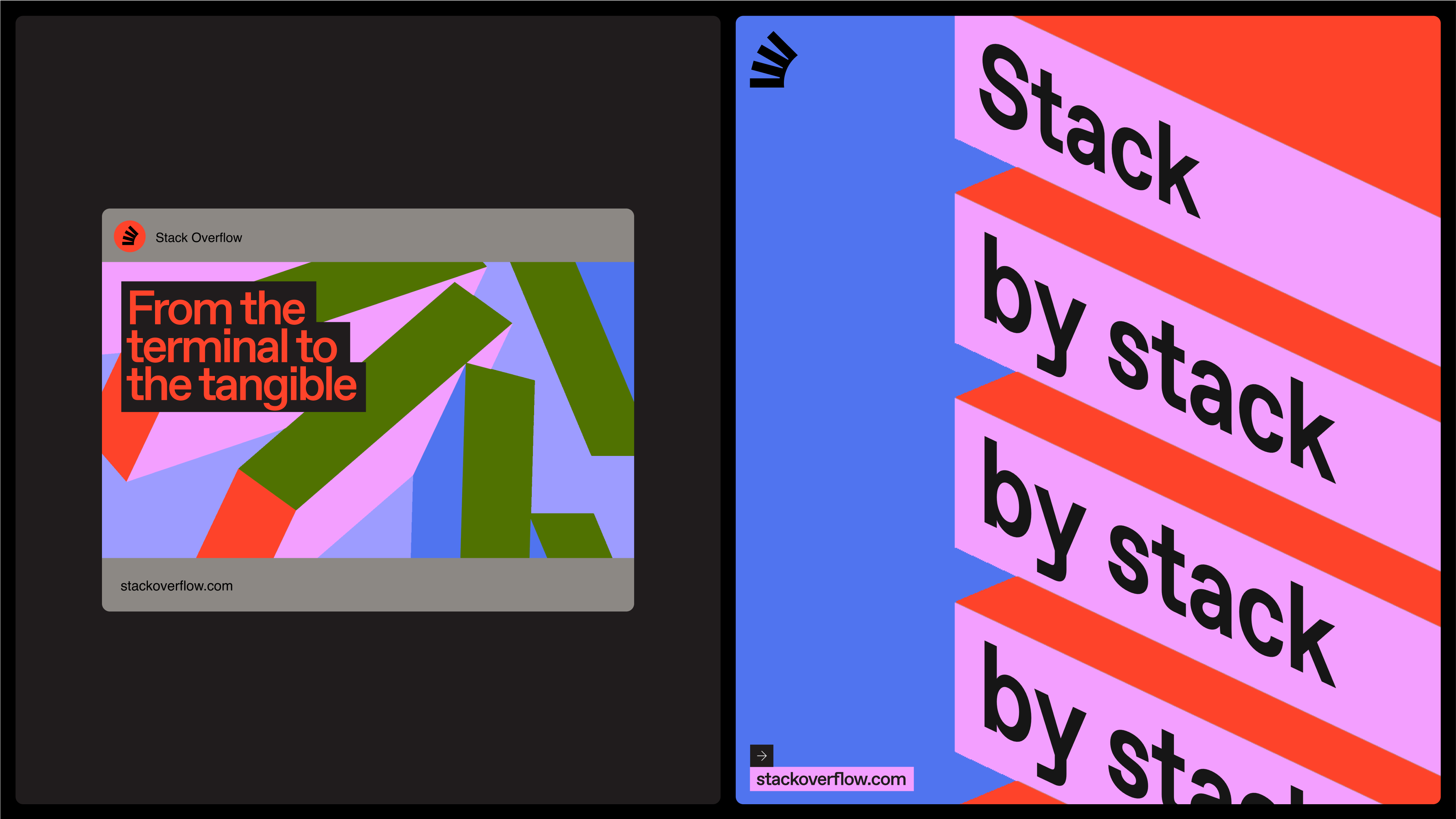
In this option, we wanted to build on the existing equity and recognition of our current logo, but simplify and modernize it to reflect the company we are evolving into.
Brand system
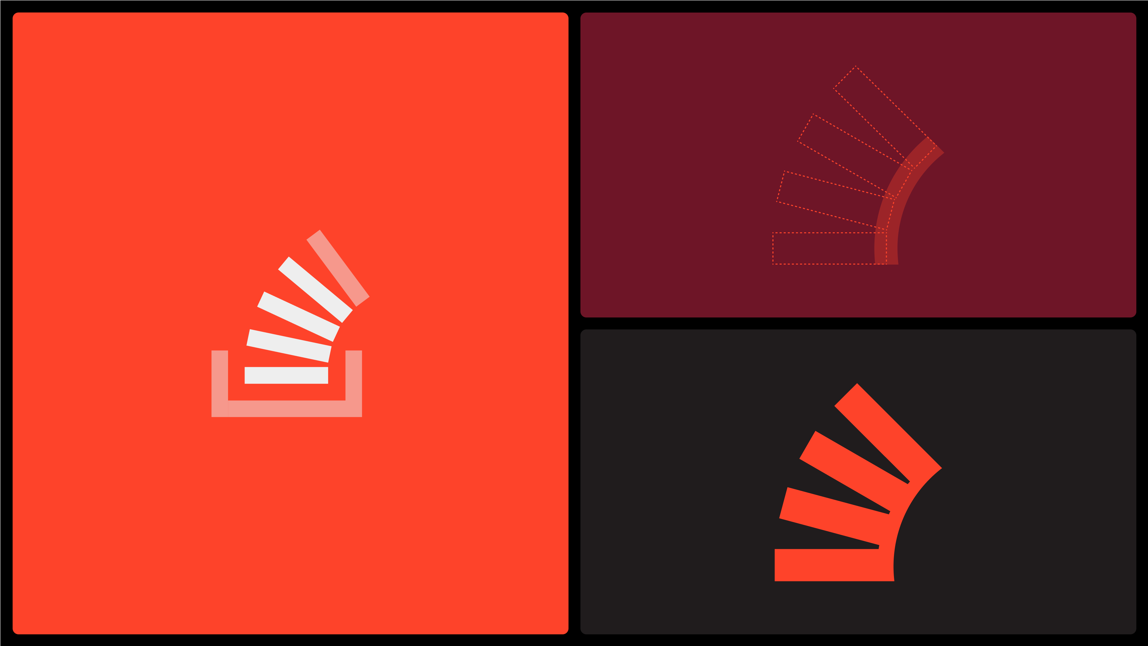
An evolution of our existing logo. The once disparate stacks now connect to form a spine or backbone — representing our ambition to reprise our role as a vital source of knowledge for technologists.
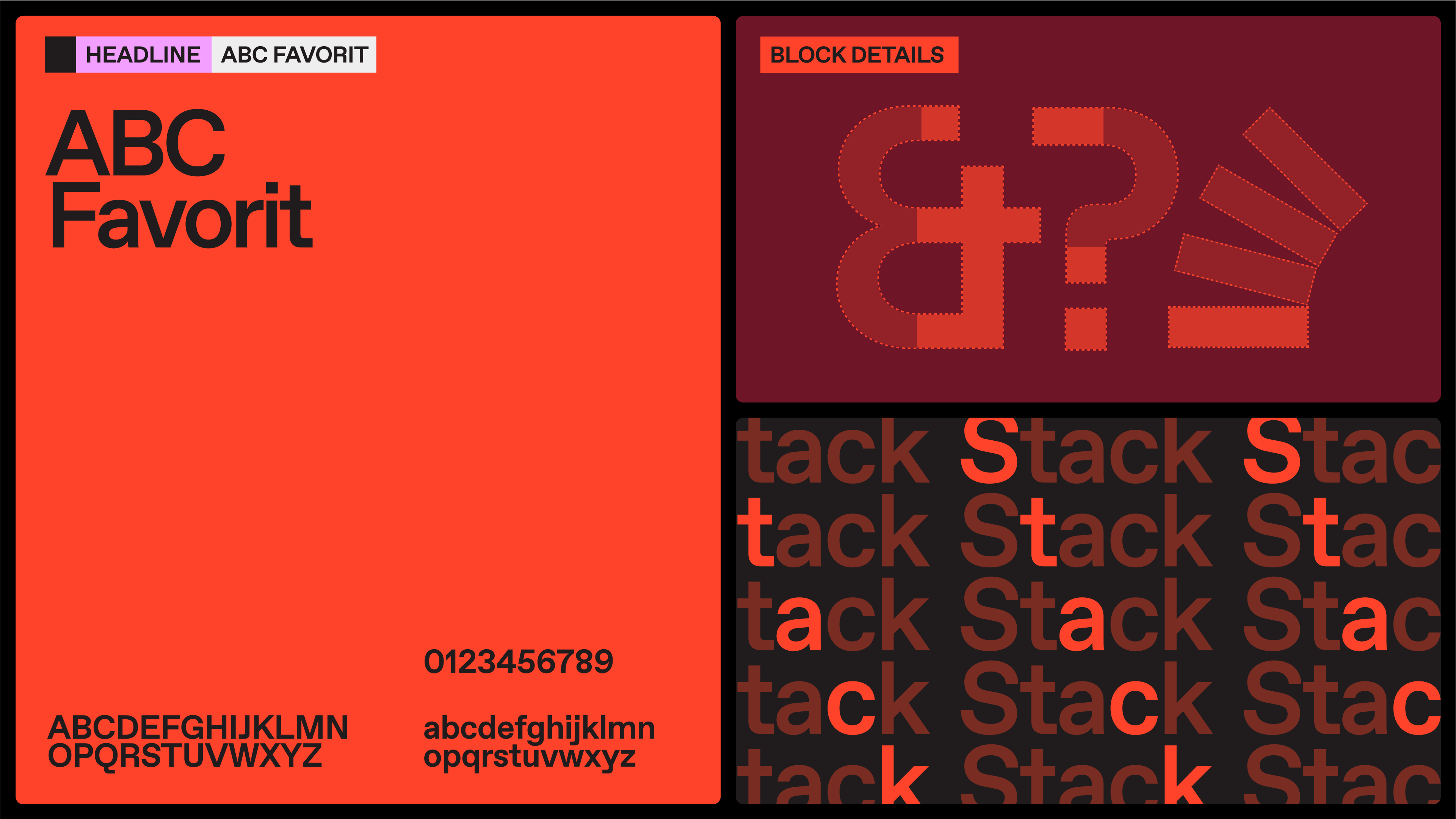
Our typeface features squared-off details that subtly echo the stacking mechanic at the heart of this route.
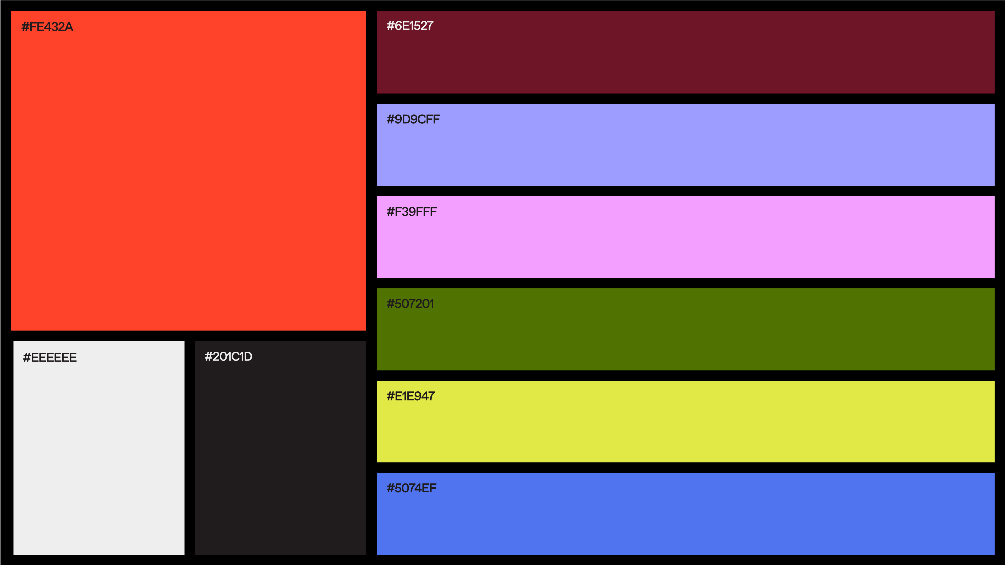
Our palette builds on our signature Stack Overflow Orange with a new range of vibrant secondary colors — all inspired by the pops and hues seen in different coding environments.
Our stacking mechanic represents continuous learning and growth. Our stacks also animate to express different states of development and modes of thought.
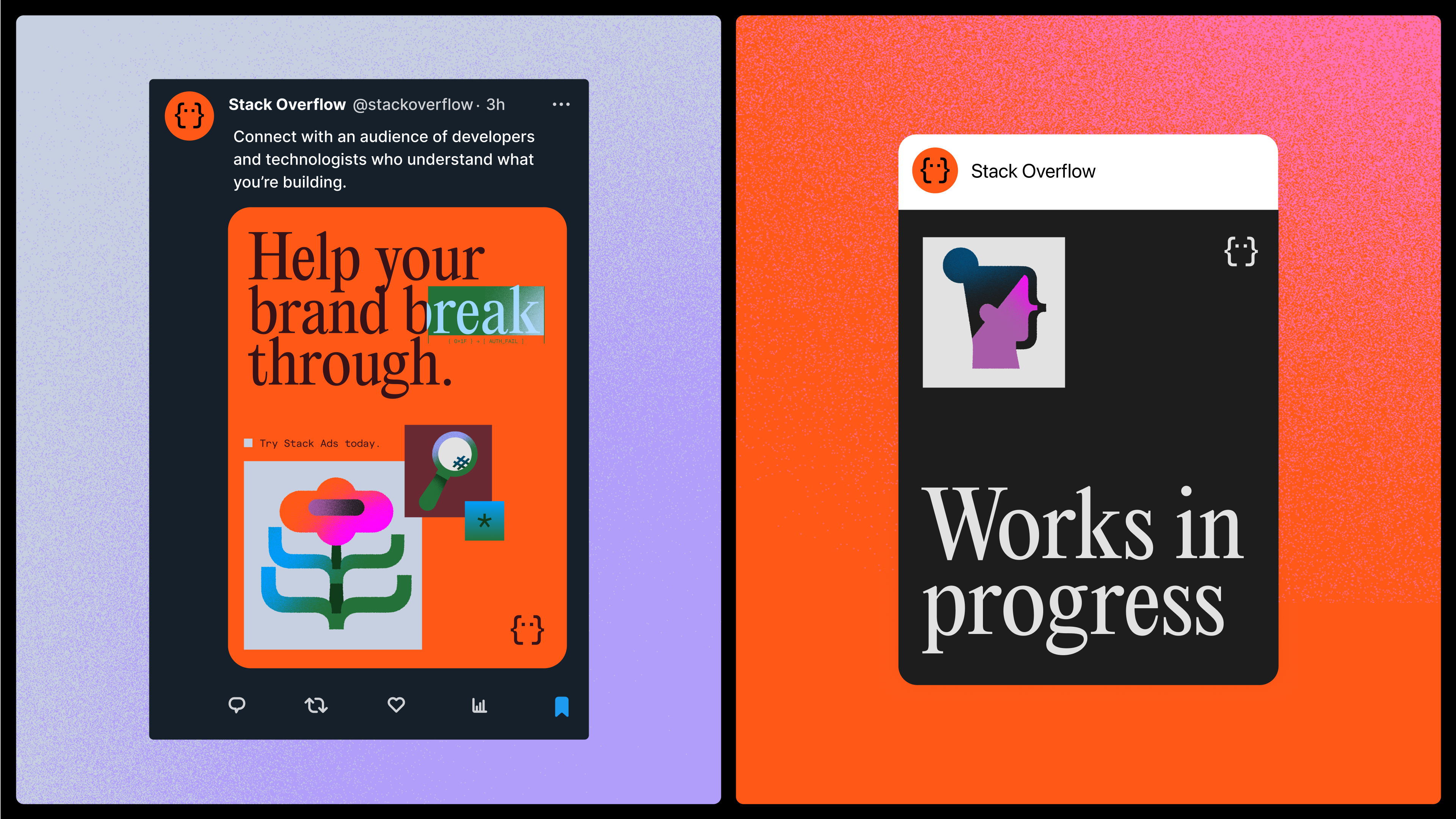
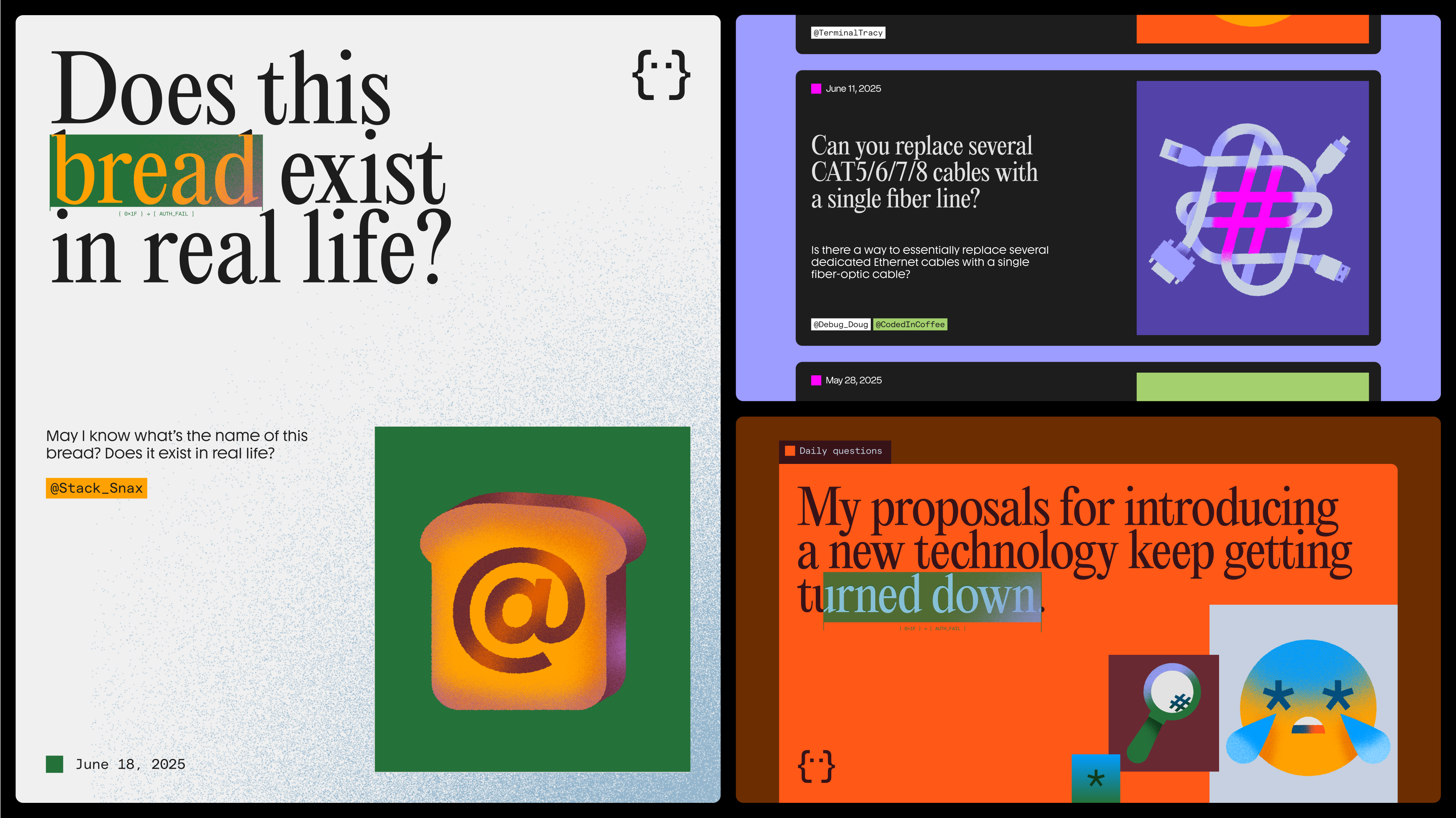
Applications
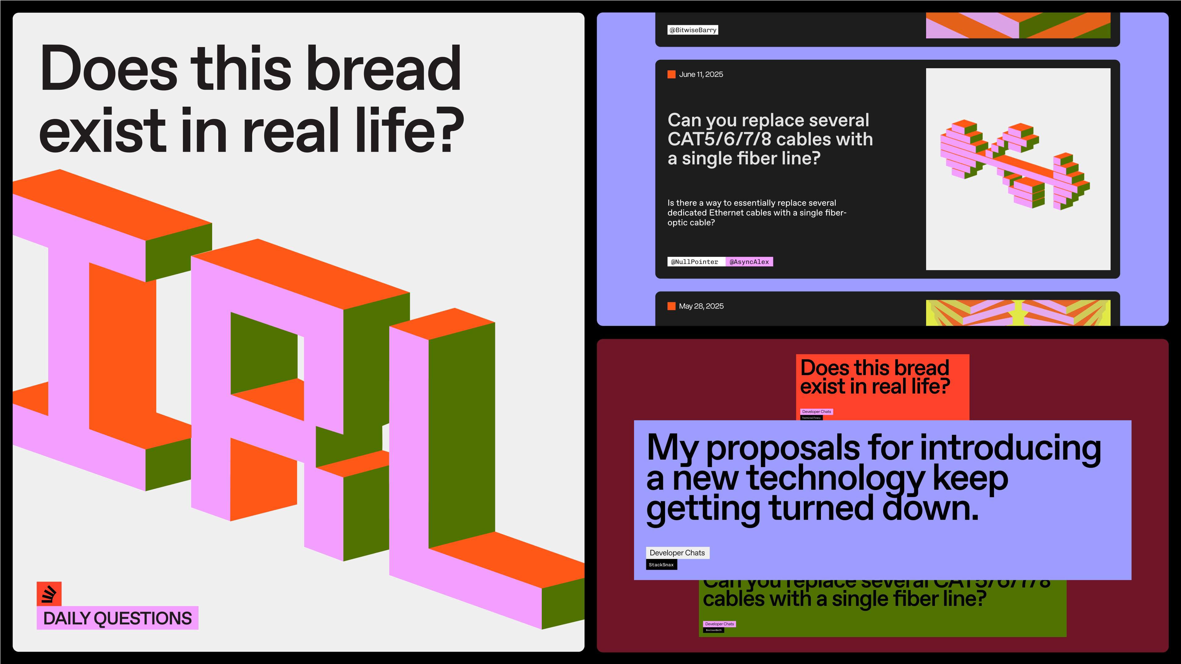
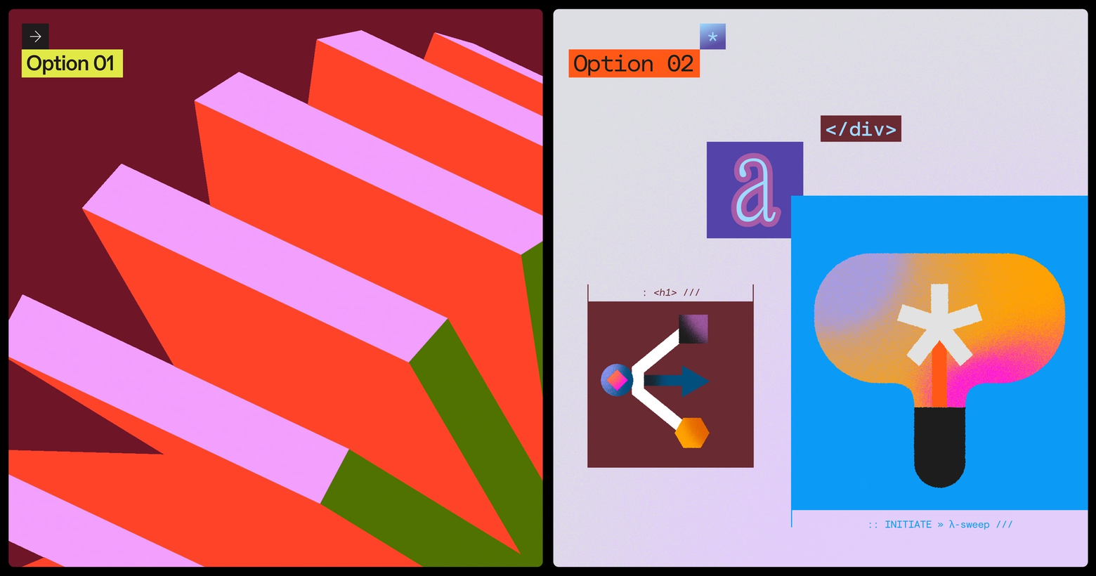
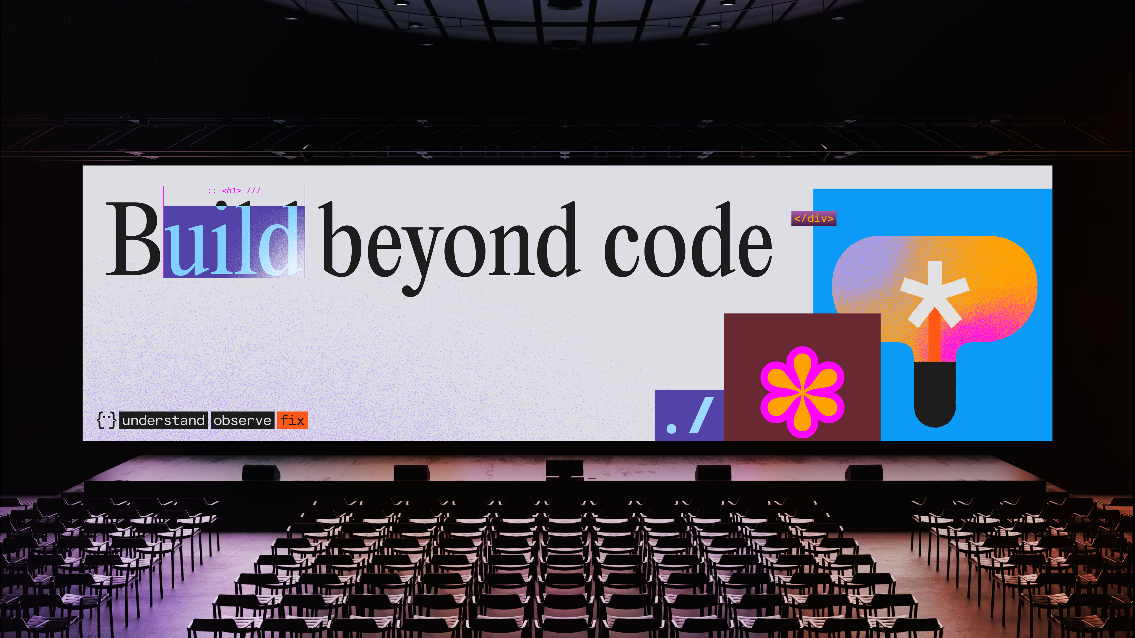
Option 2
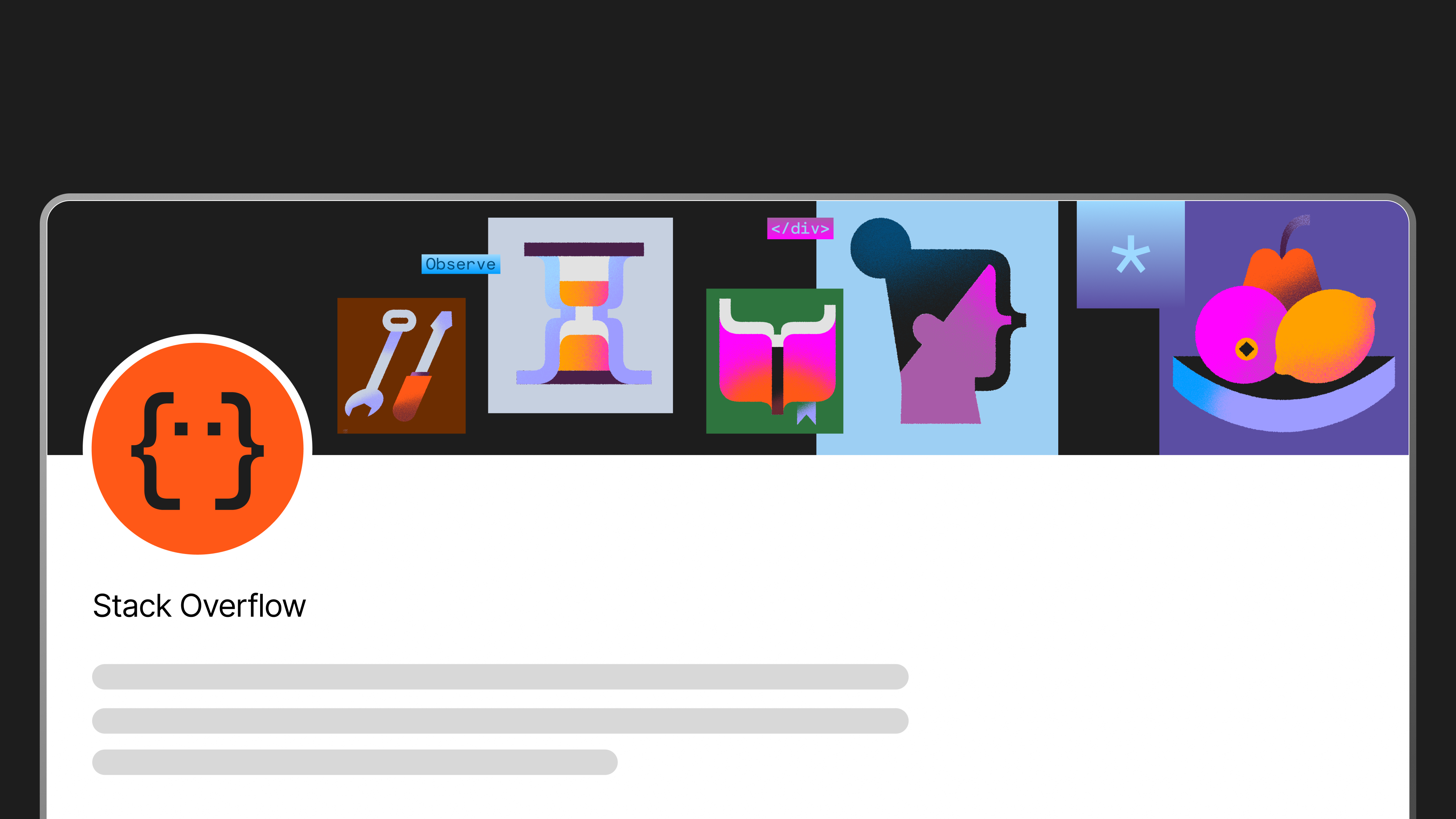
Here we are pushing ourselves, introducing a face which can bring in the human touch. We can see this being adaptable for more serious or playful contexts as needed and recognizable on its own, while not being a full mascot (yet).
Brand system
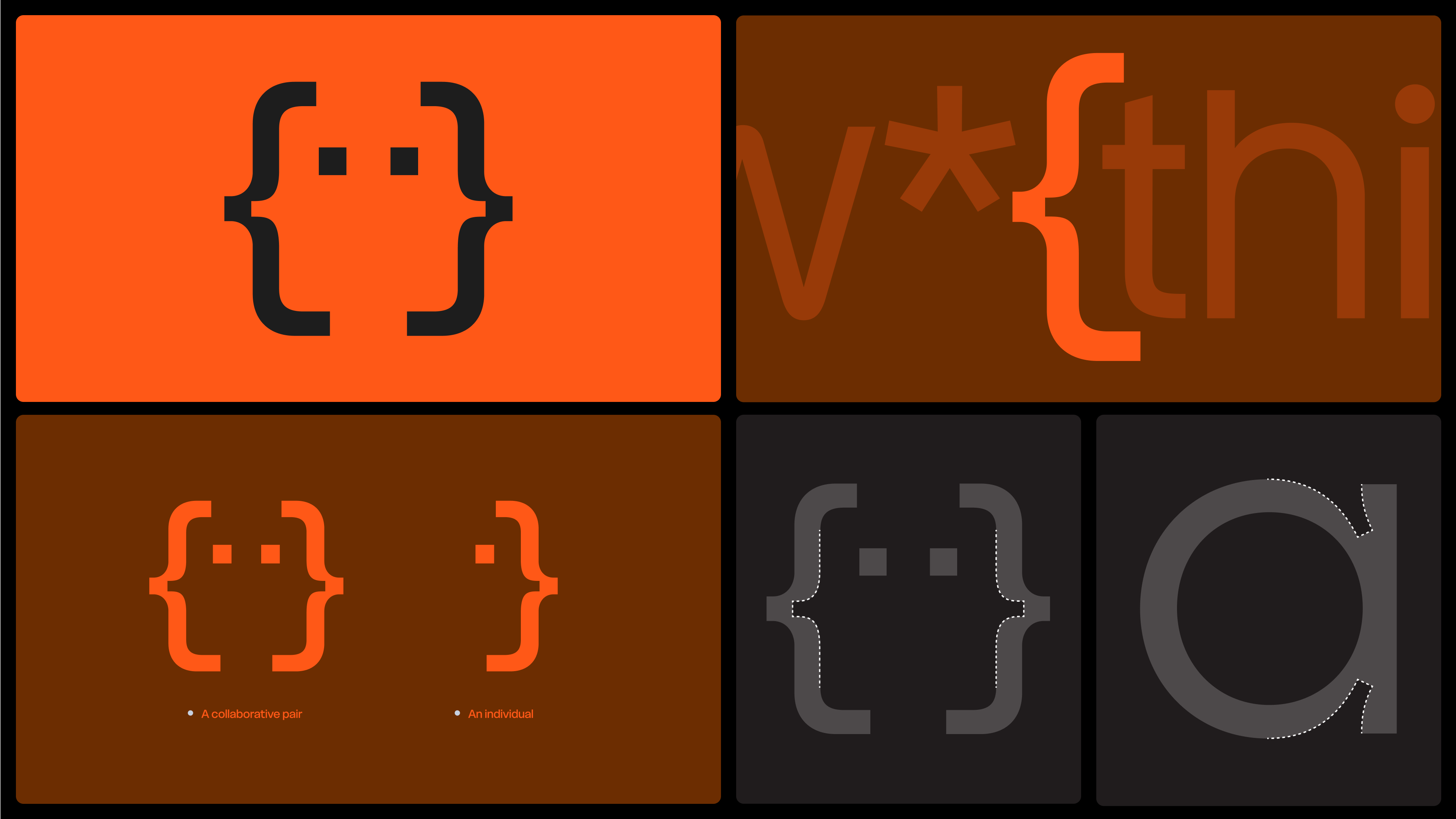
Our logo is an expressive face built from symbols commonly found in coding languages. It’s a versatile element that’s able to take on different feelings and moods. It can represent an individual, a collaborative pair, or a ‘hive mind’ coming together to solve problems and share knowledge.
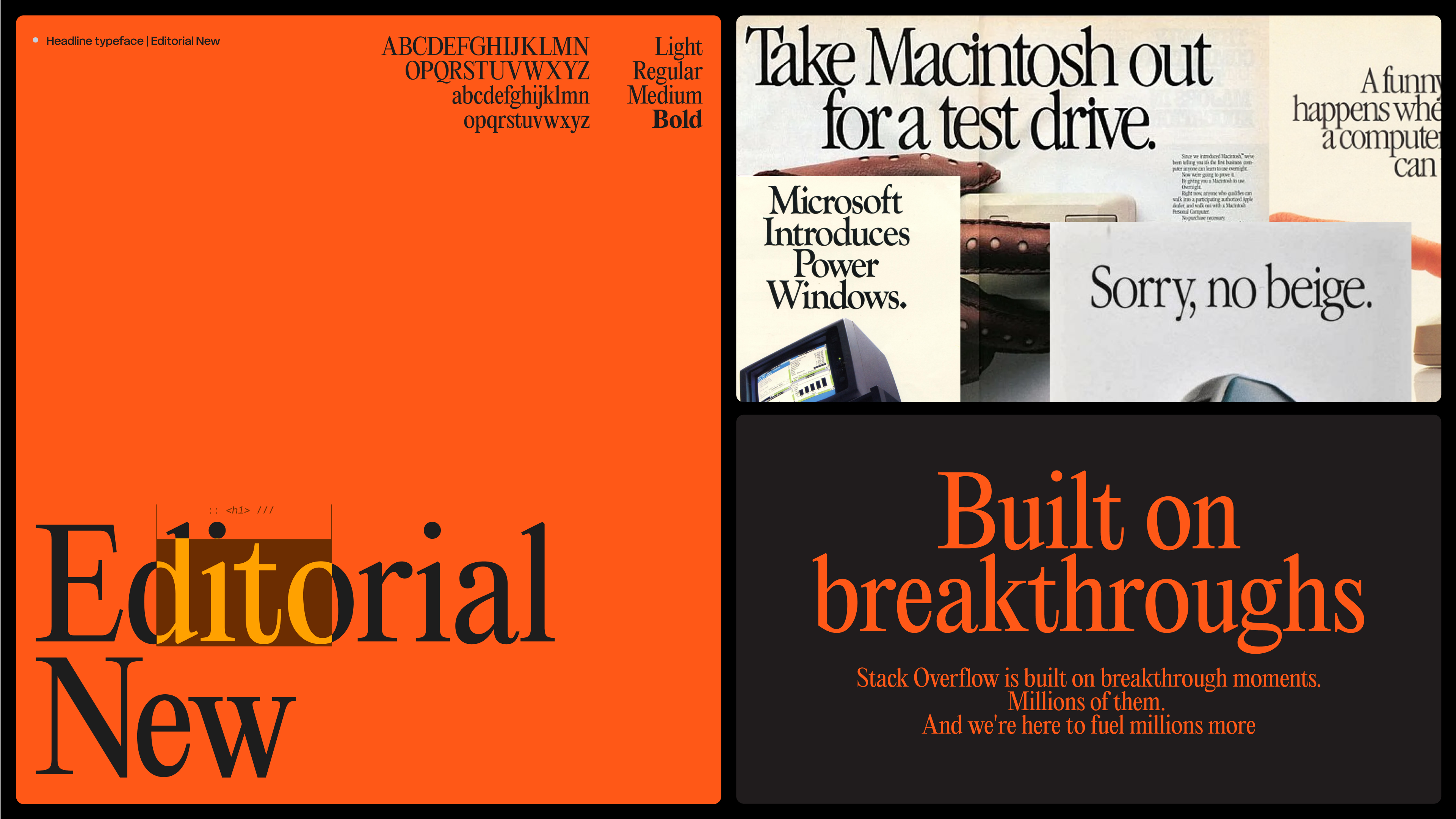
Our classic serif typeface taps into the charm of, and a nostalgia for, early PC ads. It brings to mind an era when humanity and technology started to collide in new and exciting ways.
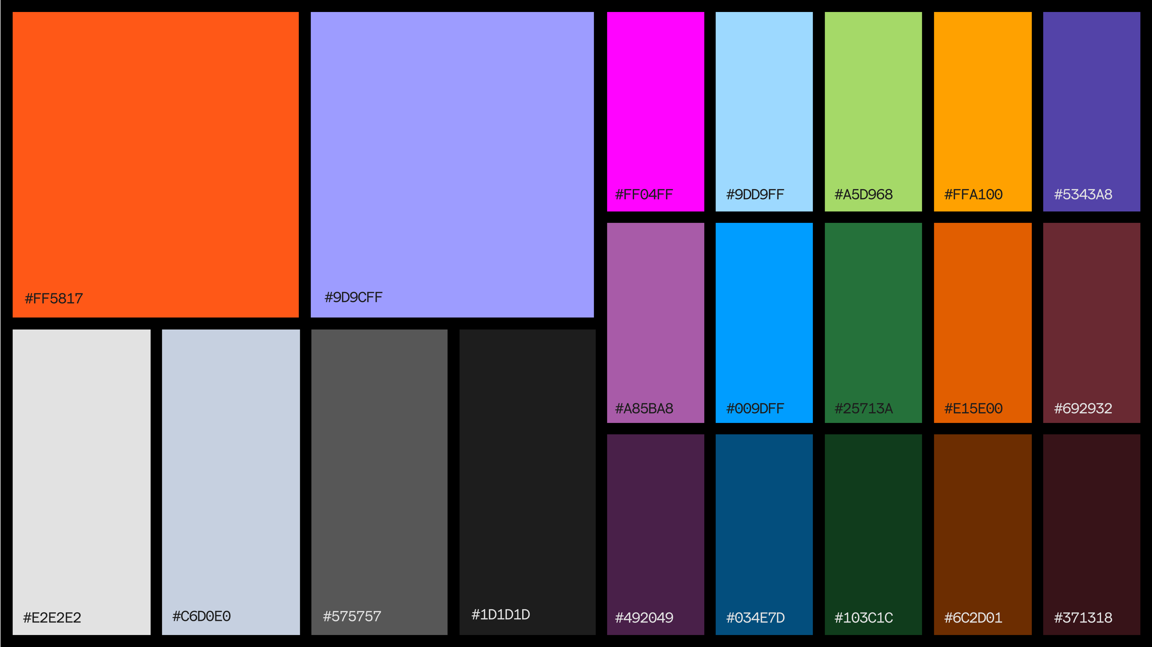
Our palette builds on our signature Stack Overflow Orange and Lilac with a new range of vibrant secondary colors — all inspired by the pops and hues seen in different coding environments.
Our illustration language is rooted in the same logic as our logo. Commonly used coding symbols serve as the foundation for each composition, while a subtle noise and texture deliver a human touch.
Applications
Thank you for being a part of this process! If you’d like to share more input, please leave a comment on this post.