A few months ago I joined as a developer on the Careers 2.0 team - this is my story of bringing Careers 2.0's new Apply button to fruition. Or, what happens when an Enterprise boy meets a Consumer Product Development company and gets exposed to how things are done on the other side.
One of my first projects after joining Stack Exchange was giving the job application process an improved, stream-lined experience. This experience gave me a different perspective on Enterprise and Consumer product development, which I’d like to share.
Probably the most eloquent explanation of the differences between Consumer and Enterprise product development comes from one of my most favourite people in tech, the late Steve Jobs:
We're about making better products, and what I love about the consumer market that I always hated about the enterprise market, is that we come up with a product, we try to tell everybody about it, and every person votes for themselves. They go, "Yes" or "No"!
And if enough of them say "yes" we get to come to work tomorrow! ...
Enterprise Development: hidden requirements and resource constraints
In Enterprise IT projects, you're typically working towards very specific requirements for very few clients, and in most cases those requirements aren’t in the project spec you were given! The stakeholders know their business domain but aren't very knowledgeable of IT systems, and so the written requirements often don't match what the client originally envisioned.
This results in a lot of back-and-forth (which experience should tell you to always write down) on every iteration to ensure what is being delivered is in tune with what they expect. And each feature is under pressure from resource constraints, re-visited on each iteration; when projects are overrun features get cut, quality gets lost and shortcuts get taken. This is not an ideal environment to produce high quality solutions or high levels of customer satisfaction.
Consumer Product Development: putting the user first. All of them...
Working on a consumer product is an evolving process where you're continually looking to improve the end-user experience in a highly competitive environment. Your guiding light is the business as a whole, and everything is done with an eye toward increasing participation, either by acquiring new customers or increasing existing customer engagement.
There is no single customer whose wishes become requirements; each new feature affects our entire user base. A feature is worthwhile if most customers will find it of value and it avoids complicating the user interface for those who don't intend to use it. With every product feature you're putting your customers front-and-center: what do you want to help them do?
The only real, measurable way of determining what customers find valuable is to record user analytics. For me, this was one of the key differences with consumer product development: you must continually monitor the behaviour of your user-base to ensure each change has a positive effect.
Designing Careers 2.0 for our users
For the Job Application feature, our requirements are pretty straight forward: we want to make it as easy as possible for potential candidates to apply for a job. However, we also want each application to be tailored to the employer, so we require a cover letter on each application. The problem with requiring more fields is that it adds more friction to the process (complicating the UI) which has the potential to reduce new and repeat applications. For this reason every field or screen that is added needs to be justified: if making one set of users happy drives away another, we step back and look for alternatives.
Most of our major features start with a mock-up and a spec, handed to us by our designer and containing the major elements and page-flow of each screen. Mock-ups are a great tool to accompany a developer spec, since both parties can get a birds-eye visualization of what's going on and what needs to happen before discussing the details of each feature. A picture tells a thousand words: there have been countless times where implicit functionality was present on the mock-ups but missing from the detailed spec.
To give you an idea of what it looks like, our initial mockups for the apply feature looked like this:
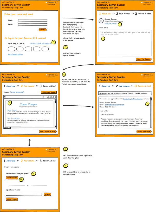
By the way: those mock-ups were produced using Balsamiq, which lets us quickly throw together clean (but obviously fake) screens. We like Balsamic Mockups so much, we partnered with them to make a light-weight version of the tool available on our UX site - check it out!
Our "Jaws" moment
In the blockbuster movie hit "Jaws", Stephen Spielberg attributed much of the success of the film to the fact that the mechanical sharks were constantly broken down, forcing him to rewrite much of the script without the shark, instead focusing more on the human element:
"The shark not working was a godsend. It made me become more like Alfred Hitchcock than like Ray Harryhausen."
This folk-wisdom hit home with our "online preview" feature displayed on the original mock-ups above. Initially, we wanted to show the candidate a real-time preview of the CV immediately after they uploaded it. The problems with this feature only surfaced after we implemented it.
The first was a legal issue only discovered after I implementing a Google Docs viewer solution - straightforward enough apart from the viewer needing direct Internet access to the attachment (which I enabled via a temporary generated URL). Unfortunately it was only after reviewing Google's Terms of Service that we found the bad news, in Google's over-reaching legalese:
"By submitting, posting or displaying the content you give Google a perpetual, irrevocable, worldwide, royalty-free, and non-exclusive license to reproduce, adapt, modify, translate, publish, publicly perform, publicly display and distribute any Content which you submit, post or display on or through, the Services."
We didn't want to have any of the uploaded CVs made public, so the Terms of Service meant we needed to look elsewhere.
I then tried the Zoho viewer but unfortunately it didn't support the small resolution of our popup window.
Finally I implemented the feature with Scribd which had everything we wanted: a beautiful viewer, the ability to upload private documents... Everything except real-time speed. I tried everything to make it faster, even working with Scribd's co-founder Jared Friedman directly. But despite all our efforts we couldn't consistently get the preview time below 7-10 seconds - Scribd is built for producing high-quality results, but not in real-time.
Performance is a feature
At Stack Exchange, we have a strong emphasis on performance which resonates right through the company from our Co Founder, in the various high-performance libraries StackOverflow has open-sourced, to my own recommendations on the subject.
Performance is often a neglected concern in Enterprise development - especially when it doesn't make it as a line item in the requirements doc. This has a direct impact on the overall usability of your system, but because optimization happens late in the project life-cycle it is one of the first things cut when a looming deadline approaches.
If you're operating in an environment where your business model is hinged on maintaining a happy customer base, then it pays to go the extra mile to try and reduce response times. In general, neither we nor the user want us to keep them waiting and the more popular a particular feature is, the more we focus on performance. Here are some examples of the things I've done to achieve better performance:
- Pre-loading content - So the popup page loads instantly, and user-input fields are pre-populated.
- AJAX lookups / Client side-validation - Provides instant feedback, and avoids round-trips for bad user-input
- AJAX file uploads - To start uploading at the earliest possible moment.
- Hiding / showing sections - To start with an easy-to-use interface for common tasks, while avoiding round-trips to load alternate content for optional features.
- Loading animations - To reduce the perceived response time for >1s tasks (e.g. creating a PDF from an online profile)
- Asynchronous / Queued processing - Defer lengthy post-application processing so we can return immediately after we've accepted the users application.
- Redis / Memory - Making use of Redis and avoiding disk when possible - for caching, users sessions and to power our Redis MQ
Having a user twiddling thumbs while staring at a loading sprite is a UX sin. So at the 11th hour, we decided to yank real-time previews and instead offer the candidate a download link with which they can preview the results in their own document reader. This wasn't totally wasted effort however - we'd streamlined the rest of the process as much as possible to allow for the time needed to preview, and with it gone, the process was blazing fast.
Measuring and Analytics
User Analytics allows you to measure the performance of your feature - at Stack Exchange we use a combination of KissMetrics, Google Analytics and our own custom analytics and reporting tools to fulfill this purpose. It allows us to get valuable insights on how well our features are working and which ones see the most "drop-offs".
An example of the importance of this feedback was when we added the ability for anonymous users to apply without using their online profile. In the original version this feature didn't seem that useful to us. It turns out we were wrong. After deploying the new feature (unannounced), we saw an overwhelming increase in job applications, practically overnight:
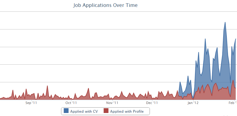
We use the high-level overview graph above to track our daily applications and the uphill climb towards the end is just after we introduced anonymous user applications by highlighting its availability in the Employers Post a new Job form. We've basically doubled the number of profile applications we received (seen in Red) and the mountainous blue on top are the candidates opting to apply with their own CV - by far the overwhelming majority. This tells us we have to accept (no matter how many features we add to our Career 2.0 profiles) that candidates often prefer to submit their own CVs and that we should optimize this use-case in future.
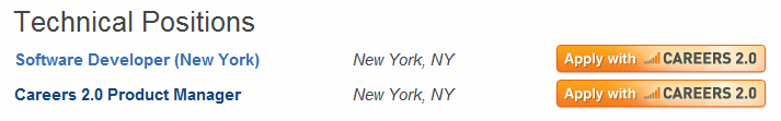
Come join us!
Working on this feature from its inception has taught me a lot about the different approaches taken for product development and after spending most of my career working in the Enterprise - it's a refreshing change.
If you're interested in this Career 2.0 lifestyle choice, come join us! We're currently on the lookout for talented devs to join the team, and applying for it gives you a chance to test-drive the new Apply feature!