The top bar of a Stack Exchange site has always been a bit of an odd place. It somehow combines user info, navigation, search, and a one-size-fits-all popup that includes hot network questions, a list of 100+ Stack Exchange sites, personal inbox messages, and other system notifications (lovingly referred to as The StackExchange™ MultiCollider SuperDropdown™). It was, in retrospect, overdue for a face-lift which is why we’re excited to roll out a new top bar this week.

A Bigger, Blacker Bar
The first thing you’ll notice is that **it’s really black***. When we originally conceived of the top bar with the Stack Exchange logo (way back in Ye Olde 2010), one of the main goals was to mark each site as a Gen-u-wine™ Stack Exchange site. Since then, however, we’ve created unique designs for over 40 different sites, and the Stack Exchange logo has started to get a bit... lost.

So, in the redesigned top bar, we wanted to make sure that it would look the same across all sites, and make it obvious that you’re on a Stack Exchange site. It turns out that when you try to pick a color to match 40 different site designs, you quickly realize you only have one real choice: black.
- Jin points out that technically it's not quite black: it’s #212121.
New Achievements popup
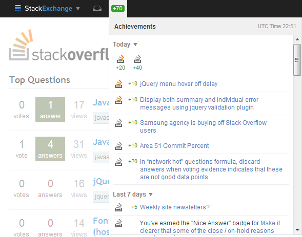
The biggest addition to the top bar is the brand new Achievements popup. Previously, if you wanted to know your reputation on every site you were active on, you had to visit every one of those sites. This led to some of us, well, compulsively cycling through sites and refreshing to see if we'd gained any rep. Now, there's one convenient place to check from whatever site you happen to be on:

This new popup includes:
- A reputation counter at the top which sums all reputation you’ve gained on all sites since the last time you checked, updated in real-time
- Entries for reputation, badge, and privilege notifications, grouped by post and time
- A summary of reputation gained today
- Aggregation from every site in the network in one place
This should make it much easier to keep track of your reputation and badges across all the sites that you are active on.
New Sites List (aka “The Site Switcher”)
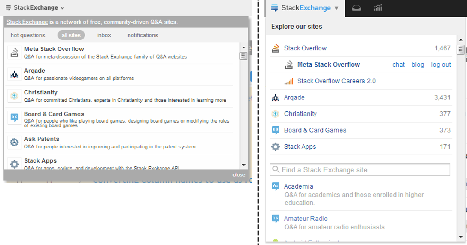
The old list of sites has gotten a new layout and is now its own distinct popup. The idea is to make it easy to switch between sites if you participate on several, or to find a new site that you don’t participate on regularly:

In the new “Site Switcher” you’ll find:
- The current site at the top, with meta, chat, and blog links for the current site (and Stack Overflow Careers when on Stack Overflow)
- A list of your top 5 sites, ordered by reputation*, with your reputation for each
- A searchable list of all sites, with a short description of each
- We’ll probably let you customize this list in the near future, so you can include sites you like to watch but don’t have much reputation on.
New Global Inbox
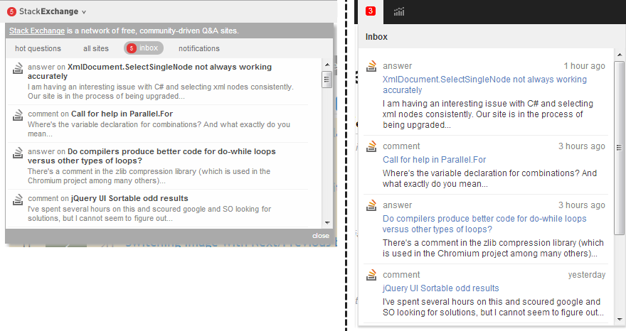
The Global Inbox has been split out into its own popup as well, instead of a subsection of the Stack Exchange popup:

We’ve gotten rid of the confusing distinction between “inbox” and “notifications”. All messages will now appear in the inbox, except for reputation and badge events which are in the new Achievements popup. Inbox items also now have a new layout, which should be easier to scan.
Feedback Welcome
There are a few smaller changes to mention as well:
- Your name has been replaced with your picture, to make it easier to recognize at a glance that you’re signed in as you (and because some longer names just don’t fit).
- The help link is now a dropdown with links to the tour and the help center, with a short explanation of what each is.
- Click areas for everything are now the full-size of the row, to make them easier to click or tap on mobile.
- The hot network questions have moved to the sidebar on the homepage, since they aren’t really navigation or notifications.
The new top bar will be rolling out network-wide, including Area 51 and stackexchange.com, in the next few weeks. As always, meta is the place to go for feedback, suggestions, and bug reports.
