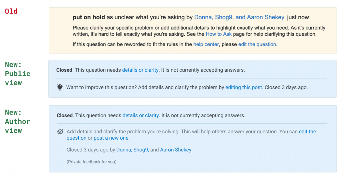
We know that giving our community mechanisms for sharing and receiving feedback is important. In her recent blog post, Meg Risdal described some of the ways that our Public Q&A product team is working to improve the way our system helps users share and receive feedback. I’m pleased to announce that starting today we are rolling out our new post notice system on Stack Overflow and across the entire Stack Exchange network.

As a reminder, post notices are the informational banners that sometimes appear on closed, duplicate, and other questions.
What’s new
The change affects all post notices, including moderator notices, post locks, migration notices, bounty notices, and every single type of close notice. The changes apply today on Stack Overflow, the Stack Exchange Network, and the Basic/Business tiers of Stack Overflow for Teams (Enterprise Teams will see the change in an upcoming release).
We have some guiding principles that we’re applying as we improve any feedback loops in the Q&A system, including post notices, going forward. Wherever possible we will work to provide better, actionable guidance for all users that helps everyone use the platform successfully while reducing room for public shaming.
Better, actionable guidance for all users
The most obvious change is the look and feel in how post notices are presented. The post notices are now more consistent in design and placement. All notices are now above the question text (instead of having notices in different positions relative to the question or answer).
Next, we decided to tailor the actual information that the post notice provides depending on what type of user is viewing the notices:
- Public
- Author
- Moderator or user with sufficient reputation-based privileges (AKA “privileged users”)
Most people seeing a post notice don’t need to do anything except take note of it. These are public viewers that are most likely just looking for an answer to a question that they googled.
Post authors, privileged users and moderators are shown an expanded notice, which can show additional information that they need to know (e.g., why the question was closed) along with suggested actions that they may want to take (e.g., edit the question). And in some cases, post authors looking at their posts with open close/duplicate flags are given additional options to take proactive action on their posts before they are closed.
The consistent placement plus tailored guidance provides a more predictable user experience. We are deliberately not showing more information to users when it is not actionable.
Reducing room for public shaming
Previously, post notices publicly listed the names of users who voted to close a question. We’ve heard in feedback from users that receiving this feedback in public is not helpful and can contribute to negative experiences on the site. We’ve also heard from users who vote to close questions that they don’t necessarily like their names being put on display, either. Plus, we’re confident not everyone viewing a question needs to see this information. So, we’re now only displaying these names to authors and privileged users who sometimes still find this information useful.
What’s next
This new set of features and improvements is the first of a series of related projects aimed at improving the user experience when a question gets closed. Here are some of the kinds of things you can look forward to:
- Better guidance for improving closed questions (e.g., in the question editor and via emails) to empower question askers/editors and lower the burden on users who review content quality issues
- Mechanisms for “hiding” closed questions so they can be worked on out-of-view
- Easier paths towards re-opening improved questions
We will also continue to iterate on post notices. With a holistic system now in place, this is easier for us to do.
With all of these upcoming changes, our goal is to better facilitate feedback and content curation for all people who code, whether they are new to programming and Stack Overflow, are seasoned moderators and technology experts, or fit anywhere in between.
We’ll be introducing these changes incrementally, and we’ll seek your feedback all along the way. If you have thoughts or feedback for us, let us know! We couldn’t make these changes without you. Join our research list (you’ll need a Stack Overflow account) for opportunities to participate in UX research.
Thank you to everyone who contributed to this project: Donna Choi (design), Shog9 and Catija (Community Management), and Meg Risdal (PM). We’d also like to thank everyone who provided generous and thoughtful feedback during our testing period. Many suggestions were incorporated and others will feed into our upcoming plans to make improvements to the question close workflows.
