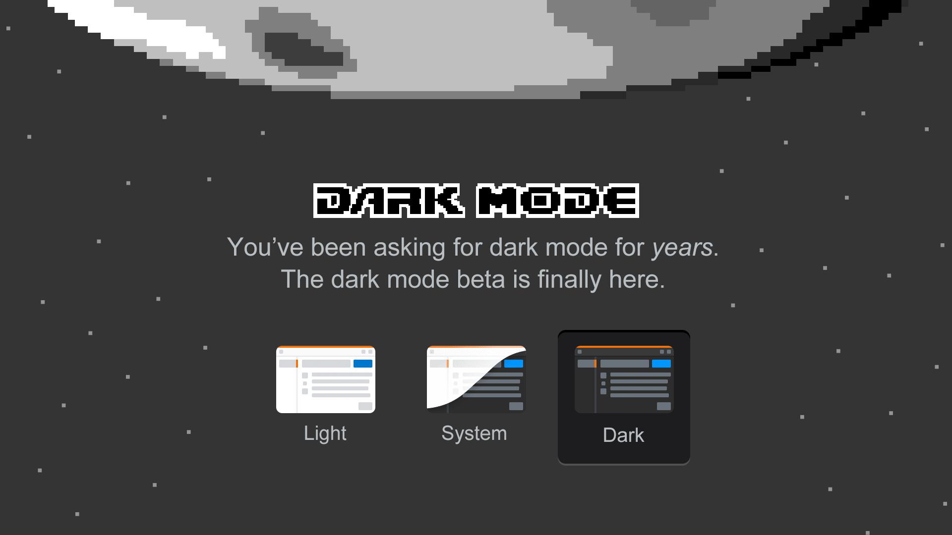
On March 30, 2020, we enabled folks to opt into a beta dark mode on Stack Overflow. Let’s talk about the work that went into it.
I’m Aaron Shekey, Stack Overflow’s principal product designer on design systems. I help design all the interface components that get assembled into new features.
First, a bit of irony. I don’t actually prefer dark user interfaces.
I often find the usable contrast to be way too low. It’s hard to use the full spectrum of colors to express your interface. It’s even harder to introduce depth with shadows and other visual cues. Light text on dark backgrounds is fatiguing to my eyes. Things that are hard to manage on light screens like simultaneous contrast is even harder to manage against dark backgrounds.
But here I am, the guy who finally shipped dark mode on Stack Overflow.
The work I’m about to talk about was never about dark mode specifically, even though countless users asked for it. By solving everything along the way to dark mode, Stack Overflow would modernize its front-end codebase, enable accessibility-conscious theming, and push for adoption of our design system. We could give our users dark mode and offer future accessibility modes for free?
Let’s do it!
Color exploration
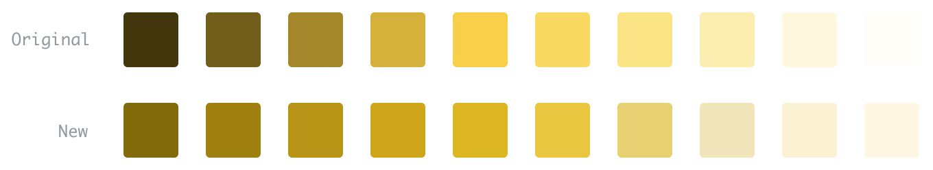
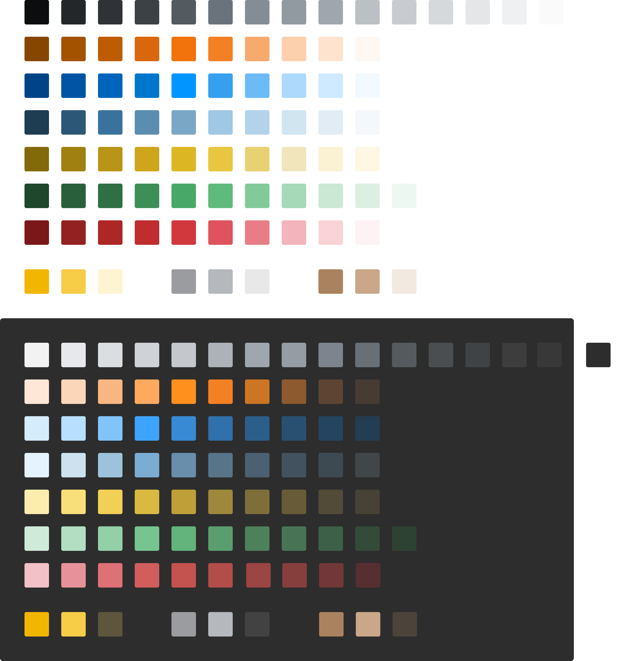
When building our product’s original color scales, we—perhaps naively—took a single color value and modified it using Less color transformations. For example, we’d define a Less variable, @red and darken it by 10% a few times using darken(@red, 10%). Then we’d tint to lighten a few times tint(@red, 10%) at the other end of the spectrum. This would lead us to a color scale represented by @red-050 through @red-900 with 10% steps in between.
In my first explorations of what Stack Overflow would look like in dark mode, I wanted to simply test swapping the white background for black, and reversing the color scales. With this approach, @red-050 became @red-900 with the values in the middle staying pretty much the same.
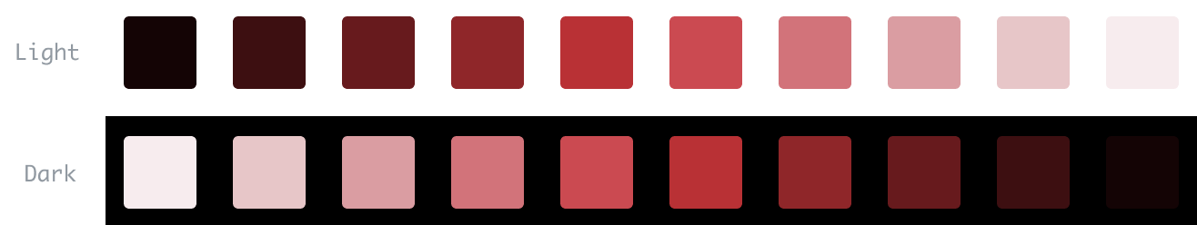
This approach made everything have unusable contrast, and fell into the traps of what I dislike about dark modes in general. Pay close attention to the darkest value of red against the black background. It’s nearly indistinguishable. More on that later.
Starting with the mockup
After just diving in technically proved to be a false start, I instead chose colors by hand in my design tool of choice Figma. I could design what Stack Overflow ought to look like without concern for how the original color values would map. Reducing the overall contrast was key to preserving depth in our interface, allowing elements to cast shadows, and displaying the full spectrum of colors.
Choosing a better algorithm
After picking a lighter background for dark mode, I could then explore the color scale in a deeper manner. First, I needed to solve some of the color issues the design system inherited in light mode. At the light end of the spectrum our reds and yellows weren’t as usable as I’d liked. With some colors, the lightest value was too close to white, while others the lightest value was much too dark.
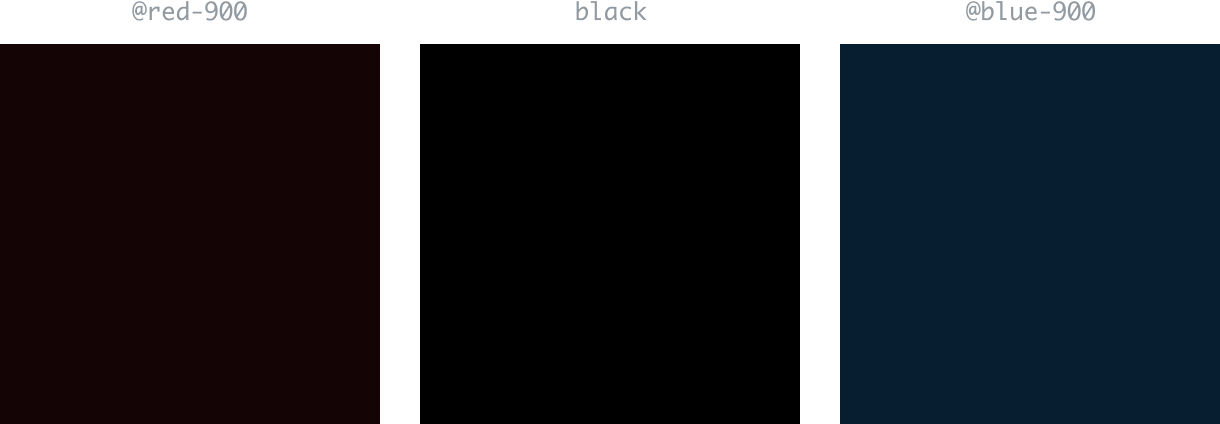
We had trouble at the darker end of the spectrum for each color. When applying @red-900 and @blue-900 to a background, these colors were indistinguishable from black and each other. We needed an algorithm that would provide colors that still read as their primary hue at the lightest and darkest values, allowing us to build components from these color values.
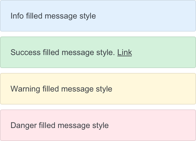
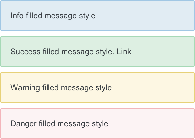
When creating our notices component, we couldn’t use colors from our design system. Instead, we had to eyeball custom colors.
I used Lyft’s amazing Colorbox to help normalize our colors. Instead of a naive linear scale at 10% increments, I used bezier curves—a vast improvement at the more extreme ends of the scale.
Dark versions
Once I polished our light versions, I could now explore these colors against the dark background. I would ultimately end up hand-tuning the algorithm’s output to preserve long-used brand colors at certain values. This would allow me to drop the new colors into production without too jarring a shift.
Adding the colors to Stacks
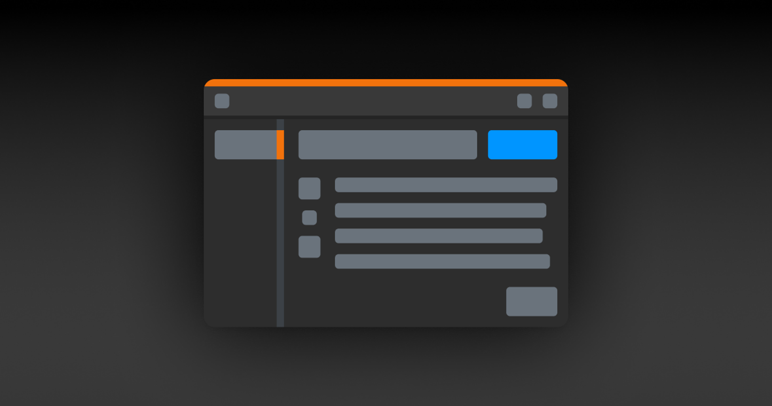
If I had any hope of shipping dark mode to Stack Overflow, I’d first need to solve dark mode using Stacks, our design system, as a sandbox.
Variables
I needed to convert static, Less-compiled hex values to runtime custom CSS properties. This meant storing our color values as var(--red-500) instead of a static @red-500. This was an interesting problem in our design system, and the site in general. We routinely take a single color value like @red-500 and lighten or darken for hover and focus states and things like backgrounds and border colors.
Each of our many buttons and their individual states were based on a set of transformations of a single compiled color value. It reminded me of this scene in The Big Short. “We can transform an original 10 million dollar investment into billions of dollars,” and of course the whole thing explodes.
The problem with native CSS variables is you can’t apply any type of Less transformation to them. darken(var(--red-500), 5%) breaks the compiler since CSS variables are only evaluated at runtime.
This meant I’d need to refactor how all of our buttons were created. I’d move from:
.s-btn {
    color: @white;
    background-color: @blue-600;
    border: 1px solid darken(@blue-600, 5%);

    &:hover {
        background-color: darken(@blue-600, 5%);
        border-color: darken(@blue-600, 10%);
    }
}
I needed to translate these to their more explicit color values as defined by our color system. Instead, it ended up looking like this:
.s-btn {
    color: var(--white);
    background-color: var(--blue-600);
    border: 1px solid var(--blue-700);

    &:hover {
        background-color: var(--blue-700);
        border-color: var(--blue-800);
    }
}
I needed to do this across all of our Stacks components, not just the buttons. These same concepts applied across notices, popovers, modals, buttons, and links to name a few.
Browser compatibility
Oh, but wait a second. CSS variables aren’t supported by Internet Explorer 11, a browser we very much supported at the time of this exploration. Ultimately, we made the decision to drop support for IE11, ripping out all the CSS hacks we’d added over the years to get it to behave, and then shipping deprecation notices to users on IE11 urging them to install a new browser. This was not a decision we took lightly, and this prerequisite alone took weeks of refactor.
Conditional classes
With IE11 no longer holding us back, I was able to work with our colors within Stacks. I chose to enable adding the class .theme-system to the body element. In doing so, we’d swap our light colors for their dark equivalents behind the dark mode media query. Additionally, we could skip that media query entirely and just force the dark colors by adding .theme-dark instead to the body. This would allow users to see dark mode regardless of their system’s settings. My approach ended up looking like this:
body {
    --red-600: #c02d2e;
}

body.theme-system {
    @media (prefers-color-scheme: dark) {
        --red-600: #d25d5d;
    }
}

body.theme-dark {
    --red-600: #d25d5d;
}
To offer complete flexibility, Stacks provides atomic color classes that are only applied when dark mode is enabled. You can read about Stacks CSS design choices at length at my personal portfolio. By adding .d:bg-green-100 to an element, our engineers and designers can say “In dark mode, apply a background of green 100.” Additional conditional classes allow us to drop borders, swap backgrounds, or change text colors in dark mode. Steve Schoger’s got a really great tweet demonstrating the customizations that are sometimes required for dark modes. I’ve taken lots of inspiration from Tailwind.
Documenting it
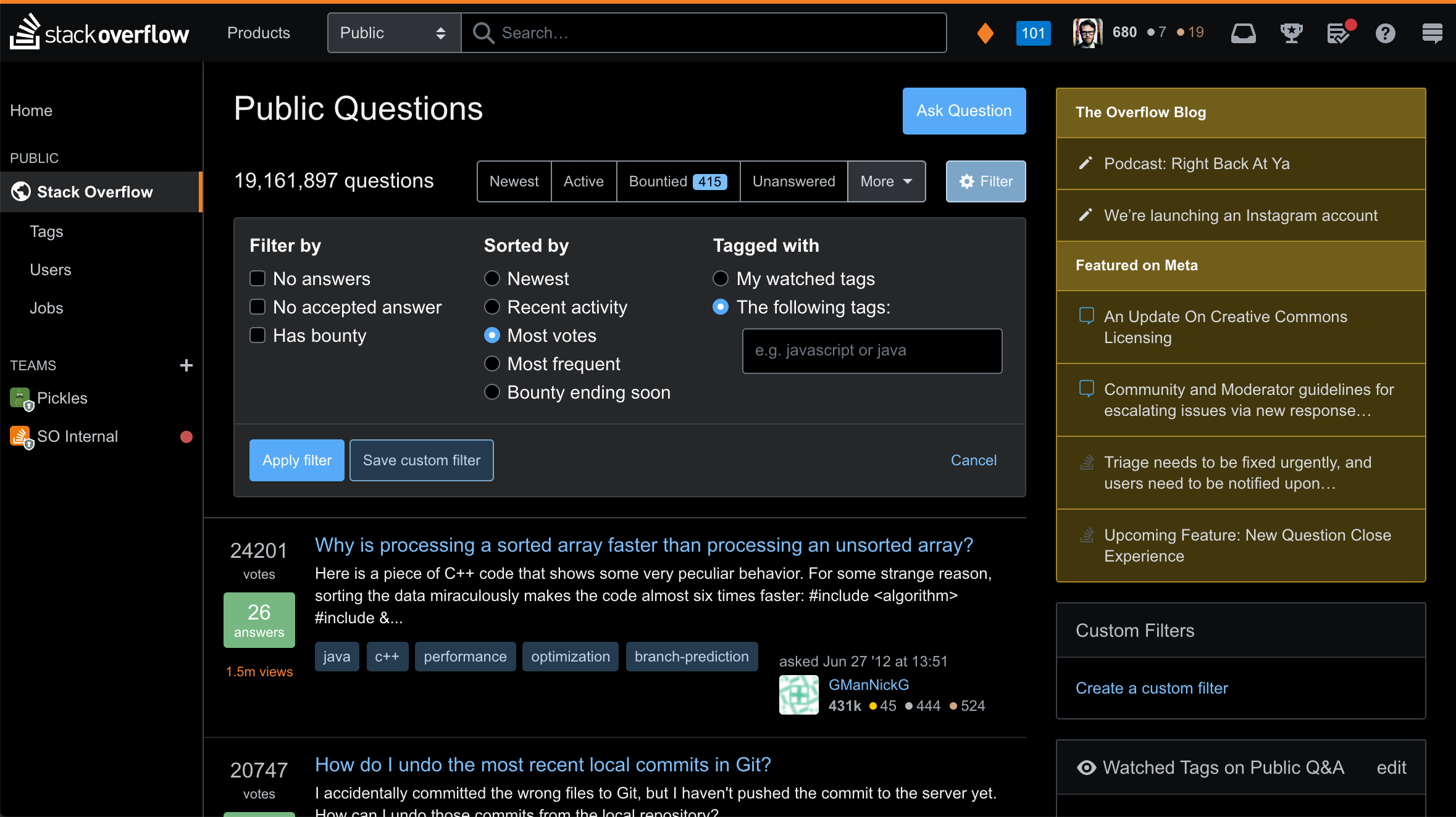
Once Stacks was in a place to ship its own dark mode, we opted to add a button on the top of the site to quickly toggle between them. Folks from Design and Engineering need to be able to switch between both views as quickly as possible.
Adding the colors to Stack Overflow
I solved all these color issues on the design system side with relative ease. Our design system’s inherited fewer mistakes from our past, making it easier to refactor with the new future in mind. In order to ship to Stack Overflow, I needed to maintain our original Less variables for backwards compatibility. This allowed us to enable dark mode on certain parts of our interface incrementally.
Since the majority of our interfaces built after 2018 use Stacks, they get dark mode and responsive layouts for free. The majority of our site, however? Not so much.
Site chrome
First, I’d need to make the largest changes I could without disrupting Stack Overflow’s default light mode. These tasks were mostly just replacing static Less variables with their CSS variable equivalents throughout the site. I first applied background-color: var(--white) to the background of the site, replacing background-color: @white. This would now flip most of the page appropriately. I then did this for font colors. Rinse and repeat. Mostly, this actually meant deleting a lot of CSS, since we often were over-specifying font colors on child elements when we could just inherit from the parent.
Staff shipping
Once I got the broad strokes down, I leaned on engineers Adam Lear and Nick Craver to provide a method to ship a preview of dark mode to Stack Overflow employees. This would allow our staff to opt into a woefully broken dark mode, allowing folks see how much conversion was left, but hopefully motivate them to help fix the portions of our site with the most traffic. This would let me fix the biggest barriers of the site—our existing codebase.
Buttons
If the view you’re working on is already built with Stacks, there really isn’t a ton you have to do to fix things for dark mode. You might decide we don’t actually need a border, or you want to select a slightly different shade of gray for the background. Unfortunately, for the widest majority of the site, we still weren’t relying on Stacks.
This was most obvious when it came to our buttons. Over the years, we had various implementations of buttons. The last was the most frustrating since we targeted the button element itself for styling. This means that any button or input type="button" on the site would get default, super specific styling from a deprecated set of styles.
This kicked off a large refactor that’s still ongoing to delete element-level references to button in CSS, instead replacing them with their Stacks equivalent. For example, hundreds of input type="submit" would need to be replaced with <button type="submit" class="s-btn s-btn__primary">. To complicate things, we were often wiring up JavaScript interactivity to these visual selectors. If we changed the visual classes, it often broke what the button actually did. Across thousands of buttons, I needed to first add js- specific classes, wire them up, and then rip out the old visuals.
This eventually got me to the point of deleting a majority of the legacy button classes, allowing our buttons to switch colors properly when dark mode was enabled—all with few regressions to the light mode of our site.
The site header
Complicating things even further, our site-wide header has several modes. Light, dark, and themed. Both Teams and our network sites force a dark appearance of the header. Additionally, our Teams have a colored bar that’s established by the Team’s avatar color. Like a lot of our components, the site header’s CSS took a single color, measured if it was light or dark, and then mutated that color through a complex set of Less functions. However, we couldn’t just rip this out and replace it with pre-baked CSS variables as we did on the design system. Our Enterprise clients actually theme their headers entirely, using a single color to generate all the custom overrides.


For the light header that we ship to Stack Overflow, we needed to find a solution to measure if our color was a CSS variable, or a static hex value. If it was a CSS variable, we’d skip the Less transformations entirely, building a header that would swap colors based on dark mode. If you passed a static Less variable instead, it’d then measure that color for lightness or darkness, and build the appropriate header.
Our approach ended up looking like this:
 & when ( iscolor(@theme-topbar-background-color) ) {
     @theme-topbar-style: if(luma(@theme-topbar-background-color) >= 50%, light, dark);
 }
 & when not ( iscolor(@theme-topbar-background-color) ) {
     @theme-topbar-style: automatic;
 }
I’d then build the header appropriately based on automatic, light, or dark.
Tags
If there’s one bit of advice I could give when designing a component—don’t add layout to your component. In other words, your context should be defining how much space is between them. Don’t bake it into your component. In Stack Overflow’s earliest iterations, it was decided that our post-tag component would have outside margins applied to it. Like our buttons, tags ran into the same JS-targeting issue. To complicate things further, most tags were generated using a single helper method in our application.
Refactoring tags would mean swapping post-tag for our new theme-aware s-tag component. I’d also need to refactor our JS to target js-tag where appropriate. I’d also need to change our tag generator method to accept arbitrary layout classes, since, in certain contexts we may want to wrap our tags in a flex layout instead of relying on (or fighting against) pre-baked margins.
Post styling
The majority of Stack Overflow is user-generated posts. These posts display Markdown as the original question body as well as answers and comments. At the time of Stack Overflow’s launch, Markdown was relatively new.
Over the years, the industry has coalesced on some standard ways of displaying things like headers and blockquotes. Dark mode was a perfect time to reconsider how we handled some of our post formatting—the most controversial being blockquotes.
We originally implemented blockquotes with an overpowering yellow background that reduced the contrast of the quote itself. The yellow was also problematic when displayed against a dark background. Ultimately, we switched to the industry-standard single gray bar to represent block quotes.
Code styling
For Stack Overflow, we very clearly have a lot of code to display. Our syntax highlighting colors used completely unbranded colors I’m pretty sure we inherited from the original syntax highlighting library we hacked in. Ultimately, I punted on a heavier redesign of syntax highlighting. Instead, I ended up shifting the existing syntax highlighting toward colors from our design system’s values, finding dark mode equivalents that didn’t make too big a change too soon.
The results
With these refactors in place, we can make larger changes with fewer regressions. We can far more easily consider extending our color palette to include high contrast accessibility modes.
Building a feature like dark mode is the result of a fundamental shift toward designing systemically at Stack Overflow. I’ve been pushing adoption of our design system over the last year, using dark mode as an opportunity to rebuild many parts of our products. This is the first of many projects to bring more accessibility to our users.
Not counting the deprecation of Internet Explorer 11, work on dark mode started in earnest in July 2019 with an exploratory pull request. Prior to that, you can see some public discussion of what it might take to build a dark mode in April 2019. A proof of concept in the production codebase was hacked together in October 2019. After at least 60 follow-up pull requests, the dark mode beta went live on March 30, 2020.
A huge thanks to the help from various folks across the organization, Adam Lear, Des Darilek, Nick Craver, Kevin Montrose, Brian Nickel, Catija, Ben Popper, Joy Liuzzo, Sara Chipps, Kristina Lustig, Jon Chan, and Ben Kelly. ✌️