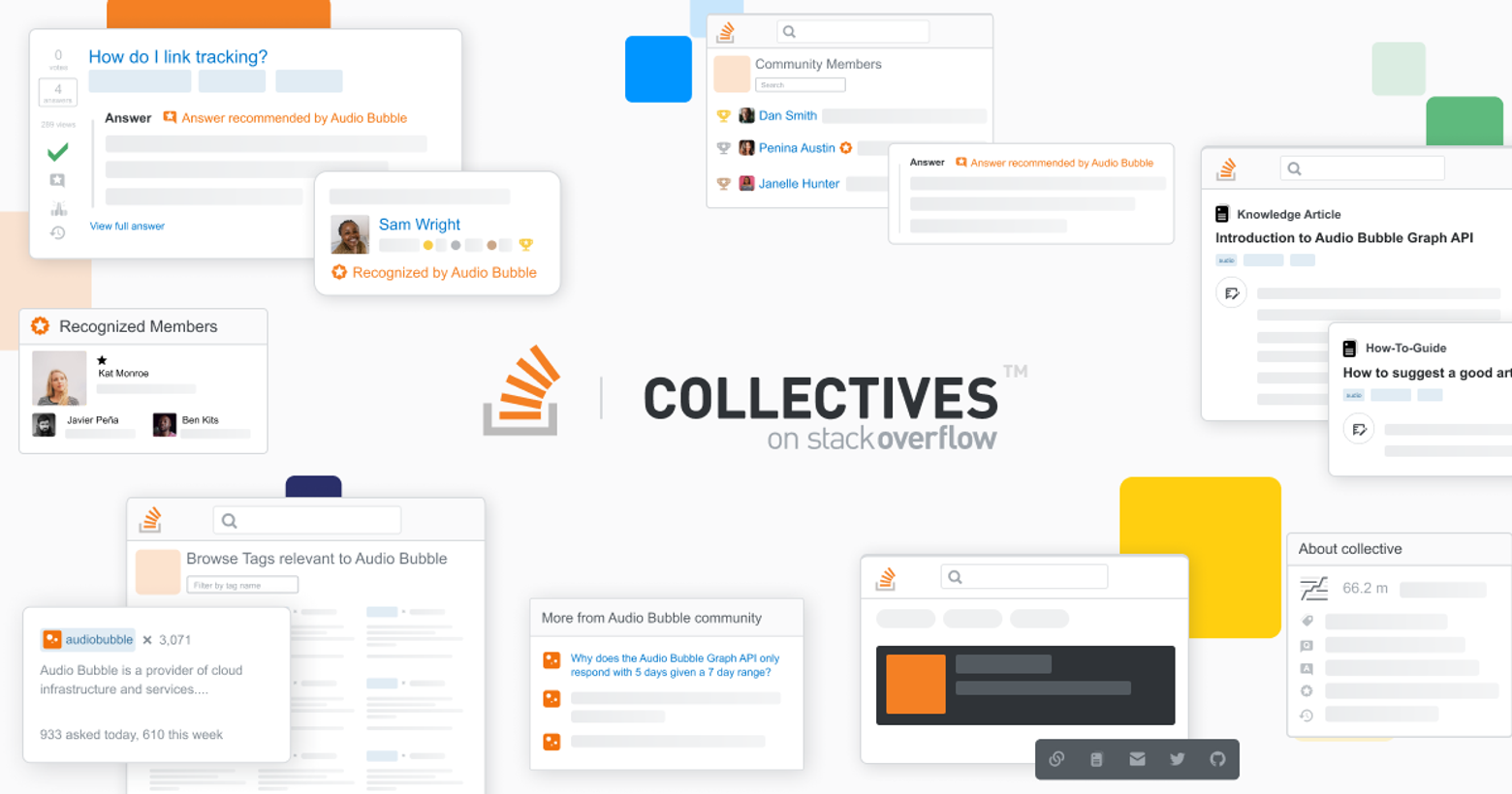
Last month, we announced the launch of CollectivesTM, places within Stack Overflow that are a little bit more concentrated, a little bit more specialized. They’re mini communities around certain programming languages, products, or services in Stack Overflow where developers can engage directly with the companies and individuals who know the technology best. Each Collective is smaller than a full exchange, larger than a single tag, and an easier way of narrowing down all of the content on Stack Overflow when working with specific tech.
We’re excited that this product is finally live in front of our community of users, and we wanted to take a deep dive into how we designed Collectives, starting from the initial ideation to all the decisions and considerations that led to what it is today. This should give you some insight into how we thought about the product and its use.
A public version of our private version
Collectives was an idea that had been kicking around for a while. For years, we had seen individuals share knowledge about technical products freely. Some companies even provided unofficial (or official) tech support by answering questions on their products. We had explored the idea of providing a home page for a technology or company within Stack Overflow, but never figured out a good implementation of it.
In 2019, at the Stack Overflow meetup in Austin, Texas, the product team did a buildup and tear down of that idea, an exercise where we collectively "tear down" an idea by identifying potential pitfalls and risks, and then build it back up stronger by addressing major concerns and incorporating additional perspectives. One of the biggest problems we found with the idea was that you’d either be moving or duplicating content. Moving content would remove years of curation from Stack Overflow and remove credit from those that helped create the content. Duplicating the content would create two repositories that needed upkeep and add unnecessary cognitive load to users on where to go for the information. In either case, you’d need to create a new user base for this content in the new location.
But in the buildup, the folks on the Reach and Relevance team saw this as an opportunity for companies to make a positive contribution to the site without taking anyone outside of the public Stack Overflow site or moving content around. The idea was to organize content and put companies around the already built communities, which is where they want to be.
When we got back from the meetup, we started a traditional five-day design sprint: the first day was understanding, the second day diverging, third converging, fourth day prototype, and fifth day test. During this sprint, we came up with the problems that this product would solve:
- Enable organizations to build relationships with the Stack Overflow community in a way that improves Stack Overflow as a resource for developers.
- Provide unique data showing trends and insights to companies so they can better understand developer needs, measure impact, and see our unique value.
At the end of the sprint, we had a few different ideas, including allowing users to post on behalf of an organization, an organization recommending an answer, a homepage to curate and interact with the organization, and a dashboard for the organization to learn about their community and users.
Our initial solutions were presented to a small group of potential clients and users with positive results. It took a few months before we garnered enough interest from customers to justify moving forward. We had to move quickly in order to get the product ready for an upcoming conference.
In order to meet this new deadline, we ran research sprints. Every two weeks, research and product design would get together and decide what we wanted to tackle, then research would design a study, run it, and come back with recommendations. Then we would design based off those recommendations. Altogether there were nine research sprints.
Some of the biggest takeaways from these sprints were that users didn’t want Stack Overflow to feel like a social network and that they wanted the answer ranking to remain the same.
What’s in a name: Recognized members
Looking back at the problems we defined during the design sprint, we wanted Collectives and the organizations that took part to improve Stack Overflow. Recognized Members was our first feature planned to solve that problem. This role is intended to increase the quantity and quality of contributions from an organization to the community. This applies not only to employees, but allows organizations to recognize and discover users that already contribute to Stack Overflow successfully. We were trying to get more people to answer the right questions or recommend the right answers. The idea that these subject matter experts of the organization could be new users of Stack Overflow and would contribute high quality answers and recommendations alongside seasoned community members at the same level within the collective was a driving motivator for this project.
Originally, the term for “Recognized Members” needed to include both experts within the community and employees of the organization. It started as “Verified;” that was too close to social media. We also tested affiliate, partner, expert, and more. There were terms that the clients really liked, like expert, but then we showed it to users and they disliked it immediately. Users felt that “Expert” was a weighted title that added too much pressure—you’re expected to know absolutely everything about the technology. They also felt it was disrespectful to other experts on the site that wouldn't have this badge.
By the time we went back the fifth time, “Recognized” was one of the original ideas that had tested fairly neutral—it wasn’t picked as a favorite, but didn't get any negative feedback. We tested it again. That's the term that best fit the expectation of what we wanted that role to be. So wording was fun.
The other challenge was how to highlight these users and their answers in the collective. We started with “Recognized Member” written in bright orange text. When you start peppering that around the site in different areas, it gets very long. Then we paired the user name with an icon that shows up alongside it so that when space is limited, we could display the icon by itself. Originally, it was a checkmark, but that just didn't fly—too much like Twitter. We tried colored backgrounds, but that felt too bold. We wanted to make sure the weighting was appropriate, but still recognizable. Eventually, we settled on a star as the icon.
In our first design sprints, we made the decision to not do employee labels in order to reduce cognitive load and minimize the amount of new user types that we were introducing. However, our potential clients wanted to differentiate between actual employees of the company versus somebody from the community that they're recognizing. Some potential clients even had this as a legal requirement. We tested this with users, and they agreed that the information should be upfront and transparent so users know who is official and who is a community user that knows their stuff.
At this point, some of the nuances around Employees and Recognized Members began to reveal themselves. If someone leaves the company and are no longer an Employee, what happens to the badge on their answer? Do Employee and Recognized statuses stay on the question if that was true when they answered? We don't want to label somebody as an employee when they're not—there can be legal repercussions around that as well. Alternatively, if someone was Recognized when they answered a question, we want to keep highlighting that answer because they were still a recognized authority at the time they answered.
On top of all this, we had to work around the existing codebase. We had to be mindful of our developers and public users, especially anything that would need extra time from the Public Platform or Architecture team; we couldn't make large changes. Plus, our engineering team had spent the last three years eliminating tech debt and improving stability; they didn’t want to endanger that by making large codebase changes. Just because we're introducing this new feature quickly, it doesn't mean we could disturb existing community functionality. This is supposed to add additional value to Public Platform users, not mess with their experience.
A new content type for the community
We knew from survey results that Articles were of interest to users, something that we had already been using successfully in Teams. Articles were present in most of the research sessions, and it went through a lot of iteration and discovery. Phase one was pretty easy: port Articles over from Stack Overflow for Teams.
We heard very early on in research about our Documentation project and how it was painful for the community when that failed. Along with the designer that originally worked on documentation, we examined why it failed and what went wrong. When that feature first came out, some users flooded the site with low quality documentation in order to inflate their reputation. Much of the design effort here was to make sure that the quality was going to be higher and there wasn't going to be the same reputation grab.
The power of these Collectives isn’t just in the people who run them, it’s in the Members. We want any Member to be able to propose or submit a draft to the Collective for review. In the near future, we’ll launch an Article proposal flow, but we’re still sorting out the nuances of moderation and review. During user research, we heard from a lot of users who don’t want this to become just another blog site.
In order to get higher quality Articles, we’ll also want to enable other users to propose edits. Part of this future feature, will allow authors to add any Member as an editor. But we need to put in extra safeguards when a Member goes back and makes edits to their article. This involves another type of approval queue. We want to avoid someone sneaking malicious content into an article without external review.
Right now, there's a lot of research into outdated answers and downvoting on the public site. People just tend to close, delete, or downvote questions if they're wrong or duplicate. Newer users feel like this poses a barrier to the site—they don’t know why their question was downvoted so it feels a little hostile. Imagine how that feels on an Article that someone put a lot of work into. We're trying to promote the feedback mechanism on Articles to avoid that. If you're going to downvote, explain why and help the author.
A concern with the feedback mechanism is that the feedback goes to the author in a private section. Only the author, collective Employees, and Recognized Members can see it. There's definitely moderation concerns because anywhere that someone can send a private message to somebody on the internet usually turns bad. One of our clients was concerned that some of their members might not want to write an article in fear of just getting downvoted or worse because of their gender or their race. They're opening themselves up to potential backlash just based on who they are, which they've seen before in the developer community.
Unlike questions, Articles can’t be answered. They still have comments, though comments on questions are for flagging something, edits, or feedback on the question. That doesn't really make sense on Articles. Typically, people use comment sections to discuss ideas that were written in the Article. We tested calling comments on articles ‘discussion,’ and it tested pretty well. But there's a lot of new stuff coming with Collectives. So we pulled back on that plan to wait and see how Articles does in the first place. For now, we still want to encourage interaction with these Articles, so instead of the small “Add a comment link,” we auto-expanded the comment text box to give it more visual weight.
Collective health
Stack Overflow has a heavy gamification component, so we wanted to use that within a collective. When we went to look at designing a Member’s page, we wanted it to be more than a list of members; it should be a little bit more interactive and have a little bit of that competitive spirit. So we pivoted the feature into a leaderboard. We have several leaderboards—the overall one on Stack Overflow, tag-specific ones, ones on Stack Overflow for Teams—so we looked at these and external leaderboards to see what worked and what didn’t.
The biggest change is that we highlight where you are on the leaderboard. Not everyone will be on the first page, even the first five pages, but it's still fun to be able to track your progress as you learn and level up. The top three on the leaderboard will get a trophy beside their user card throughout the collective. Employees and Recognized Members will be competing on the same leaderboard; our research showed that users appreciated seeing these users high up on the leaderboard. It meant that the organization behind the collective was actually engaged and putting something back into the site and into the community.
On the client side of things, we still wanted to provide that insights dashboard. We’d heard from users of our Stack Overflow for Teams dashboards that the information in them was great, but that they didn’t know what to do with it. At first, we tried cutting the amount of information down—location, time of day, and other pieces of data got cut. But still, clients ran into the same problem: here’s the info, now what? If my Collective is doing badly, what can I do to make it better?
We were constantly prioritizing during the design of this dashboard. The deadline kept moving, so we always felt like we were up against this tight deadline and we constantly needed to prioritize over other items. Sometimes, one thing would be the most important and other times, it was something else. Constant communication, prioritization exercises, and time management were our daily lives. One of our biggest trip-ups was the amount of times that we had to go through and iterate on it. The team was split on whether to do it at all.
Just reports and metrics could help prove return on investment with clients. But we wanted something that would ensure that Collectives succeeded, so the insights dashboard evolved into Actions for you, a list of tasks that we think the collective experts should do to make the place successful. It highlights problem areas, so if a Recognized Member has a little bit of time, they know where their efforts will pay off the most. Maybe there’s a lot of unanswered questions. Maybe questions have answers, but those answers need recommendations.
Along with these highlights, we included a weekly tasks list, steps that the collective team should take every week to help their space thrive. The collective Recognized Members and Admins know exactly what they need to do—write two articles, answer ten questions—and tick off those boxes as the tasks are completed. Next week, it refreshes. It helps level set what a reasonable amount of effort looks like.
In the future, the task list may have more dynamic items supported by data, nudges to invite more Recognized Members or encourage more edits. When we tested that feature with some of the moderators and high rep users, they all really liked it and requested that we bring it to the mod review queue, which was a good confirmation we were on the right path.
Getting the dashboards up and running was one of design's biggest challenges, but it was worth it—it looks great.
And we’re just getting started
Google Cloud and the Go programming language were the first Collectives to launch and those organizations and their users are seeing the value of the work we put in. More technology providers and more features are on the way.
For example, we’re looking at the ability to pin certain content to the top of the list, perhaps as a way for the collective to promote a certain article for a limited amount of time so that everybody can see the official answer immediately. We’re also looking for ways that the organization can ask and discuss topics with their collective Members. But we want to make sure this adds value to users and it remains within the confines of the collective.These are a few of the features that will really make Collectives feel unique.
As always, we’re trying to lower the friction between technology workers and the answers that they need to get the job done. Technology companies want to be able to engage with those people directly, and Collectives gives both groups a space to interact and share knowledge.