As developers, we are always looking for better ways to ensure we ship quality code. Many of us already use processes such as pull requests (PRs), automated integration tests, and monitoring to make sure the code we deliver is well written and working as expected. The popularity of these workflows speaks for themselves, but what happens when they go wrong? (And they will go wrong.) When we are working at larger scales, how do we even know if they are going wrong? The answer is data visualization, when applied properly it’s a powerful tool for getting insight into our workflows.
In this article, we’ll discuss three areas that visualization can make it easier to diagnose and solve problems in everyday software engineering.
Flaky tests
When testing new code, you look for tests that fail in order to highlight bugs to fix. But what about tests that only fail some of the time? We’ve all been frustrated with the subtle time-wasting of flaky tests, but how many times do we just write it off as something that just happens to us and accept the time lost as a cost of writing software? What if we were able to see just how flaky our tests were for everyone on the team?
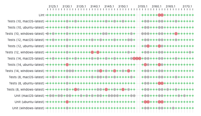
The above visualization is taken from this example open source dashboard showing the status of the test suites run for the sveltejs/svelte repository. This kind of birds-eye-view packs a lot of information in a small amount of space so your eyes can do what they do best, spot patterns. Each row in the visualization represents a single test, while each column represents a run (perhaps triggered by a pull request). If a row has a lot of red circles (test failures) you may start to suspect that test of being flaky. However if a column has a lot of red circles and/or gray circles (tests being cancelled) then it is more likely a problem with the code being pushed.
Integration tests in particular take a long time to run. If everyone on the team is waiting a few extra minutes every time they push code, those minutes can add up to days worth of wasted productivity pretty quickly.
The following visualization shows how long each test took to run and exposes patterns.
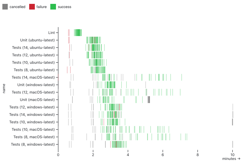
Something you may notice in both of these visualizations is the lack of aggregation. These visualization techniques emphasize surfacing patterns by showing the underlying data directly. This enables further investigation directly from the visualization. For example, each integration test represented here has an interactive tooltip that gives details as well as deep links to the run on GitHub for further analysis.
Consider where we might be without these visualizations: essentially looking at a table of information. This is the standard interface for the same set of integration tests shown in the visualizations:
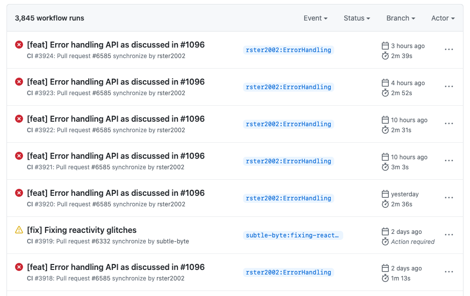
While this is always a useful interface for getting detailed information and drilling into a specific test run, it does not give us a view of the patterns that can have systemic impact on our productivity.
Pull requests
Pull requests are the way most teams collaborate to ship quality code. They provide a process for giving feedback and ensuring quality, but the process isn’t always balanced. Some teammates may end up reviewing too many PRs, while others could be helping out but don’t get asked. Data visualization can help us surface these patterns in the process so we can help bring them back into balance.
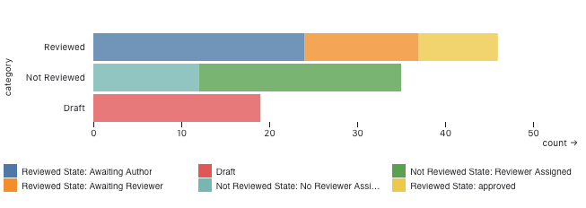
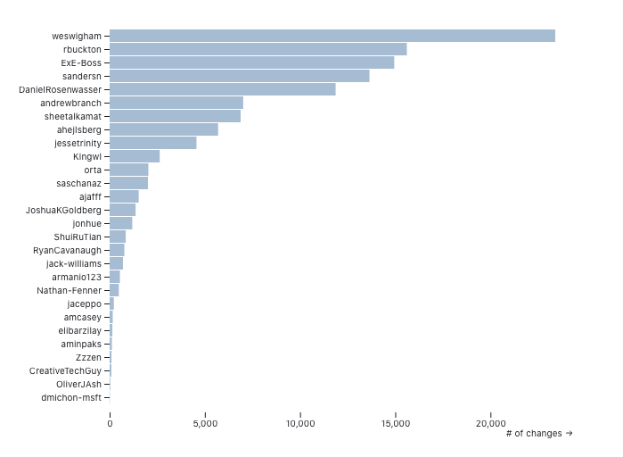
We can use visualization to gain a bird's-eye view of the open pull requests on a repository and answer a couple of key questions. The first question we may ask is: what is the reviewer workload across the team? It may make sense for senior members to be doing more reviewing, but you may also notice that some teammates are ready for more responsibility.
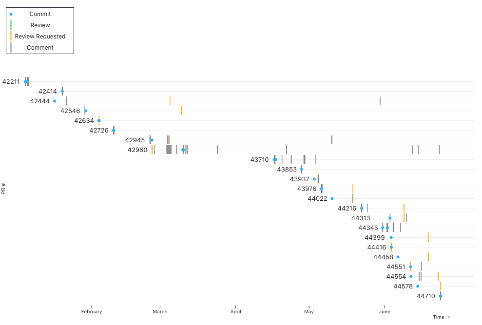
Data visualization enables us to answer another question: where are there stagnant pull requests that need attention? You can also look for patterns in PRs that have been unreviewed or stagnant for a long time. Individual developers may have that nagging feeling that their PR isn’t getting the attention it deserves, but it can be hard to understand where it fits in with all of the other work happening on the team. Seeing the unreviewed PRs in context can help a team decide what needs extra attention.
Monitoring
A well known use case for data visualization in the engineering process is for monitoring the status of our systems. Whether it’s keeping an eye on system metrics like CPU usage and network latency or watching for an increase in errors or user signups, most teams have some sort of dashboards to track important metrics.
What you may not have seen is a very compact view of your metrics using what’s called a horizon chart. The following visualization shows HTTP status codes per minute for an app over an almost two week period, minute-by-minute.

The principle of doing the least amount of aggregation comes through again. With this compact form, we can get very detailed information while also seeing broader patterns come through. You can see that at some point around April 17th there was a huge increase in 403 errors (due to some buggy code that was deployed). For the same period, you can see that the 200 status is lighter, indicating fewer successful requests.
This is a D3-based open source component called a TimeChart, which is intended to make it easier to see patterns in dense time series metrics. It supports interaction, so you can see the exact values for any minute in the time range.
Conclusion
Ultimately, we all want to be productive and ship quality, working code, but it’s not always easy to see how we are doing. Data visualization can be a powerful way to direct our energies and achieve a clearer view of how our processes are functioning. Aggregating as little data as possible can give us even sharper insight into what is happening in our systems. Have you used data visualization to manage your team’s engineering process? What data visualizations do you think would be beneficial to your workflow? Let us know in the comments what works for you!
