
For five years as a data analyst, I forecasted and analyzed Google’s revenue. For six years as a data visualization specialist, I’ve helped clients and colleagues discover new features of the data they know best. Time and time again, I’ve found that by being more specific about what’s important to us and embracing the complexity in our data, we can discover new features in that data. These features can lead us to ask better data-driven questions that change how we analyze our data, the parameters we choose for our models, our scientific processes, or our business strategies.
My colleagues Ian Johnson, Mike Freeman, and I recently collaborated on a series of data-driven stories about electricity usage in Texas and California to illustrate best practices of Analyzing Time Series Data. We found ourselves repeatedly changing how we visualized the data to reveal the underlying signals, rather than treating those signals as noise by following the standard practice of aggregating the hourly data to days, weeks, or months.Behind many of the best practices we recommended for time series analysis was a deeper theme: actually embracing the complexity of the data.
Aggregation is the standard best practice for analyzing time series data, but it can create problems by stripping away crucial context so that you’re not even aware of how much potential insight you’ve lost. In this article, I’ll start by discussing how aggregation can be problematic, before walking through three specific alternatives to aggregation with before/after examples that illustrate:
- Rearranging the data to compare “like to like.”
- Augmenting the data with concepts that matter, like “summer” vs. “winter” or data-defined categories like “high” or “normal” energy usage.
- Using the data itself as context by splitting the data into “foreground” and “background,” so the full dataset provides the context necessary to make sense of the specific subset of the data we’re interested in.
What’s the problem with aggregation?
We praise the importance of large, rich datasets when we talk about algorithms and teaching machines to learn from data. However, too often when we visualize data so that we as humans can make sense of it, especially time series data, we make the data smaller and smaller.
Aggregation is the default for a reason. It can feel overwhelming to handle the quantities of data we now have at our fingertips. It doesn’t have to be very “big data” to have more than 1M data points, more than the number of pixels on a basic laptop screen. There are many robust statistical approaches to effective aggregation and aggregation that can provide valuable context (comparing to median, for example). In other cases, we need to see more details while trying to find the key insight, but once we’ve finished the analysis and know which features of the data matter most, then aggregation can be a useful tool for focusing attention to communicate that insight.
But every time you aggregate, you make a decision about which features of your data matter and which ones you are willing to drop: which are the signal and which are the noise. When you smooth out a line chart, are you doing it because you’ve decided that the daily average is most important and that you don’t care about the distribution or seasonal variation in your peak usage hours? Or are you doing it because it’s the only way you know how to make the jagged lines in your chart go away?
Informed aggregation simplifies and prioritizes. Uninformed aggregation means you’ll never know what insights you lost.
In our rush to aggregate, we sometimes forget that the numbers are tied to real things. To people’s actions. To the hourly, daily, weekly, monthly, and seasonal patterns that are so familiar that they’re almost forgettable. Or maybe it’s that we so rarely see disaggregated data presented effectively in practice that we don’t even realize it’s an option. By considering these seasonal patterns, these human factors, we could embrace complexity in more meaningful ways.
Consider how much energy we use. If we take a moment to think about it, it’s obvious that we use a lot more energy in the late afternoon than the early morning, so we’d expect big dips and troughs every day. It also shouldn’t be a surprise that the daily energy usage patterns on a summer day and a winter day are different. These patterns aren’t noise, but rather are critical to making sense of this data. We especially need this context to tell what is expected and what is noteworthy.
However, when our dataset has big, regular fluctuations from day to day or hour to hour, our line charts end up looking like an overwhelming mess of jagged lines. Consider this chart showing the 8,760 data points representing one year of data on hourly energy use in California.
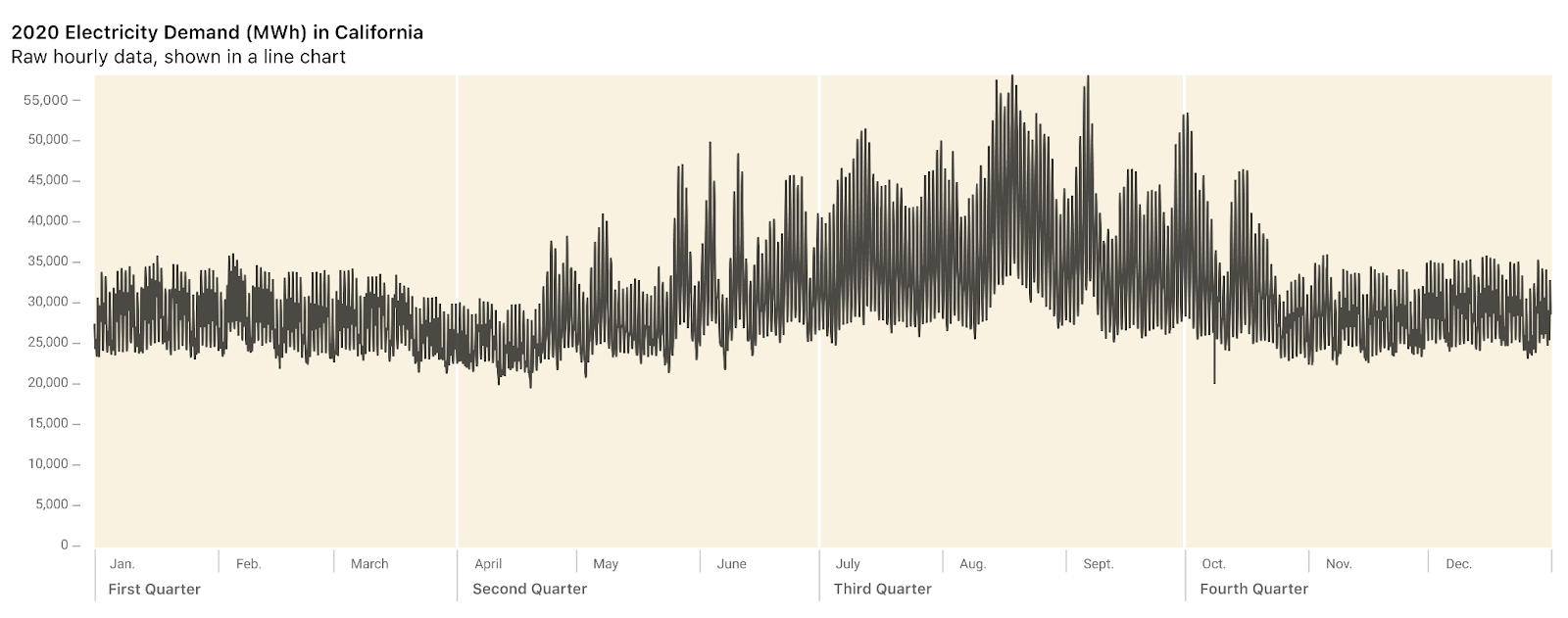
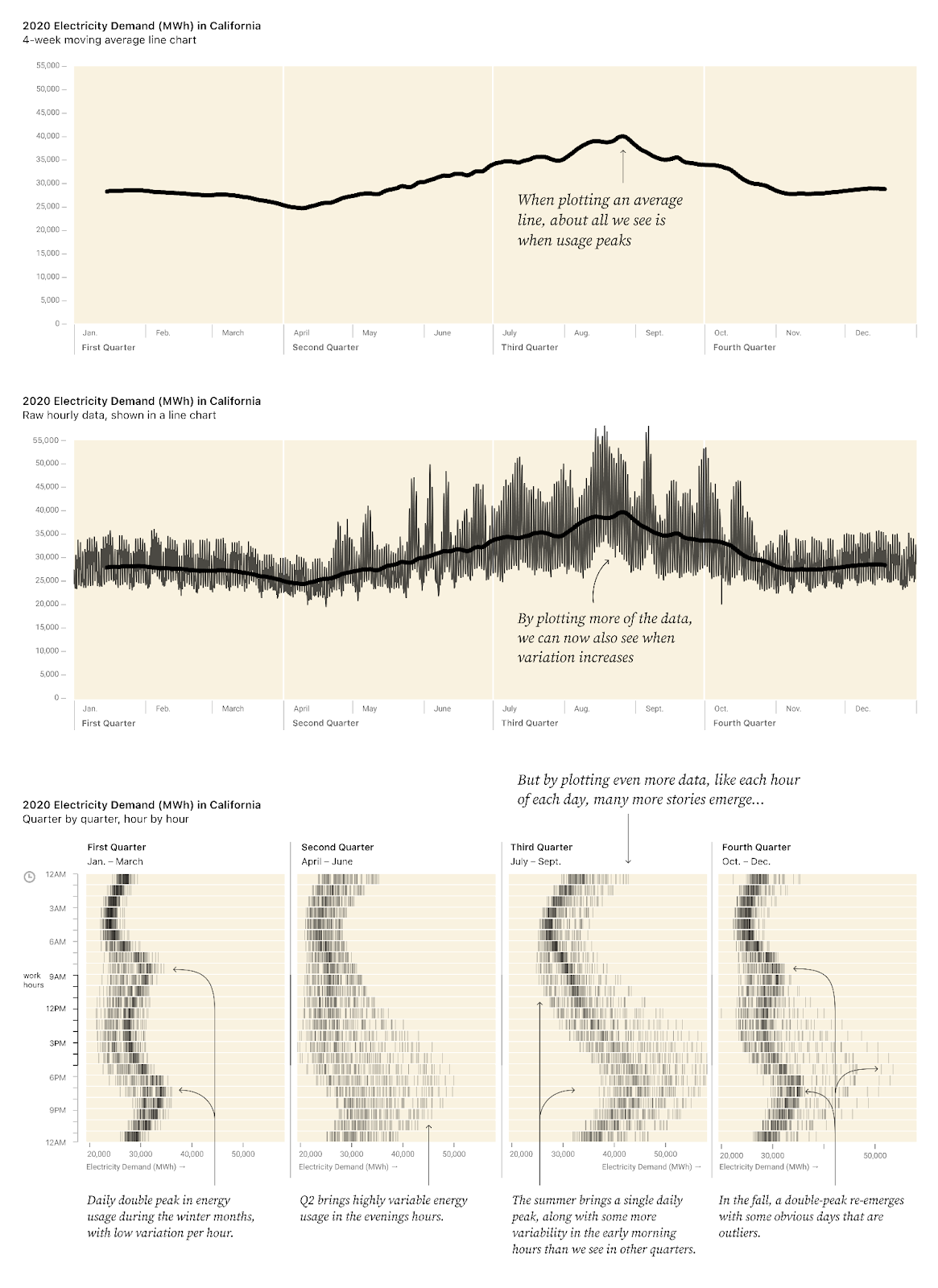
A standard way to deal with this overwhelming chart is to apply a moving average by day, week, or month (defined as a four-week period).
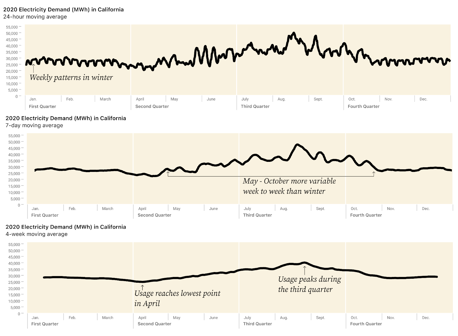
Yes, now we have a simple chart, and can easily see that the lowest energy usage is in April, and the peak in late August. But we could see that in the first chart. Moreover, we’ve smoothed out anything else of interest. We’ve thrown away so much information that we don’t even know what we’ve lost.
Is this annual pattern, with a dip in April and a peak in August, consistent for all hours of the day? Do some hours of day or days of week change more than others through the seasons? Were there any hours, days, or weeks that were unusual for their time of year/time of day? What are the outliers? Is energy usage equally variable through all times of year, or are some weeks/seasons/hours more consistent than others?
Despite starting with data that should contain the answers to these questions, we can’t answer them. Moreover, the smoothed line doesn't even give us any hints about what questions to ask or what’s worth digging into more.
Solution: Embrace the complexity by rearranging, augmenting, and using the data itself to provide context.
#1: Don’t aggregate: Rearrange
What if we considered what categories likely matter based on what we know of human behavior and environmental factors, especially temperature? Factors like time of day and time of year? In Discovering Data Patterns, we grouped the data into 96 small, aligned tick charts, one for each hour of the day for each season of the year and organized the visualization around the concepts most likely to matter. The x-axis for each mini chart is the amount of electricity used, and each tick mark represents a single hour on a specific day.
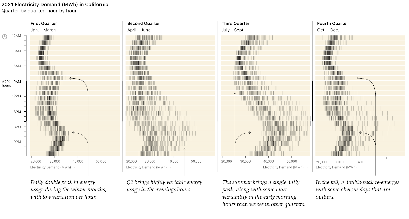
This way we can immediately see what’s typical or unusual for each hour and quarter. For example, generally more energy is used at midnight in winter than at 3am. Skimming down a column, we can see the shape of a day for each season. And, we can see how energy demand by hour changes across seasons by comparing each column to the next.
Now the “noise” has become the signal. We can clearly answer the questions we posed above:
- Is this annual pattern consistent for all hours of the day?
- No, the “shape” of energy used during the course of the day is different in winter vs. summer, with a double peak in Q1 and a single peak in Q3. Also, Q4 looks a lot like Q1, except for a few unusual days. And Q2 shows the most variability in “shape” of day.
- Do some hours of day or days of week change more than other hours through the seasons?
- Yes, late afternoon and evening hours show much more of an increase in energy usage from Q1 to Q3 than early morning hours.
- Were there any hours, days, or weeks that were unusual for their time of year/time of day?
- Yes. For example, in Q4 some very unusual days saw high energy usage in the evening.
- Yes. In Q3 in the early morning hours (between 4am and 6am), there were some outlier days with much higher energy usage.
- Is energy usage equally variable through all times of year, or are some weeks/seasons/hours more consistent than others?
- No! Q1 has very more consistent energy usage, with a very narrow range of energy used for any particular hour of the day. Meanwhile, Q2 shows very inconsistent energy usage, with a lot of variability especially in the higher-energy evening hours.
Not only do we notice some patterns immediately, but this view of the data also gives us the chance to go deeper just by looking more closely (and doing some basic research into what was going on in California at that time).
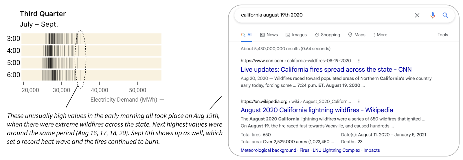
Let’s look closer at the early morning hours of Q3. There were some abnormally high values between 4pm and 6pm. Interactive tooltips reveal that these took place on August 19. A quick Google search for “California Aug 19th 2020” shows that the region was suffering from wildfires, so perhaps people kept windows closed and the AC on instead of opening their windows to the cooler nighttime air. September 6 also shows up among the highest values, and a search indicates a likely cause: a record-breaking heat wave in California that hit the national news while the fires continued to burn.
Overall, our faceted tick heatmap chart has the same number of data points as the original jagged line, but now we can see the underlying daily and seasonal patterns (and how daily patterns vary by season) as well as the relative outliers. The more time we spend with the chart, the more we notice, as it invites us to ask new data-driven questions.
2: Augment first, then group or color
Bring in common knowledge: augment with familiar classifications
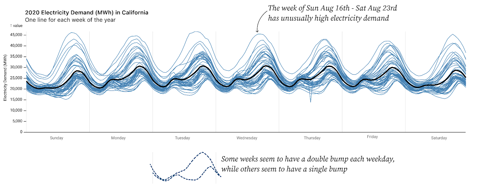
At another point in our exploratory analysis, we looked at a chart showing 52 weeks of hourly energy usage in California (shown above) and noticed that the higher-energy weeks seemed to have a single bump each day in the evening while lower-energy weeks seemed to have more of a double bump (see above). This is actually the same pattern revealed in section #1 on rearranging.
We guessed that the single bump/double hump might be related to seasonal differences in temperatures. To test this hypothesis we added a column to the dataset to designate “summer” vs. “winter,” and then made two charts (faceted) by splitting data on that parameter. Suddenly it was obvious. No longer were we squinting to notice a pattern hidden in the squiggles.
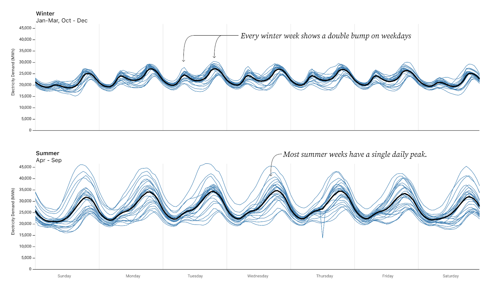
The “faceting” itself was simple, a feature built into many charting APIs including Observable Plot (which we were using to visualize our data). In hindsight, this seems like an obvious way to split the data. But how often do we step back and actually augment our data with these human-relevant concepts? The key was having the summer/winter parameter to facet on.
It doesn’t have to be perfect. Guessing at a date boundary for summer/winter is enough to see that a distinct pattern emerges. Once we have the double-bump/single-bump insight visible here, we can use that insight to go back and look at our data more closely. For example, it appears that there are some daily “double-bump” weeks in the “summer.” Are those boundary weeks that should be classified as winter (or fall or spring)? Or are they unusual weeks during the summer? Moreover, now that we know a defining signal, we could use that signal to classify the data and thereby use the data to identify when energy usage transitions from a “summer” pattern to a “winter” pattern.
Augment with data-driven classifications
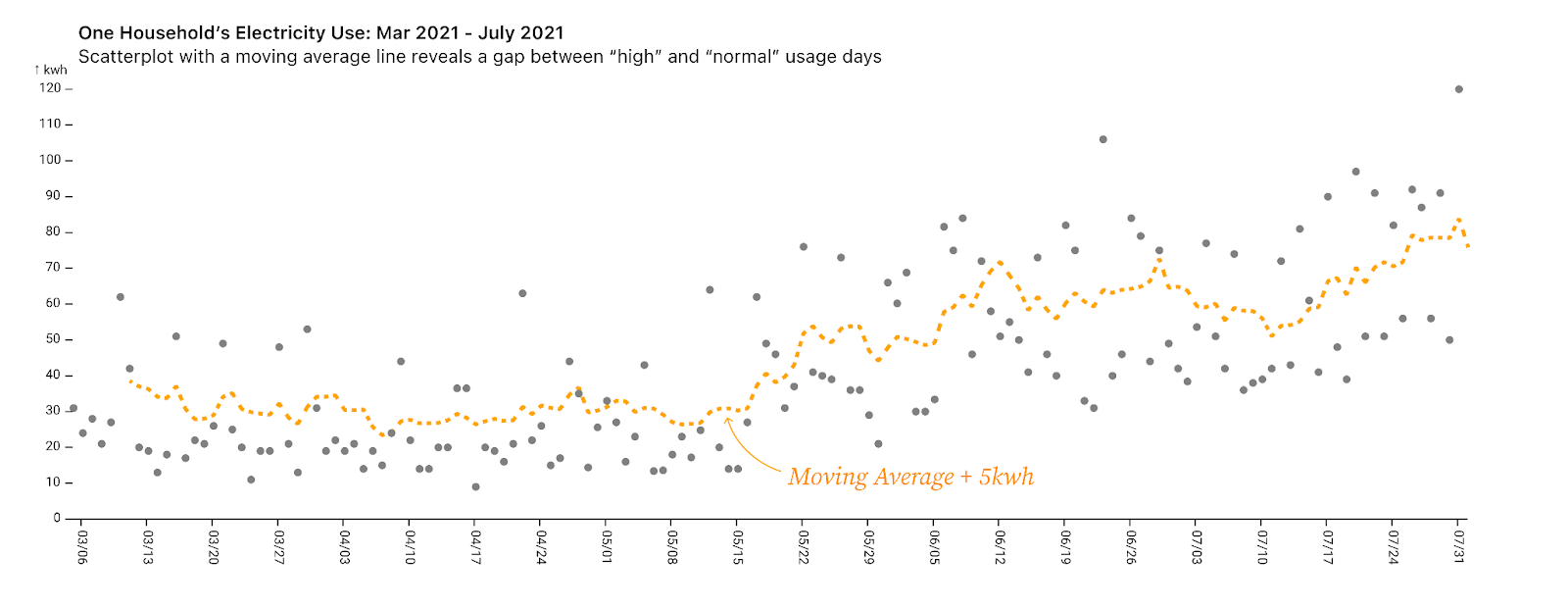
This line chart shows the daily energy use by a single household in Atlanta from March through July 2021. What do you notice? Lots of spikes? Higher energy use in the summer months?
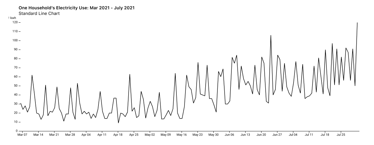
Switching to a scatterplot makes it more obvious that there are normal-energy days and also high-energy days. Drawing in a line for the moving average plus a (5kwh) buffermakes this split between “normal” and “high-energy” days more clear and shows that the gap is maintained even as energy use overall increases in the summer months.
Now that our exploratory data analysis has revealed two distinct categories (normal and high-energy), we can augment our data by using the moving average to define which points fall into each category. We can then color the points by those new classifications to make it easier to analyze.
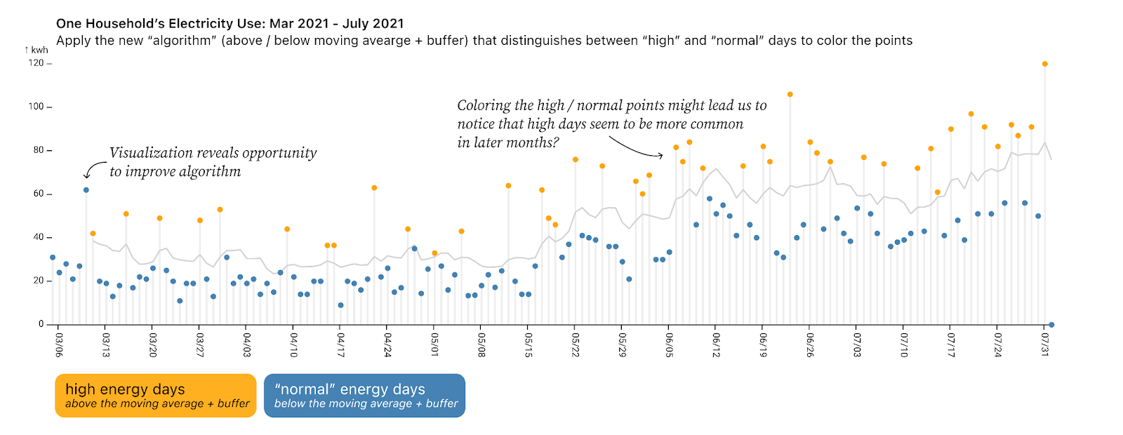
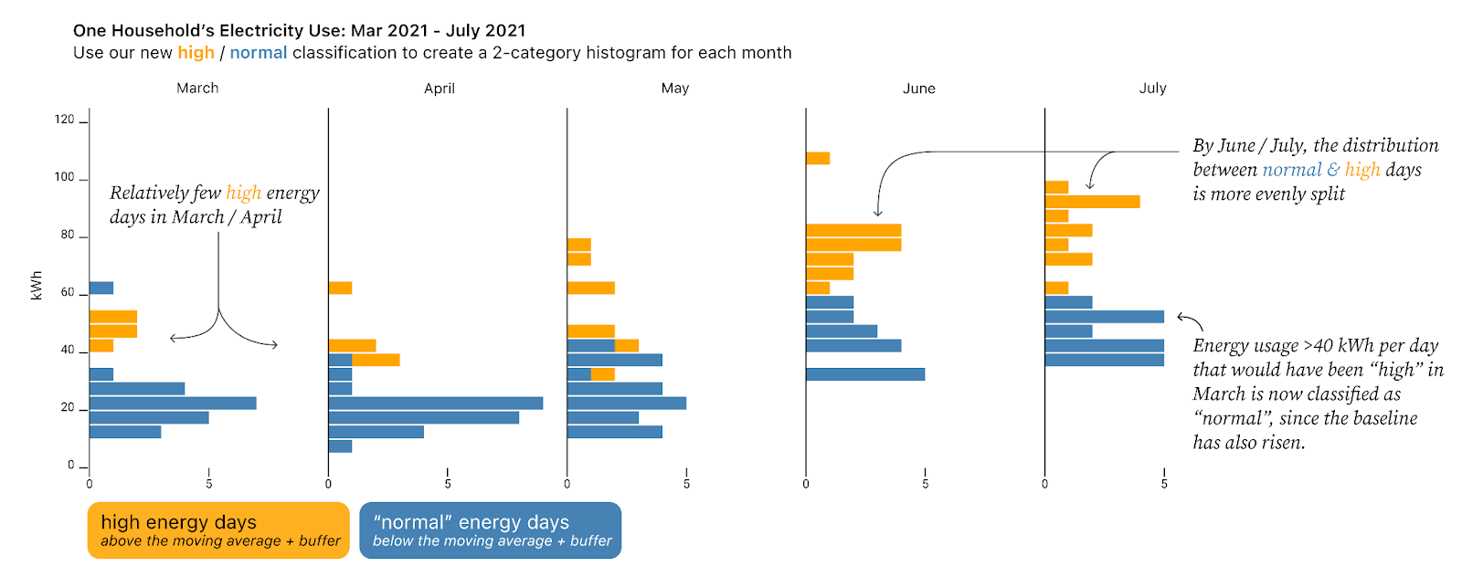
In this way, we complete the circle: we use visualization to notice a key feature of the data and leverage this insight to further classify our data, making the visualization easier to read. And we can take it a step further, continuing to analyze our data based on this classification by creating a histogram showing the frequency of high-energy vs. normal usage days by month. In this view, we can see that in the summer the amount of energy used on normal days went up, and that there were more high-energy days in June and July than in March and April (even after taking into account that the baseline energy usage also went up). Therefore, we can now say with confidence that overall energy consumption increased for two reasons: (1) baseline energy usage increased and (2) a higher percent of days were high-energy days.
This pattern of looking, then augmenting, then looking again using the classification can also reveal any issues with our classification, like the high point that occurred on our sixth day of data which is mislabeled because the moving average was not defined until the seventh day (as a trailing moving average). This gives us a chance to improve our classification algorithm.
While this example used a very simple algorithm of “moving average + 5kwh” to classify days as “normal” or “high-energy,” this cycle of “look, augment, look, refine classification” becomes more important for machine learning as our algorithms become more opaque.
3: Split your data into foreground and background
Split based on a time period of interest
We also dug into data on energy generated by fuel type in Texas in January and February of 2021, including a critical time period in February leading up to and during the rolling blackouts that were initiated to save the electricity grid from collapse following an unusual winter storm. In the analysis story, my colleague Ian faceted the data, creating a chart for each fuel type. This was quite effective: you can immediately see which fuels make up the bulk of energy in Texas, as well as some of the abnormal patterns in mid-February.
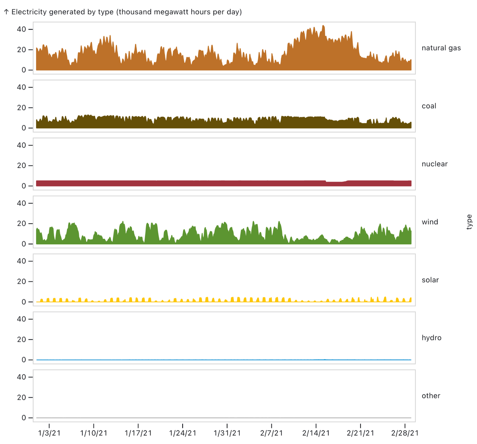
Knowing that the critical time period was around February 7 to February 21, Ian further focused attention on those two weeks by making the weeks before and after partially transparent and adding vertical gridlines. He might have been tempted to delete the data outside the period. After all, why waste space on data outside the time period of interest?
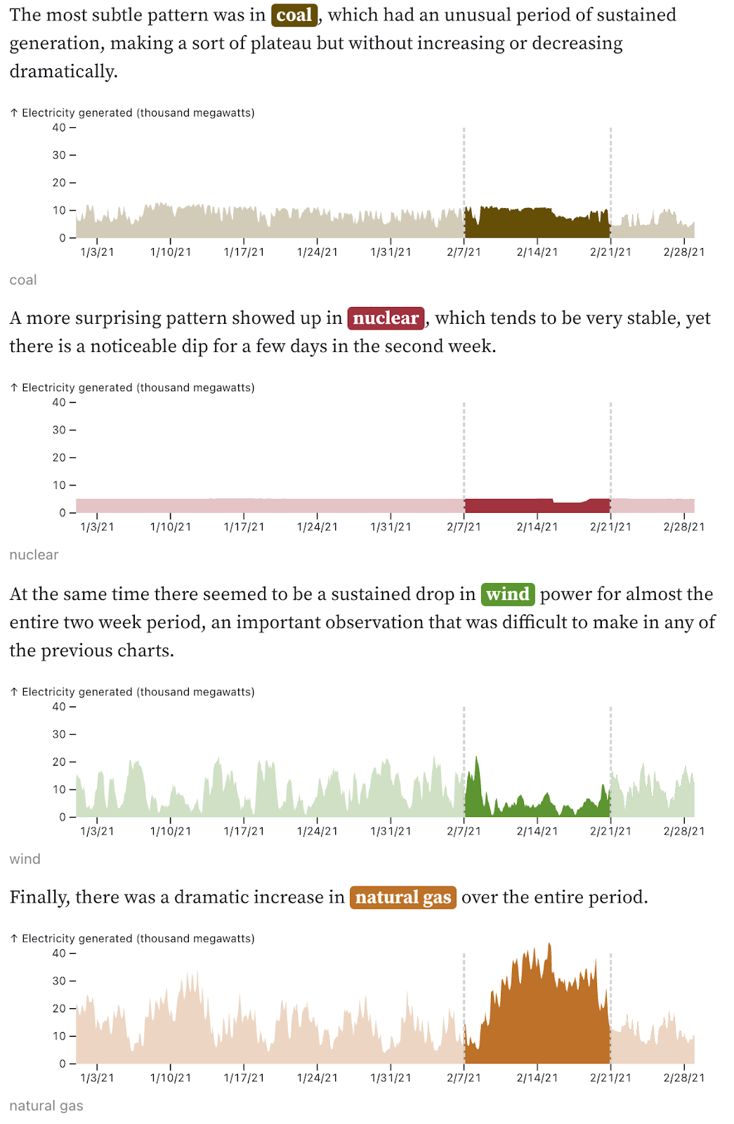
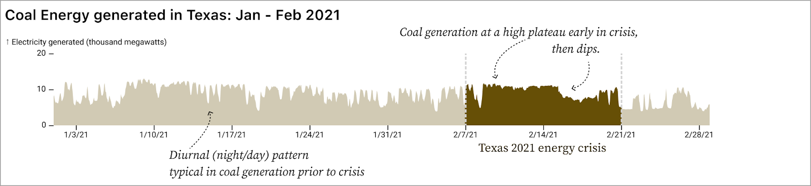
But it’s that granular background data that helps us understand what is so unusual for each fuel type during the critical time period. For example, in coal we’d notice the dip after February 15 regardless, but we need the data from January to notice how unusual the nearly flat plateau between February 1 and February 15 is. Similarly, the January and late-February data for nuclear shows how steady that fuel source typically is, helping us to understand just how strange the dip that we see after February 15 is.
Split by comparing each category of interest to the full dataset
When we want to know if there is a relationship between metric A and metric B, the first step is to create a scatterplot. For example, the scatterplot below shows the outdoor temperature and energy demand in Texas for each hour over the course of a year. It’s immediately clear that there is a strong relationship between temperature and energy use (even though that relationship is also obviously non-linear!).
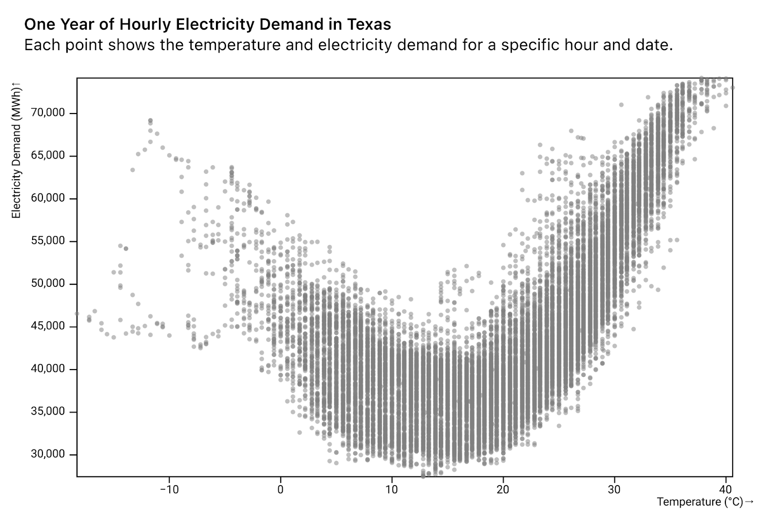
While there is clearly a correlation between temperature and electricity demand, it’s also clear that temperature doesn’t tell the whole story. For any given temperature, there is a roughly 10-15K MWh difference from minimum to maximum energy use. Knowing that in our own homes we crank the thermostat a lot higher on a cold afternoon than on a cold night, we guessed that the hour of day could play a key role in the relationship between temperature and energy use.
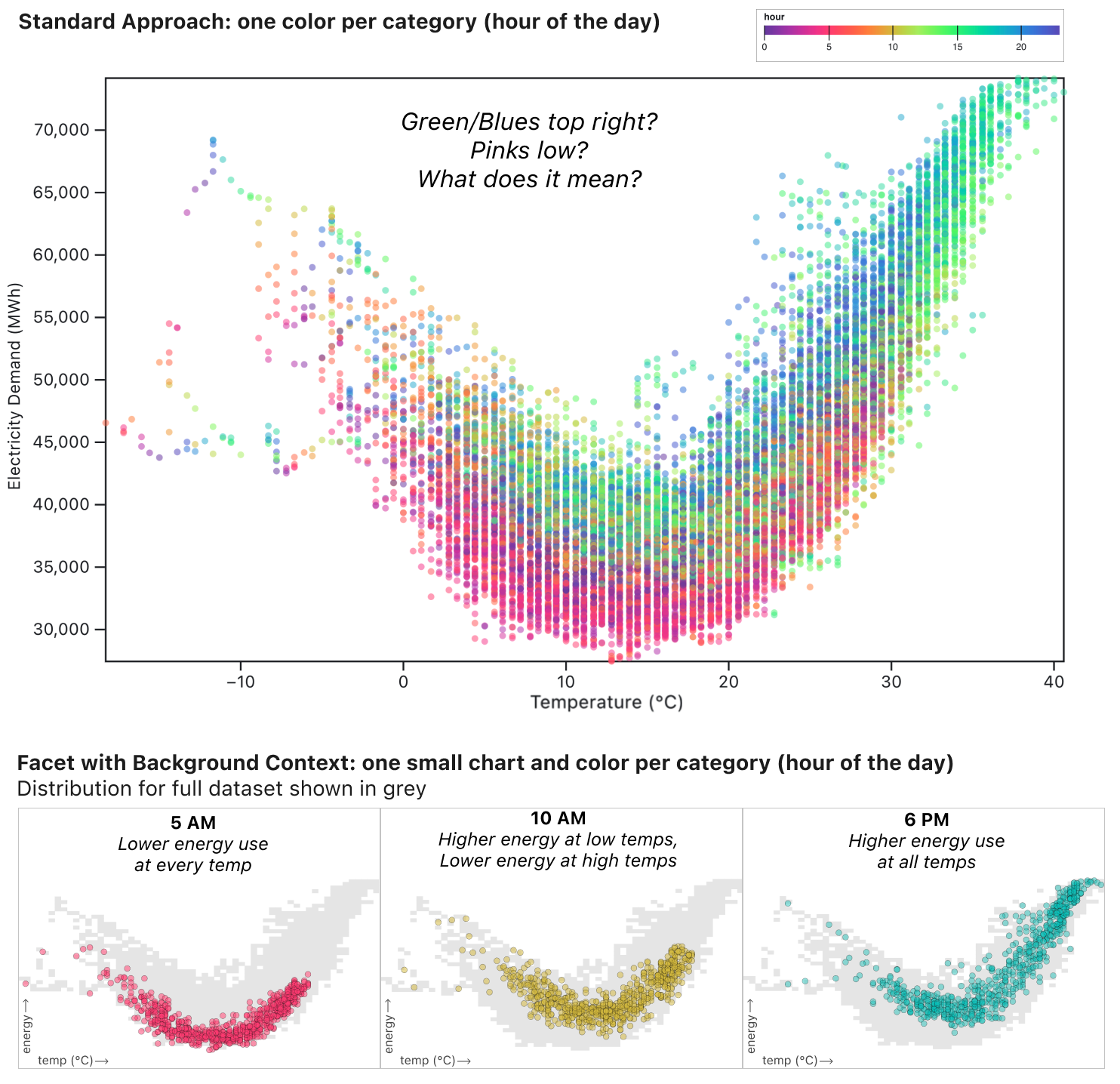
The standard approach to adding an additional category to a scatterplot is to apply a categorical color, thereby comparing everything to everything (comparing all hours, temperatures, and energy demand in one chart). If we do that, we do see that something is going on. More greens and blues in the top right, more pinks low. But to understand what the colors refer to, you have to look back and forth between the legend and the data a lot. Moreover, it’s impossible to answer a question like, “What’s the relationship between temperature and energy at 10am?” Or, “How does early morning compare to evening?
Instead we can apply two techniques: grouping and splitting the data into foreground and background.
In the three charts below, the dots representing 5am, 10am, and 6pm are colored brightly. Meanwhile, the entire dataset is shown in grey in the background. This gives us the context to see the relationship between temp and energy for each hour, and see that in the context of the full dataset.
By specifically comparing “5am” to “all other times of day,” we can see that 5am is relatively low energy use regardless of temperature (and temperatures are never very high at 5am). Meanwhile, at 6pm energy use is generally higher at all temperatures.
10am is in some ways the most interesting: at lower temperatures (in the left half of the graph) the yellow dots are relatively high compared to the grey dots, indicating high energy use relative to other hours of the day at the same temperature. Meanwhile, for high temperatures on the right half of the graph, the yellow dots hug the bottom of the grey area. At hot temperatures, relatively little energy is used at 10am compared to the rest of the day. This type of insight is made possible not just by grouping, but also by using the full “noisy” dataset as a consistent background providing context for all the faceted charts.
Summary: Embrace the complexity of your data
In the course of creating the Analyzing Time Series Data collection, Ian Johnson, Mike Freeman, and I employed a range of strategies to embrace the complexity of the data instead of relying on standard methods that aggregate it away. Those frustratingly jagged lines are the signal, not the noise.
We embraced complexity by:
- Rearranging data to compare “like to like.”
- Augmenting our data based on the concepts that we know matter and on what we discovered in the data.
- Using the larger dataset to provide background context for the data of interest (the foreground).
These approaches are especially powerful for time series data because the underlying daily, weekly, and seasonal patterns can feel so distracting. In particular, consider how these strategies might power real-time data analysis by putting incoming data in a richer historical context for quick visual pattern-matching to identify normal vs. worrisome patterns. At the same time, these foundational techniques also apply to any data that can feel overwhelming and noisy, like machine learning classifications or data resulting from high-throughput scientific experiments.
After seeing each of these techniques in action, perhaps the next time you are about to aggregate your data in order to simplify it, you might instead try to rearrange, augment, or split your data into foreground/background. See the data in its full context to reveal unexpected patterns and prompt new data-driven questions. Embrace complexity by (literally) changing how you look at your data.