On the Stack Exchange Network, getting a custom subject-relevant site design used to be a benefit of the site graduating. As Stack Overflow, the company, grew and matured, the problems that the design team needed to focus on grew in number and in scope. This meant that there was less time to focus on creating themes for Stack Exchange sites. Eventually, the backlog became overwhelming.
Thanks to the hard work of the Stacks team, we have been able to do something at Stack Overflow that we haven’t been able to do in a very long time—theme Stack Exchange sites. How is this possible you might ask? Well, the creation of the design system first and foremost, but the icing on this cake is Stacks v1.0. It introduced a feature we call theming—this makes creating and building designs much simpler for designers and developers.
At its core, theming is simply the extended use of a primary and secondary color. Our design system takes these colors and creates gradations labeled between 050 and 900, with the pure version of the color being around 400 or 500. This is a simplified example of how we generate the gradation, but conceptually, it looks something like this:
@theme-primary-color: #F48024;
@theme-primary-color-050: tint(@theme-primary-color, 80%);
@theme-primary-color-100: tint(@theme-primary-color, 60%);
@theme-primary-color-200: tint(@theme-primary-color, 40%);
@theme-primary-color-300: tint(@theme-primary-color, 20%);
@theme-primary-color-400: @theme-primary-color;
@theme-primary-color-500: darken(@theme-primary-color, 20%);
@theme-primary-color-600: darken(@theme-primary-color, 30%);
@theme-primary-color-700: darken(@theme-primary-color, 50%);
@theme-primary-color-800: darken(@theme-primary-color, 75%);
@theme-primary-color-900: darken(@theme-primary-color, 80%);
One of these colors is then automatically plugged into our design components, creating a faster way to theme a site. We tested the flexibility of this feature at scale during our April Fools prank this year. Now that we had the tools we needed to get through theming faster, we had to find folks to do the work and prioritize the backlog.
Attacking the backlog
Designers at Stack Overflow work on a variety of projects. In order to advance design and work on things that matter to designers, we work under what we call a “guild.” Every quarter, members of the design guild suggest a project that they would like to work on for that quarter. Members then vote on projects that mean the most to them. After I experienced designing the Frisa Lank theme for Filters on Stack Overflow, I really wanted to use this to give back to the community. I made sure the Community Managers were on board, and threw it onto our suggestion board. I was happy to see that a lot of our designers agreed with me—it was time to theme some communities!
Catija, our CM rep for the project, was excited to join the effort and helped make our backlog less intimidating. She did this by prioritizing the sites that still needed themes using the following factors: time since leaving beta, question volume, answer volume, total site users, daily visits, and questions per day. It was a great method because the sites waiting the longest also happened to be the sites near the top of her prioritization list..
I then took Catija’s prioritized list and offered it to the designers. I asked them to select subjects that interested them, but to give weight to the order in which they showed up on the list. Our communities are passionate about the subjects they engage in, and we felt it was important to have a designer that felt a connection to the subject they were designing.
Design and Community working together
While the designers selected their sites, I created a process on how we would move forward. This process started with designers selecting at least one site that they wanted to work on—without prompt, each designer actually selected two sites!
Next, the Community Manager and designer would work together to ask their selected site for input on their designer. Each site would have a week to give feedback.
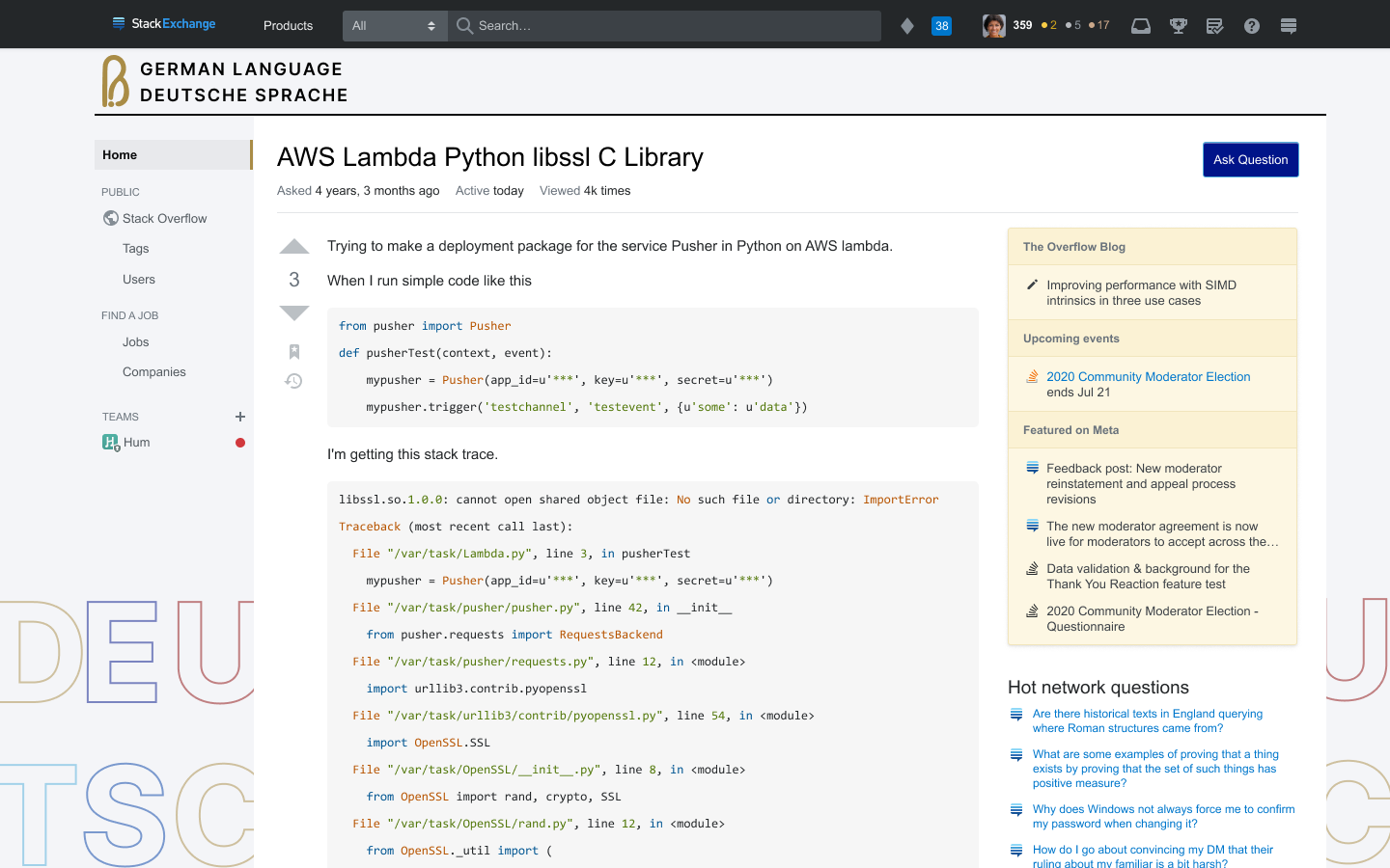
The German Language site was incredibly involved in the creation of their theme. They wanted a professional design that was inclusive of all countries that spoke German. The designer for this theme took their input seriously and worked toward creating a comprehensive design, pulling inspiration from flag colors, German typography, and literature.

"I gathered extensive feedback from the community and landed on a theme that met their goals of simplicity, professionalism, and inclusive of all German speakers. We referenced colors from all six German-speaking nations and used outlined letters in Meta—as Meta is an outline of the main site, technically speaking. The logo was created by one of the most active mods and is a nod to the German letter ß."
Katie, Product Designer on Community Products.
Once the inspiration was gathered from the site, the designer would get to work. Most designers worked directly with the code to build the designs. At a minimum, designers were asked to create a logo, color scheme to be used for buttons, links, background, and footer, as well as a corresponding meta theme. A lot of designers decided to also explore tag colors, badge icons, and error page artwork. While we originally wanted to also tackle the chat design, this was cut from our scope due to it not being visible on our designers' local environments.
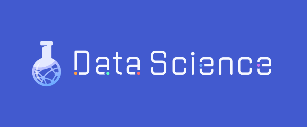
The designer tackling the Data Science theme knew that he wanted to create an intersection of math, science, and data. He understood the community wanted to stand out from similar SE sites, while remaining modern, clean, and simple.


“I think the fun part about designing this theme was to find an interesting idea that would illustrate concepts seen in data science into visuals that could be understood by the community as representative, unique, and reminiscent of their day-to-day.”
Simon, Senior Product Designer on Community Products.
Once the design was completed, the designer once again worked with a Community Manager to gather one round of feedback from the community, open for a week, before performing one last iteration. The designer and CM both went through the feedback to see exactly what could be incorporated into any changes.
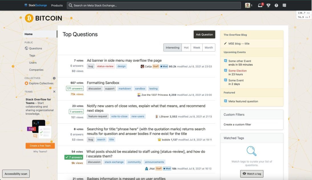
The first iteration of the Bitcoin theme included a simple connection of dots used in the background as a representative of blockchain nodes and a slightly altered Bitcoin logo. The community had a lot of feedback in regards to their design.The designer was able to assess the feedback alongside a community manager and come out with a design that better suited the subject matter and the audience.

“Our main focus was asking and understanding what the community wanted for the redesign of their site. To achieve this, the design and Community teams worked together to properly communicate and gather feedback we could use to successfully deliver a unique design for each of the communities”
Jose, Product Designer on Community Products.
After the designer’s final iteration, a pull request was sent to the design system team to ensure that the theming page was being used correctly. This part is still in progress, so when this PR gets approved, it then goes to a product developer to review a checklist to get the site pushed to production. We should see some of our first sites go out soon, including my design for Ethereum!


We are very excited to finally be able to give back to the communities that mean so much to us. I want to thank everyone who was involved in this endeavor, including our Consumers developers, our Stacks developers, our CMs with special mention to Catija for all of her support and attention. Finally, below you’ll see our full list of sites that were chosen and the designer that “adopted” them in an effort to show gratitude to each and every one of them.
Jake: Gardening and Landscaping, Islam
Jose: Bitcoin, Spanish Language
Katie: German Language, French Language
Paul: Arduino, Sound Design
Phoebe: Motor Vehicle Maintenance and Repair, Writing
Piper: Ethereum, Quantitative Finance
Simon: Data Science, Philosophy
The design guild is going to pause working on themes for the next quarter so we can shift our focus to accessibility, but we hope to be back soon, delivering more themes to our loyal Stack Exchange communities.
