[Ed. note: While we take some time to rest up over the holidays and prepare for next year, we are re-publishing our top ten posts for the year. Please enjoy our favorite work this year and we’ll see you in 2023.]
Images are one of the most pervasive parts of the web. This isn’t a huge surprise as we humans are quite visual and the <img> tag has been around for almost 30 years. Images are so prominent that they are part of the most important content in over ~70% of pages on both mobile and desktop according to the largest contentful paint metric. We like images over on the Stack Overflow blog too.
The humble <img> element has gained some superpowers since it was created. Given how central it is to image optimization on the web, let’s catch up on what it can do and how it can help improve user-experience and the Core Web Vitals.
First, some tips to get us started optimizing our metrics:
- For a fast Largest Contentful Paint:
- Request your key hero image early
- Use
srcset+ efficient modern image formats - Avoid wasting pixels (compress, don’t serve overly high DPR images)
- Lazy-load offscreen images (reduce network contention for key resources)
- For a low Cumulative Layout Shift:
- Set dimensions (width, height) on your images
- Use CSS
aspect-ratioor aspect ratio boxes to reserve space otherwise
- For low impact to First Input Delay:
- Avoid images causing network contention with other critical resources like CSS and JS. While not render-blocking, they can indirectly impact render performance.
Note: Modern image components that build on <img>, like Next.js <Image> (for React) and Nuxt image (for Vue) try to bake in as many of these concepts as possible by default. We’ll cover this later. You can of course also do this manually just using the <img> element directly. If using 11ty for your static sites, try the 11ty high-performance blog template.
Image impact on user-experience and the Core Web Vitals
You may have heard of Core Web Vitals (CWV). It’s an initiative by Google to share unified guidance for quality signals that can be key to delivering a great user-experience on the web. CWV is part of a set of page experience signals Google Search will be evaluating for ranking. Images can impact the CWV in a number of ways.
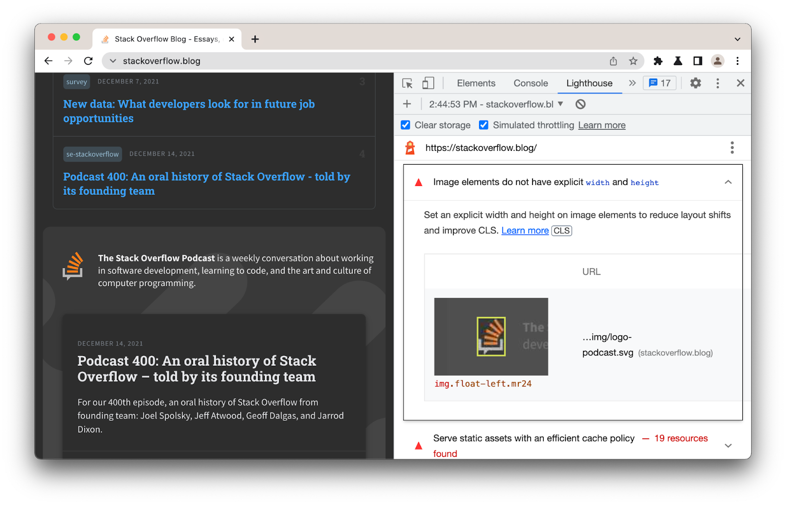
In this guide, we will be using Lighthouse to identify opportunities to improve the Core Web Vitals, walking through optimizations for each metric. Lighthouse is an open-source, automated tool for improving the quality of web pages. You can find it in the Chrome DevTools suite of debugging tools and run it against any web page, whether public or requiring authentication. You can also find Lighthouse in PageSpeed Insights, CI, and WebPageTest.
Keep in mind that Lighthouse is a lab tool. While great for looking at opportunities to improve your user-experience, always try to consult real-world data for a complete picture of what actual users are seeing.
Cumulative Layout Shift
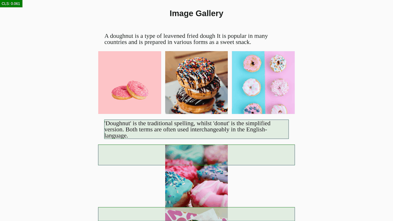
Layout shifts can be distracting to users. Imagine you've started reading an article when all of a sudden elements shift around the page, throwing you off and requiring you to find your place again. Cumulative Layout Shift (CLS) measures the instability of content. The most common causes of CLS include images without dimensions (see below), which can push down content when they load and snap into place. Ignoring them means the browser may not be able to reserve sufficient space in advance of them loading.
The basics
To place an image on a web page, we use the <img> element. This is an empty element—it has no closing tag—that requires a minimum of one attribute to be helpful: src, the source file for the image. If an image is called “keyboard.jpg” and it exists in the same path as your HTML document, it can be embedded as follows:
<img src="keyboard.jpg">
To ensure our image is accessible, we add the alt attribute. The value of this attribute should be a textual description of the image, and is used as an alternative to the image when it can’t be displayed or seen; for example, a user accessing your page via a screen reader. The above code with an alt specified looks as follows:
<img src="keyboard.jpg"alt="A beautiful pink keyboard.">
Next, we add width and height attributes to specify the width and height of the image, otherwise known as the image’s dimensions. The dimensions of an image can usually be found by looking at this information via your operating system’s file explorer (Cmd + I on macOS).
<img src="keyboard.jpg"
    alt="A beautiful pink keyboard."
    width="400"
    height="400">
When width and height are specified on an image, the browser knows how much space to reserve for the image until it is downloaded. Forgetting to include the image’s dimensions can cause layout shifts, as the browser is unsure how much space the image will need.
Modern browsers now set the default aspect ratio of images based on an image’s width and height attributes, so it’s valuable to set these to prevent such layout shifts.
Identify layout shifts from images without dimensions
To limit Cumulative Layout Shifts from images without dimensions, include width and height attributes on your images and video elements. This approach ensures that the browser can allocate the correct amount of space in the document while the image is loading. Lighthouse will highlight images without a width and height:
Largest Contentful Paint
In many modern web experiences, images tend to be the largest visible element when a page completes loading. These include hero images and images from carousels, stories, and banners. Largest Contentful Paint (LCP) is a Core Web Vitals metric which measures when the largest contentful element (images, text) in a user’s viewport, becomes visible. This allows a browser to determine when the main content of the page has finished rendering.
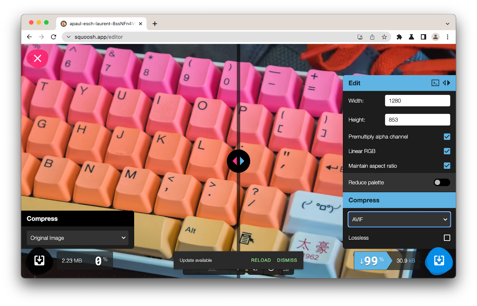
When an image is the largest contentful element, how slowly the image loads can impact LCP. In addition to applying image compression (e.g. using Squoosh, Sharp, ImageOptim or an image CDN) and using a modern image format, you can tweak the <img> element to serve the most appropriate responsive version of an image or lazy-load it.
Identify the Largest Contentful Paint element
Lighthouse has a “Largest Contentful Paint element” audit that identifies what element was the largest contentful paint. Hovering over the element will highlight it in the main browser window.
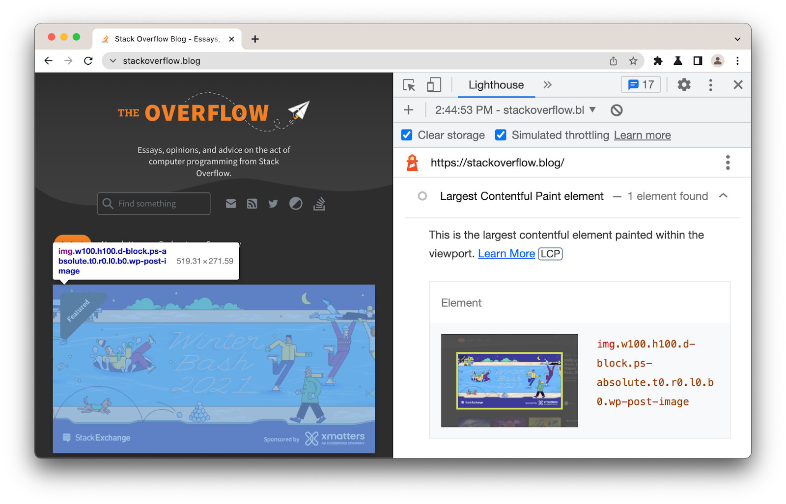
If this element is an image, this information is a useful hint you may want to optimize the loading of this image.
Hovering over an image in the Chrome DevTools Elements panel will display the dimensions of the image as well as the image’s intrinsic size.

Responsive images
What about switching image resolution? A standard <img> only allows us to supply a single source file to the browser. But with the srcset and sizes attributes we can provide many additional source images (and hints) so the browser can pick the most appropriate one. This allows us to supply images that are smaller or larger.
<img src="keyboard-800w.jpg"
    alt="A beautiful pink keyboard."
    width="400"
    height="400"
    srcset="keyboard-400w.jpg 400w,
            keyboard-800w.jpg 800w"
    sizes="(max-width: 640px) 400px,
            800px">
The srcset attribute defines the set of images the browser can select from, as well as the size of each image. Each image string is separated by a comma and includes: a source filename (keyboard-400w.jpg); a space; and the image’s intrinsic width specified in pixels (400w), or a pixel density descriptor (1x, 1.5x, 2x, etc.).
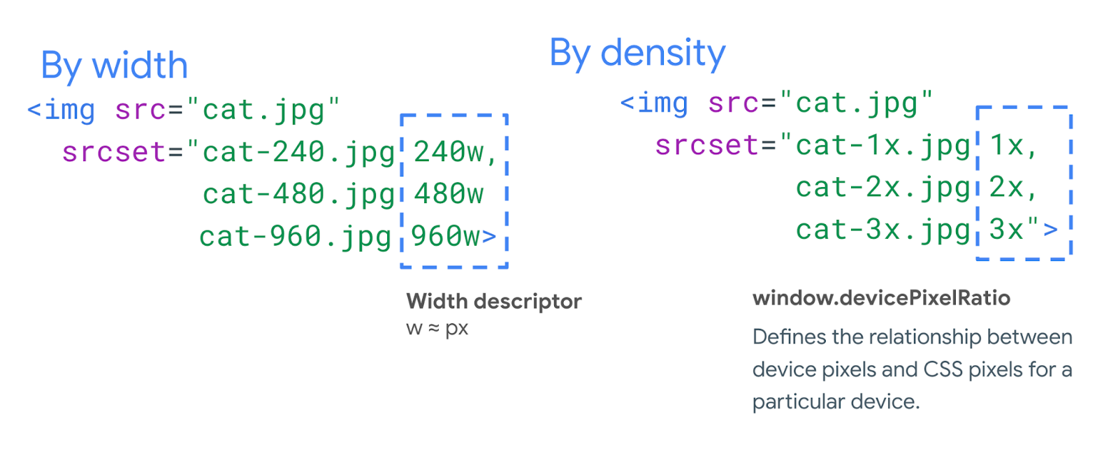
The sizes attribute specifies a set of conditions, such as screen widths, and what image size is best to select when those conditions are met. Above, (max-width:640px) is a media condition asking “if the viewport width is 640 pixels or less,” and 400px is the width the slot the image is going to fill when the media condition is true. This typically corresponds to the page’s responsive breakpoints.
Device Pixel Ratio (DPR) / Pixel density capping
Device Pixel Ratio (DPR) represents how a CSS pixel is translated to physical pixels on a hardware screen. High resolution and retina screens use more physical pixels to represent CSS pixels for imagery that is sharper and has more detailed visuals.
The human eye may not be capable of distinguishing the difference between images that are a 2x-3x DPR vs. an even higher-resolution. Serving overly high DPR images is a common problem for sites leveraging <img srcset> and a suite of image sizes.
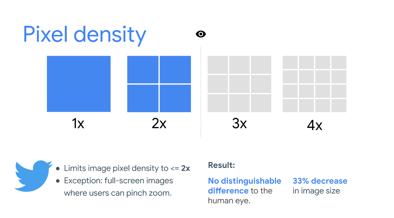
It may be possible to use DPR-capping to serve your users an image at a 2x or 3x fidelity to prevent large image payloads. Twitter capped their image fidelity at 2x, resulting in 33% faster timeline image loading times. They found that 2x was a sweet spot of both good performance wins with no degradation in quality metrics.
Note: This approach to DPR-capping is currently not possible if using “w” descriptors.
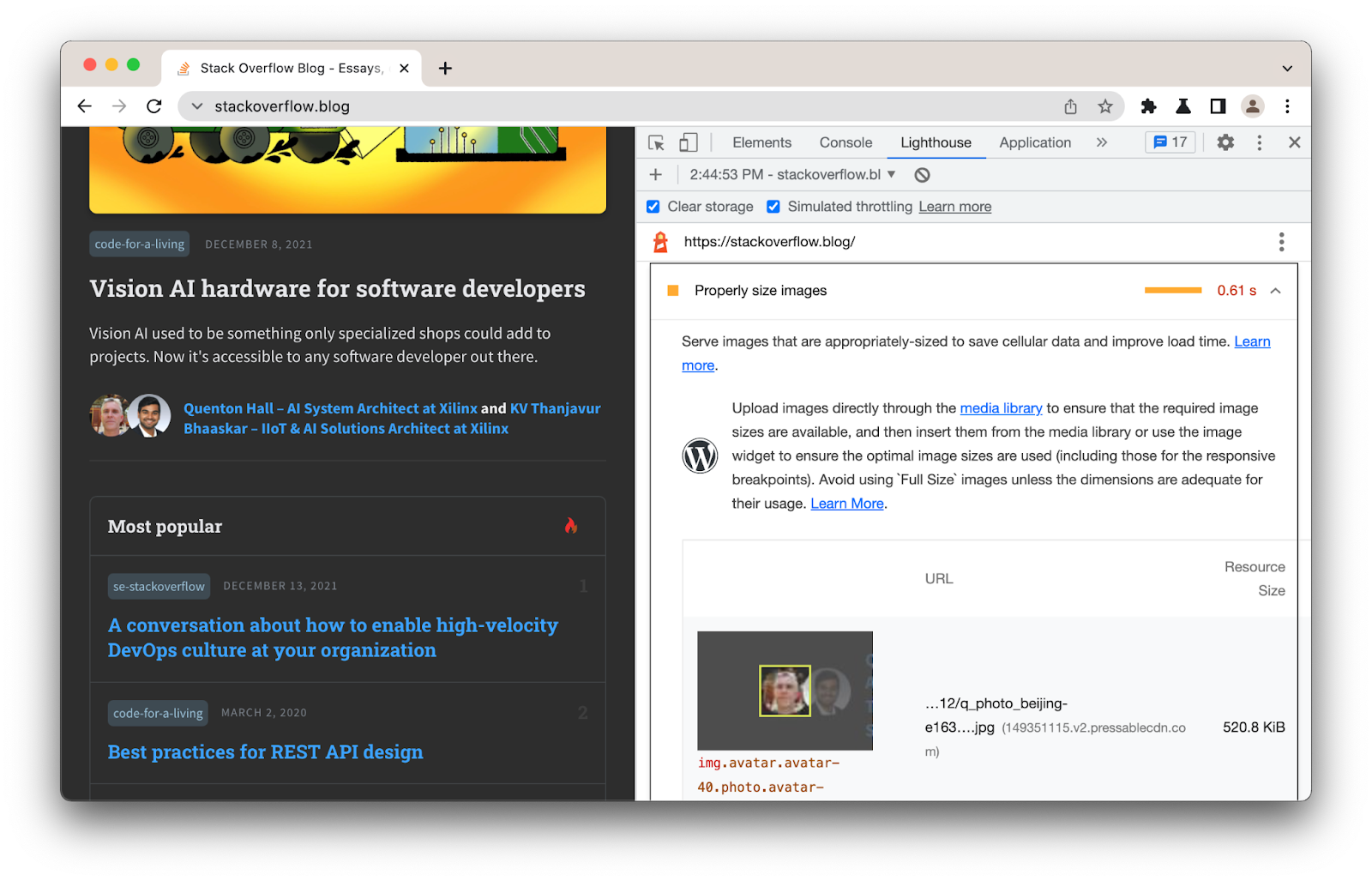
Identify images that can be better sized
Lighthouse includes a number of image optimization audits for helping you understand if your images could be better compressed, delivered in a more optimal modern image format or resized.
Even those images that are responsive (that is, sized relative to the viewport) should have width and height set. In modern browsers, these attributes establish an aspect ratio that helps prevent layout shifts, even if the absolute sizes are overridden by CSS.
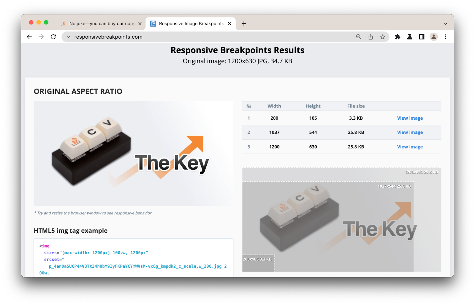
When not using an image CDN or framework, I like to use responsivebreakpoints.com to determine the optimal image breakpoints and generate <img> srcset code for my responsive images.
Serving modern image formats
Art direction allows us to serve different images depending on a user’s display. While responsive images load different sizes of the same image, art direction can load very different images based on the display.
The browser can choose which image format to display using the <picture> element. The <picture> element supports multiple <source> elements and a single <img> element, which can reference sources for different formats including AVIF and WebP.
<picture>
    <source srcset="keyboard.avif" type="image/avif">
    <source srcset="keyboard.webp" type="image/webp">
    <source srcset="keyboard.jpg" type="image/jpeg">
    <img src="keyboard.jpg" alt="Omg a keyboard">
</picture>
In this example, the browser will begin to parse the sources and will stop when it has found the first supported match. If no match is found, the browser loads the source specified in <img> as the fallback.
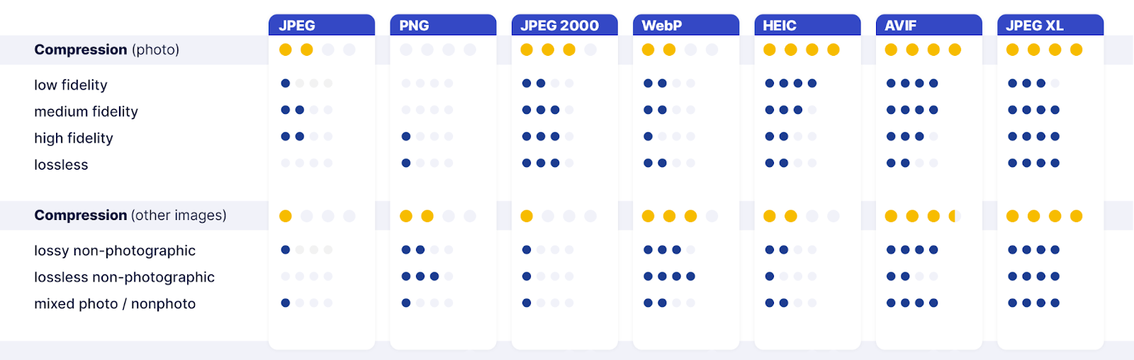
Understanding the myriad of image format options out there today can be a confusing process, but you may find Cloudinary’s comparison of modern image formats helpful:
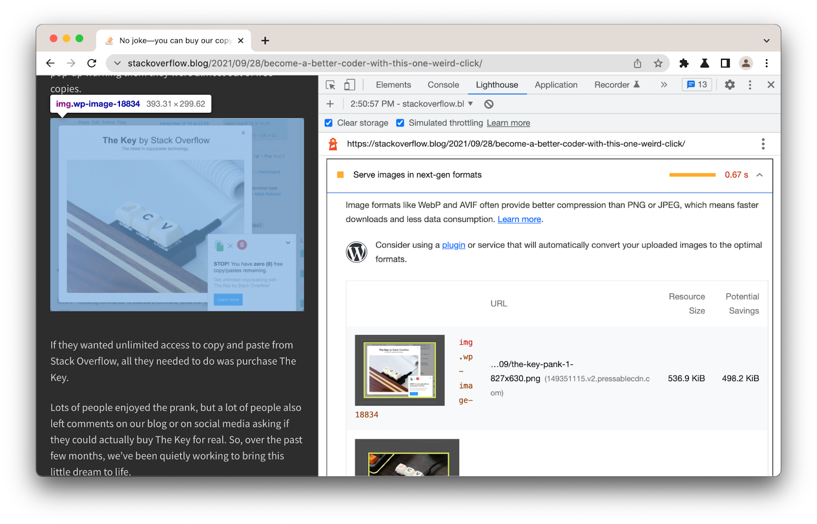
Identify images that could be served in a more modern format
Lighthouse highlights potential savings from serving images in a next-generation format.
I also enjoy using Squoosh for its support of bleeding-edge formats, such as JPEG XL, as it offers a low-friction way to experiment with modern formats outside of a CLI or CDN.
There are multiple ways to approach sizing issues as both srcset and sizes are both usable on <picture> and <img>. When in doubt, use <img> with srcset/sizes for single images that have a simple layout. Use <picture> for serving multiple formats, complex layout, and art direction.
caniuse has the latest browser support details for WebP, AVIF and JPEG XL.
Content negotiation
An alternative to manually handling image format selection using <picture> is to rely on the Accept header. This is sent by the client, allowing the server to deliver an image format that is a best-fit for the user. CDNs such as Akamai, Cloudinary, and Cloudflare support it.
Request your image early
If you are optimizing LCP, preload can help boost how soon late-discovered hero images (e.g such as those loaded by JavaScript or background hero images in CSS) are fetched. Where possible, attempt to solve this by better minimizing the request chains to your LCP image so that the browser doesn’t need to first fetch, parse, and execute JavaScript or wait for a component to render/hydrate to discover the image.
You can use <link rel=preload> with <img> to allow browsers to discover critical resources you want to load as soon as possible, prior to them being found in HTML.
<link rel="preload" as="image" href="keyboard.jpg">
Note: Use preload sparingly and always measure its impact in production. If the preload for your image is earlier in the document than it is, this can help browsers discover it (and order relative to other resources).
Preload can be used to fetch sources for an <img> of a particular format:
<link rel="preload" as="image" href="keyboard.webp" type="image/webp">
Preload can also be used to fetch responsive images so the correct source is discovered sooner:
<link rel="preload" as="image"
     href="keyboard.jpg"
     imagesrcset="
        poster_400px.jpg 400w,
        poster_800px.jpg 800w,
        poster_1600px.jpg 1600w"
    imagesizes="50vw">
Placeholders
What if you would like to show the user a placeholder while the image loads? The background-image CSS property allows us to set background images on an element, including the <img> tag or any parent container elements. We can combine background-image with background-size: cover to set the size of an element’s background image and scale the image as large as possible without stretching the image.
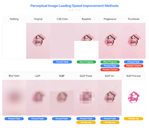
Placeholders are often inline, Base64-encoded data URLs which are low-quality image placeholders (LQIP) or SVG image placeholders (SQIP). This allows users to get a very quick preview of the image, even on slow network connections, before the sharper final image loads in to replace it.
<img src="donut-800w.jpg"
    alt="A delicious donut"
    width="400"
    height="400"
    srcset="donut-400w.jpg 400w,
            donut-800w.jpg 800w"
    sizes="(max-width: 640px) 400px,
            800px"
    loading="lazy"
    decoding="async"
    style="background-size: cover;
            background-image:
              url(data:image/svg+xml;base64,[svg text]);">
Note: Given that Base64 data URLs can be quite long, [svg text] is denoted in the example above to improve readability. The decoding attribute above is also used to signal a preference between synchronous and asynchronous image decoding.
With an inline SVG placeholder, here is how the example from earlier now looks when loaded on a very slow connection. Notice how users are shown a preview right away prior to any full-size images being downloaded:
There are a variety of modern solutions for image placeholders (e.g CSS background-color, LQIP, SQIP, Blur Hash, Potrace).
First Input Delay
It’s possible for images to block a user’s bandwidth and CPU on page load. They can get in the way of how critical resources are loaded, in particular on slow connections and lower-end mobile devices leading to bandwidth saturation. First Input Delay (FID) is a Core Web Vitals metric that captures a user's first impression of a site's interactivity and responsiveness. By reducing main-thread CPU usage, FID can also be reduced.
Image lazy loading
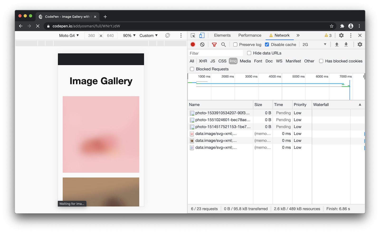
What about offscreen images that are not visible until a user scrolls down the page? There may not be value in eagerly loading lots of images a user may never see, especially if it slows loading more critical content they see earlier on in the page. In the example below, all the images on the page are “eagerly loaded” (the default in browsers today), causing the user to download 1.1 MB of images. This can cause users’ data plans to take a hit in addition to affecting performance.
Using the loading attribute on <img>, we can control the behavior of image loading. loading="lazy" lazy-loads images, deferring their loading until they reach a calculated distance from the viewport. Setting loading="eager" loads images right away, regardless of their visibility in the viewport. The default is eager, so it doesn’t need to be explicitly added (that is, just use <img> for eager loading).
Below is an example of lazy-loading an <img> with a single source:
<img src="donut.jpg"
alt="A delicious pink donut."
loading="lazy"
width="400"
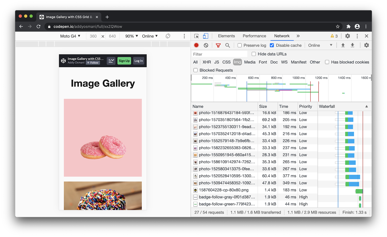
height="400">With native <img> lazy-loading, the earlier example now downloads only about 90 KB of images! Just adding loading="lazy" to our offscreen images has a huge impact. You ideally want to lazy-load all images present outside of the initial viewport and avoid it for everything within the initial viewport.

Lazy loading also works with images that include srcset:
<img src="donut-800w.jpg"
alt="A delicious pink donut"
width="400"
height="400"
srcset="donut-400w.jpg 400w,
donut-800w.jpg 800w"
sizes="(max-width: 640px) 400px,
800px"
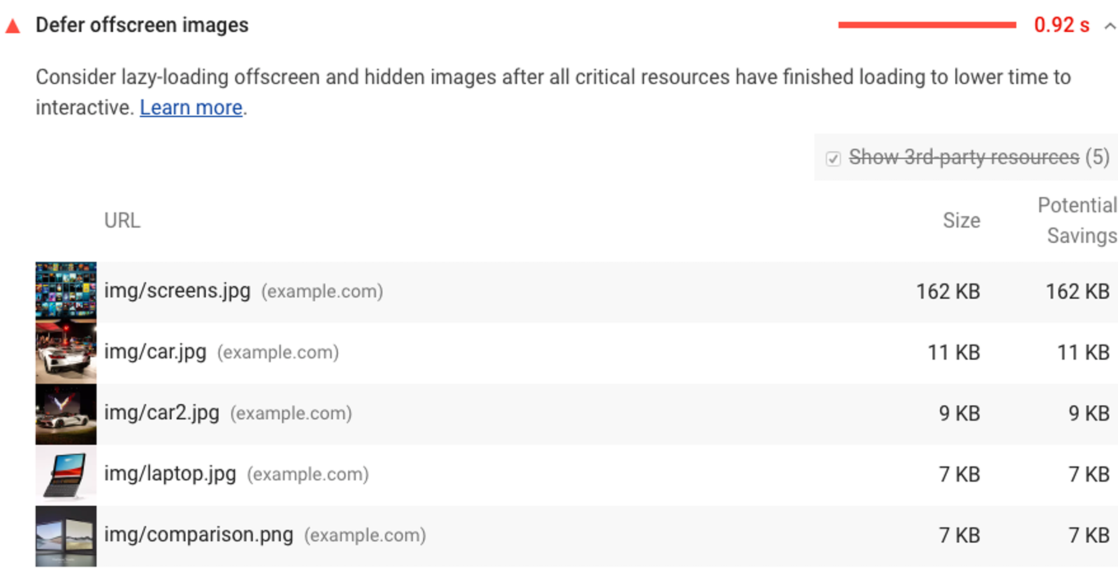
loading="lazy">The Opportunities section of Lighthouse lists any offscreen or hidden images on a page that can be lazy-loaded as well as the potential savings from doing so.
Conclusions
Images are key to delivering a great experience on the web. Hopefully you’ve learned something useful about how far the <img> element has evolved. When in doubt, test it out and see what tools like Lighthouse suggest might be opportunities to deliver an even more amazing image loading experience than you are today.
If you’re interested in learning more, I recently published a new book called Image Optimization that covers advanced image optimization techniques that can help make your images on the web shine.