This post refers to "Channels", a product which is now called "Teams." This post is part of a series on how we’re making Channels, the thinking behind the product, and insight into the process. Read “How We’re Designing Channels” and “Why Channels” for more background info. In his post, How We’re Designing Channels, Kurtis wrote that this project required a change to Stack Overflow’s information architecture. We created several prototype navigations, narrowed to two, and tested with a group of users. This brought us to the following design direction, with content navigation on the left side:
We’re confident that this design will serve Channels users, but what about the greater Stack Overflow, Stack Exchange communities, and Enterprise? Our design explorations were guided by the following questions:
- How will the new information architecture support existing Stack Overflow users? How will it impact important workflows like reviewing posts or answering questions?
- How will this scale to Stack Overflow Enterprise and the Stack Exchange network sites? How can people transition seamlessly between Stack Overflow and other sites without having to learn new patterns?
- What about people using smaller screen sizes? Adding a vertical left navigation increases the page width, and how will we support people across a range of screen sizes and devices?
- Is the new information architecture inclusive and accessible? How will this impact people using screen readers or with other accessibility needs? How can we leverage this moment of change to improve the site’s accessibility?
- How will the new information architecture scale as the site grows and changes over time?
In this post, I’ll talk about our approach to answering these questions. First, though, I want to step back and explain why it’s important for us to be thinking about these needs simultaneously.
Background
You may remember that we updated the navigation design last year. Our approach was to focus on the already complex needs of Stack Overflow, and solve Enterprise and network site solutions soon after. Through that project, we learned that - despite many similar or overlapping use cases - there were major differences that were not easy to resolve. As a result, it took us longer than expected to ship navigation to network sites, and we still haven’t updated Enterprise sites. This means there’s been extended or unresolved fragmentation between Stack Overflow and our other sites. This is problematic because there’s a lot of overlap between people using Stack Overflow, Enterprise, and network sites. For example, about 70% of users joining network sites already have a Stack Overflow account. More generally, fragmentation means that shipping basic improvements to Enterprise and network sites becomes increasingly costly as differences accumulate over time. This time, we wanted to make sure that we were considering Enterprise and network site use cases early, as well as ensuring that basic improvements like accessibility and responsiveness can benefit our 150+ communities and Enterprise clients as quickly as possible.
How We’re Addressing These Needs
We started by broadly considering use cases across our product offerings: Stack Overflow, network sites, Enterprise, and soon - Channels. This approach helps us avoid fragmentation and allows improvements to flow quickly to all of our users. I’ll explore these use cases in further detail below. First, here’s a recap of the basic design solution, with content navigation on the left side:
Next, I’ll layer in the principles and use cases that have guided our designs so far.
Principle #1: Flexibility
The new information architecture had to be flexible enough to support a broad range of use cases and screen sizes, including:
- User has joined Stack Overflow only
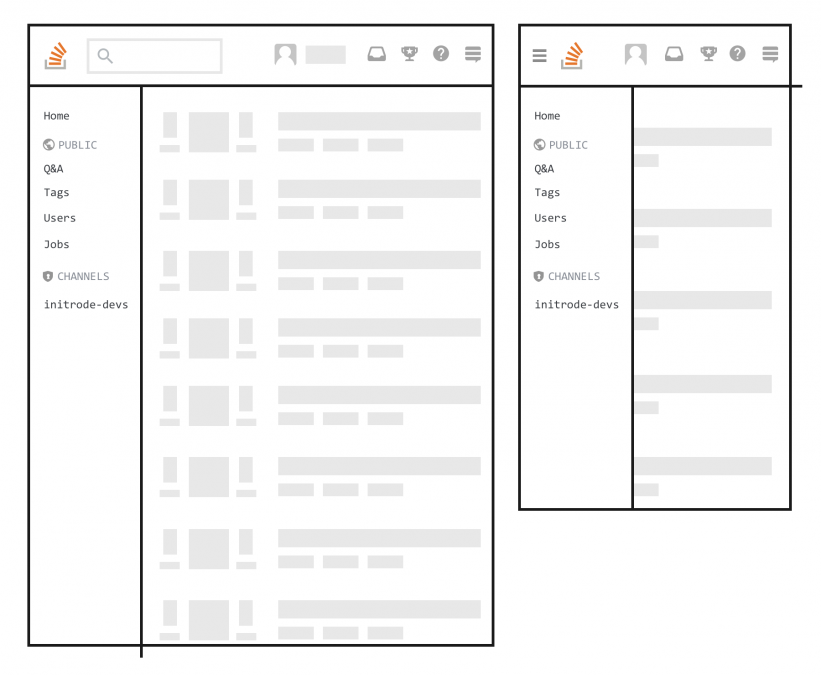
- User has joined Stack Overflow and a private channel
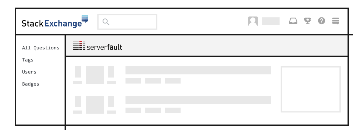
- User has joined Server Fault only (or a different network site)
- User is viewing on a tablet or mobile
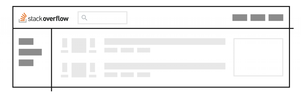
Let’s see what the navigation looks like for each of these use cases. User has joined Stack Overflow only:
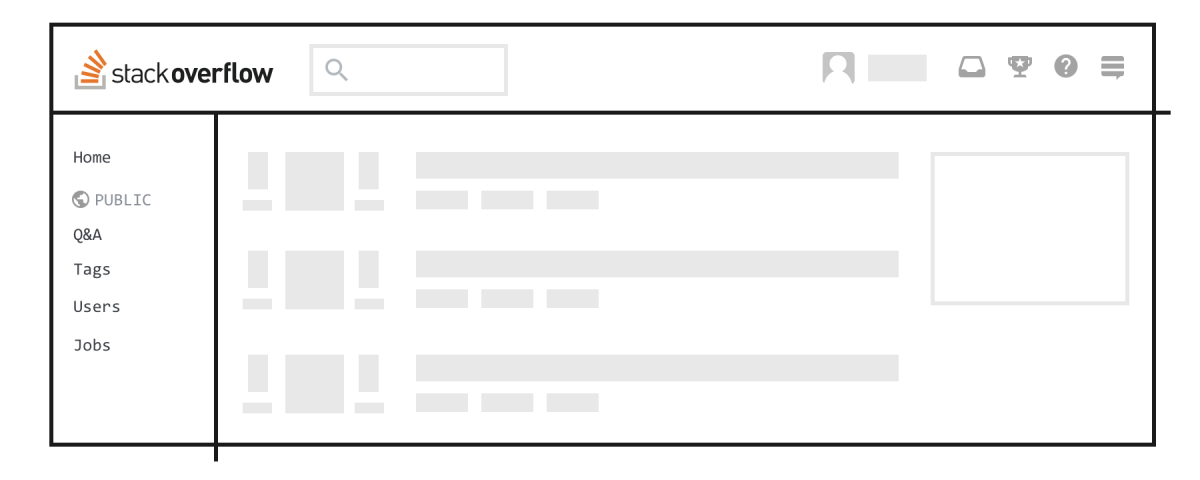
User has joined Stack Overflow and a private channel:
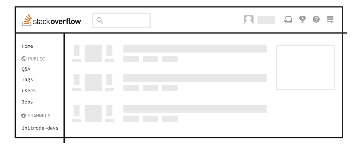
User has joined Server Fault only (or a different network site) :
User is viewing on a tablet or mobile:
Principle #2: Scalability
The new information architecture also needed to scale reasonably over time. People should be able to expect a coherent experience as the site grows and changes. Here are some hypothetical scenarios that we can use to approximate the use cases that the information architecture needs to consider:
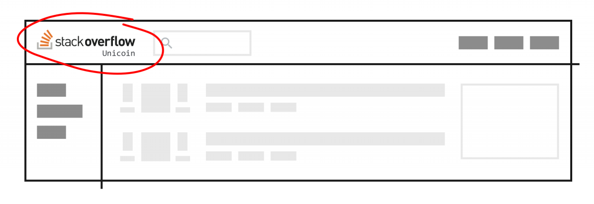
- A new product offering that is a separate entity from Stack Overflow
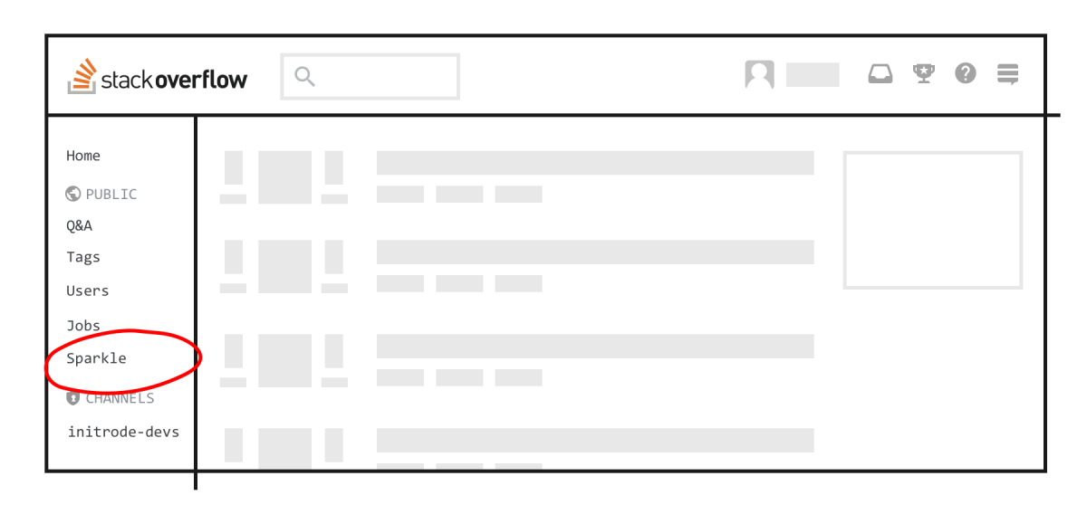
- A new feature on Stack Overflow
Next, let’s see what the navigation looks like for these hypothetical scenarios. A new product offering that is a separate entity from Stack Overflow:
A new feature on Stack Overflow:
Principle #3: Accessibility
We know that Stack Overflow and our other sites could better support people with differing abilities. That’s why the new information architecture also needed to support our effort to make Stack Overflow accessible to all. We are learning from the Inclusive Design approach, and also piloting a collaboration with the University of Washington AccessComputing initiative to identify improvements that bring our sites closer to conformance with the W3C Web Content Accessibility Guidelines 2.0 Level AA. We are also interested in hearing additional recommendations from you, if you encounter barriers that WCAG AA doesn't address. While all of these changes may not be ready on day one, we are taking this opportunity to improve access for all of our users.
What We’ve Learned So Far
In December, we launched Channels Alpha and kicked off research with Enterprise and high-rep Stack Overflow users. We asked questions about their day-to-day workflows on Stack Overflow, showed them mockups of the new information architecture, and discussed potential disruptions to their workflows. Overall, we learned that this change caused minimal impact to their workflows. Any concerns about the extra screen width this would introduce were alleviated with knowing that the site will become responsive. We’ll also be testing with network site users in the upcoming months.
Next Steps
We’ll be rolling out these changes in the near future. In the meantime, please look for future posts sharing our design, research, and product process for Channels. If you have any questions for the team or me, feel free to drop them in the comments below. Note that these designs are not final, and we’ll continue to iterate as we receive feedback. Let us know what you think.