Introducing Dark Mode (beta) for Stack Overflow
Ed. note: Dark mode is officially out of beta! Thanks for everyone’s feedback.
Update: Check out our article on how we made dark mode a reality.
For many years now, people have been asking us for the option to view Stack Overflow in dark mode. We know from user surveys that lots of developers visit our site multiple times a week and folks working their way through a tricky coding problem sometimes have a Stack Overflow window open all day next to their IDE.
In fact, a request for Dark Mode is the 12th most upvoted question on Stack Overflow’s Meta community (out of 41,785 questions) and the #1 most upvoted on Feature Request overall.
There are a lot of challenges to implementing dark mode across a platform like ours. We are among the 40 largest websites in the world in terms of monthly unique visitors. We also have hundreds of communities with different design aesthetics. On top of our public Q&A platform, we also have our developer profiles, job listings, product pages, and many other surfaces.
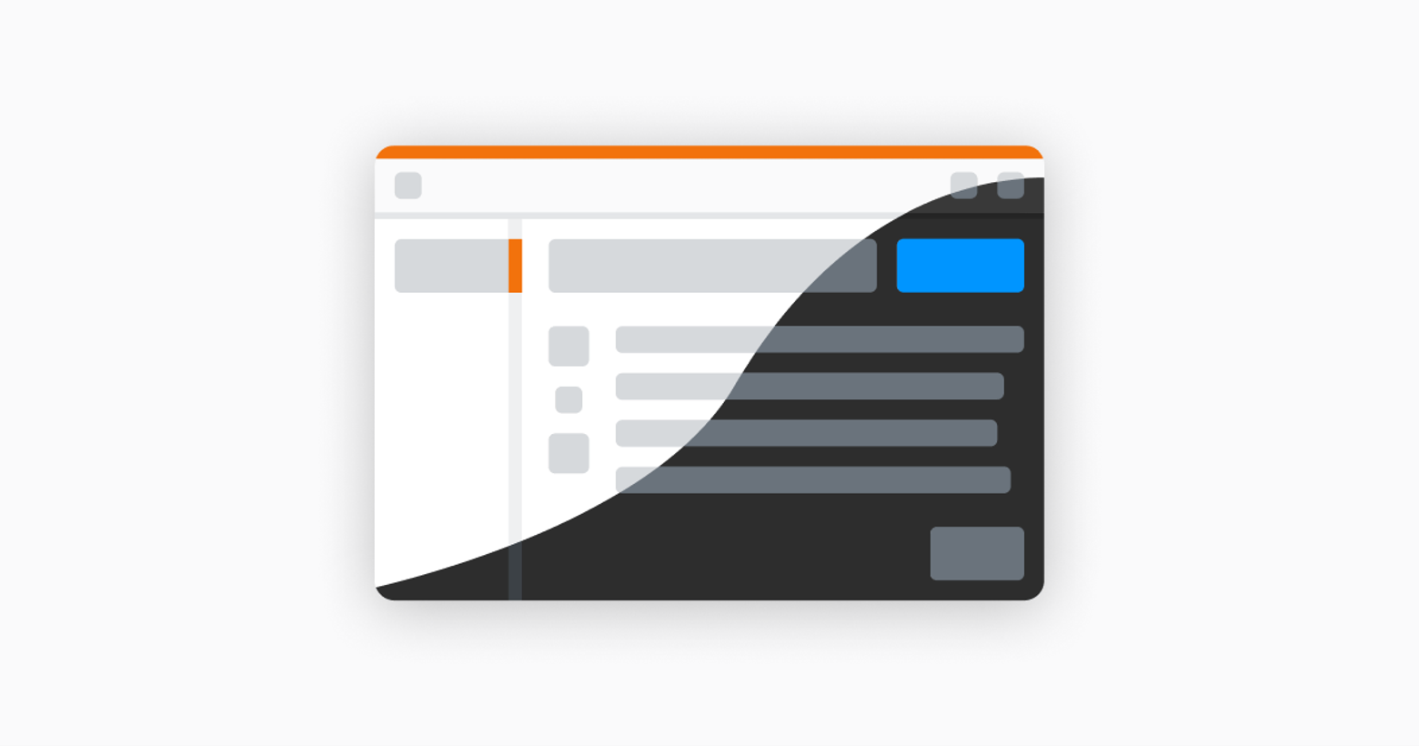
Despite the challenges, this opportunity was too big to be ignored. Today, we are proud to announce the release of Dark Mode in beta for Stack Overflow. We want to share it with our community, especially our power users, and gather feedback so we can improve, iterate, and expand Dark Mode in the future. You can opt-in Dark Mode through your user preferences. You must be logged into your Stack Overflow account to get this option.
For now, we have no plans to bring dark mode to the many sites across the Stack Exchange network. Many of the designs on our sites have been around long enough that converting them to dark mode would require redoing the artwork completely. We would prefer to avoid giving anyone across our network a substandard experience and we don’t want to change those elements without the input of these communities.
Tomorrow, we will publish a blog post from Aaron Shekey, our design systems lead, detailing the process behind the creation of this new feature. And if you really, really like dark mode, stick around. We have something to share on Wednesday as well…
Ed note: If you’d like to provide feedback, please see this Meta question.
219 Comments
👨💻😍👨🏿💻🎊🎉
Absolutely love it!
I installed a plugin for dark mode in my browser but now I not need when use stackoverflow. 😍
Looks a huge improvement, well done
I have an important question
Hopefully this feature will become available on Worldbuilding.SE soon 🙂
Links in dark mode should have white color
Yellow, preferably.
There are ample ways for users to force dark css on sites that don’t provide one.
Unfortunately, there is nothing of the sorts for mobile apps – which are significantly more in use in dimly lit nighttime settings.
I am of opinion that you and every company doing this should have done that first – then the website.
@Bojan Markovic “There are ample ways for users to force dark css on sites that don’t provide one.” There are? Is this with the flip of a switch? If so, would you provide a link showing how to do this please? I didn’t know you could force the dark CSS for a website without manually accessing the source code… i.e.: change font color, background, etc. of the site. Thanks.
There’s extensions for Chrome and Firefox, called ‘Dark Reader’. It uses a pretty sophisticated algorithm to, as you say, apply the changes with CSS, but for all of the sites you visit (it doesn’t just invert the colours like some of the other ones do). It works great on Stack Overflow!
Hey Chris, depending on your browser, there are extensions which can help accomplish this task. For Chrome, and I believe Firefox, search for ‘Dark Reader.’
I use “Dark Reader” plugin.
Links in dark mode should NOT be blue. White or grey preferably. Everybody who has ever made a proper PowerPoint presentation knows that black background with blue text is an absolute disaster. Thanks
To be fair it’s not full black. Grey or white doesn’t work well for me because it’ll look like standard text. I highly prefer blue links in dark grey backgrounds like this.
I would normally agree, but, luckily, the darkmode shown doesn’t have a black background. It’s a dark grey, which looks just fine with blue text links. In fact, I prefer it with blue text. Most dark mode sites have adopted shades of dark gray over true black for the reasons you mentioned.
Links contrast is accessible: https://webaim.org/resources/contrastchecker/?fcolor=3CA4FF&bcolor=2D2D2D
You mean the links to questions? Yes, definitely – or at least they should be brighter.
The color that is used if I already visited the question seems ok for me to use as a default color.
I don’t think white would be the best, as normal text is white.
But that blue looks a bit old-style to me…
why not its iconic orange, contrasted by the shades of gray saturating its dark theme
darkorange
White, maybe.
Yellow or orange probably better.
But not blue for sure !
no!
Yesssssss, finally!
Thanks for adding a long-awaiting dark mode!
The Developer Story is not completely adjusted to the dark mode, e.g. the links Traditional view / Story view, Add a new item icons are low contrasted. Companies’ logo are poorly visible in case it is designed for a light mode. Some weird colour/white gradient at the end of the job position description in a Story view.
This is a wonderful feature. Totally friendly to the human eye. I wish I was in the team implementing this. Next time please do consider me a collaboration please. Finally thank you Stackoverflow. Continue overflowing with new amazing features.
Great start! Needs a bit more contrast and a darker background. I think the dark theme generated by the Dark Reader Chrome extension still looks better right now.
Yes, contrast is still too low. (It’s 4.41 for code comments: https://imgur.com/WE1f2V1)
In particular, I find that tags are nearly invisible due to poor contrast.
Lezzzgoooo, so wonderful and relaxing to the eyes.
Great!!
http://i.gzn.jp/img/2017/05/10/forest-gump-apple-stock/00.jpg
Finally!!!! Yeah!!!!
Thanks a lot!!!
Just one thing is bothering me – The “Looking for a Job?” panel is still white.
I agree, that white panel, it’s like a punch on the eyes
Please, please make the text grey, not white. Really hard on the eyes.
You’re making a dark mode, not a “high contrast theme from Windows 95” 🙂
Agreed. The white text is a bit too much contrast. I’ve been using Chrome’s Dark Reader and the text color is F0E8DB.
+1
Lmao, you sarcastic asf bruh
That’s great, it would be nice if the dark mode is inferred automatically from the system settings
There _is_ a “follow system setting” option.
I’m curious as to how this is implemented… would be great to be able to tell more websites that I prefer dark mode 🙂
Give yourself to the Dark Side. It is the only way you can save your friends.
What setting is this? Is this a browser option, or an OS option? How does one set it?
It does look nice. However, I find myself turning away from the dark side more and more.
Very good. One thing, the comments using ` and ` are almost the same color of the background, I would suggest to make them lighter.
While dark mode is nice, it is certainly _not_ the most requested feature. At least – not if you factor the significance users assign the feature.
Just off the top of my head, and considering stylistic features only: I’m sure most everyone would agree that making `backtick text` have the proper size in subscripted text is more important.
Very nice, thank you for helping my eyes when it’s way too late at night to be working 🙂
Coders love to live in the Dark world!!
Well done. Thank you.
It’s about time. Jeez.
Nice, thank you. Can you make stackoverflow be better in Emacs Eww browser so I can live inside and never cheat it with my Firefox-esr browser. Already using Exwm. Thank you on your time.
No
Cool, but I already used a Stylus CSS mod for this.
Great for everyone that doesn’t, and even better for having official support.
Way to late… https://darkreader.org/
here is a BIg bug, when we write new quetion that time click on “code” then shows white screen not showing names in that section. This is big bug in this theme. So fix ASAP.
If you want a dark mode on more website, try Dark Reader for Chrome, Firefox and Safari https://darkreader.org/
Fork it on GitHub https://github.com/darkreader/darkreader
Finally!
Few things though. The color of the text in the code blocks are sort of getting mixed with the dark color. So the text which was blue and looked fine in the white theme, is now suddenly looking dull and difficult to read. Other than that, dark theme looks great!
It doesn’t look as good as Midnight Lizard yet but I presume you’ll be making improvements since it’s in beta. I think there needs to be more contrast in general.
Thank you! For the Blog/Hot on the Meta section, you don’t really need the yellow background, just some borders. That section is the ugliest on light mode and it’s worse in dark mode. My 2 cents.
Okay,
Dark mode is nice and thank you
But, hmmm, it is more nice if you rune a vote before you spend time on a feature.
this is going to be an april fools’ prank.
I just turned the dark mode off. In the side-by-side view of code snippet in “Suggested Edits” both panels was unreadable.
How can I change back to Light mode? can’t find any setting after close header…. (
Thanks a lot! Finally I can retire my Stylus tweak for SO.
As somebody else commented already: the job-ad box is still bright white, which sticks out a bit brutally. Maybe that can yet be fixed… but I like the dark theme, in particularly also that it’s not super high contrast.
Amazing! Can’t believe it took so long but thank god it’s finally out. Now I don’t have to strain my eyes as much.
Links in dark mode should NOT be blue. White or grey preferably. Everybody who has ever made a proper PowerPoint presentation knows that black background with blue text is an absolute disaster. Thanks
Please change the tag from “announcements” to “stack-overflow” as this beta is only available on SO and not the whole network.
YAAAAAAAAAAAAYYYY!!!!!!!
https://media.giphy.com/media/zfYpmAfrcVOAE/giphy.gif
People really are getting soft.. we spent many decades with c0c0c0 and white as the 2 main colours of windows.. no one moaned, few people bothered to change the colours, yet now, if its not dark grey all over with lighter grey people flip out
Hell yeah!
Finally!!! Would it be possible t consider making it change with the browser light/dark setting? That would be much appreciated for those of us who use apple devices at night and I think chrome might support it as well.
The foreground color of text need more light. The background color (gray/black) need more dark. Thank you. Please do like this http://docs.microsoft.com
Finally here…. much anticipated!. Let’s overflow the stack. Thank you guys
I dark love it!
Finally. SO, a big thank you!
This is literally the best news that I’ve seen in months! Started using it and it’s lovely! Thank you!
Thank you so much Stack overflow team.
🥳
Wow. Can you grey the text colour instead of white and make those blue links white?
Yay! The “looking for a job” ad is still light-mode, FYI. (And even that is still readable, as opposed to mixing light and dark modes, so good job.) Also, my profile picture seems to have reverted to an Identicon on all sites for some reason, and seems to require changing it for each. (Not sure if that’s related.)
The stackoverflow logo looks bad without color 🙁 .. But dark mode is fantastic …
As long you are not making this the standard in the long term, and make it impossible to go back like jsfiddle, it is fine with me. Basically i feel the “cry” for a dark mode is made by lazy Atom users ….
Here we go with dark mode………..
Thanks for helping me and others who seats on their Computer for longer hours.
Love the dark view made for an eye and sustainability!
Looking for job on right side is better changed to dark mode
Dark Reader is better than your default dark mode.
Doesnt anybody getting the april fool part
ThumbsUp… good approach to stay in eyes 🙂
Dark theme move is useful, but the actual theme is not great for eyes. With white version I have white background and blue titles, with dark one I have dark background and… blue titles. Is “blue” some kind of magic color fitting to everything?
Actually, it should be possible to customize the theme fully by user.
Guys April fools day is around the corner, just in case you’ve forgot.
Wow! Great Feature! Should be a focus on more readability, blue color on dark mode could be better!
Awesome
Looks great. I’ve been using dark reader for a couple of years now, always nice to see a website i’m on frequently implement a dark mode so that i can turn off dark reader 😀
Finally! Thank you
Stack overflow has finally joined the dark side , Enjoy the cookies
Thanks
Polish buttons on Dark version would be more great
Thank you! This is great!
This is an awesome improvement. Just some suggestions :
1. The links should be a little brighter, or white altogether.
2. The reputation change in the notification bar is not clearly visible. Make it a tone lighter (both for green and red)
😍
Yes!
This has definitely made my day 😀
BUG:
Drop-down arrow balc but its background is white Here is a screenshot
https://www.screencast.com/t/j2A52tW8f
this is good for our eyes at least
I hope this will not be forced on on users – never understood this hankering for the dark side.
I still have fond memories of green on black monitors (with orange for the up-market).
Bricks SE could benefit from this new feature as well since its design is basically the same as StackOverflow.
Finally! Just loved it!
It’s something wrong here! Why does current dark mode have too much blue color (blue light) ?
What is it with you people? Are you all color-blind?
And now make it available to all users via @media prefers-color-scheme even if they are not logged in.
Absolutely. Having a manual setting is completely retrograde. The media queries work everywhere, including in apps with embedded WebViews, at least on iOS.
How do we provide feedback, report bugs? For example the close question modal is unreadable to due contrast issues.
Thank you, but current dark mode is not enough dark for me, I want darker 🙁
Thank you so much!
We have been waiting for dark theme.
Syntax highlighting should be updated to the dark mode
Y’all support prefers-color-scheme, right?
> “Everything is proceeding as I have foreseen.”
https://meta.stackexchange.com/questions/111399/dark-mode-for-stack-exchange-sites
Thank you, this is fantastic. The article mentions that you are going to (or maybe actively are) gathering feedback. I have feedback I would like to submit, what/where can I do that? Example: When closing a question and selecting a reason the text is white washed to the point where it is not legible.
Thank you again.
Finally, my eyes appreciate you
Love it !
Was already using the Stylus chrome extension, for this purpose.
Thanks !
Will be the dark theme turned on on ruSO?
its perfect. the jobs section needs this stylus
div.clc-jobs-multi>.middle{
background: #243;
background-color: #243;
}
nothing else. its amazing. you made my day better today
Awesome. Love it.
At first, I thought this is that April fool thing that so does every year, turns out real, love it.
Cool, but would prefer darker… (so I still use the “Dark mode/night reader” extension)
love this mode
it so nicely
Love it!
Relaxing to eyes
Thanks ……!!!!
[Code] button help-area in answer mode is all whiteout. Please change it to black text.
All good but tiny snag found – you have a white fade out image on the end of career entries on the timeline, so the test does not fade out i dark mode, just a white splat 🙂
Really love it.
My only point of feedback would be that it could be a bit more black.
A great example is are the Microsoft docs.
Open source themes for SO would be cool as heck.
The dark mode seems nice so far
That’s great love that eventhough still need some little more contrast
Love it! – all things dark !
zOmgggggg!!!!
Amazing job guys, i really love the chosen palette of colors.
Thanks a lot
Awesome!!!!
Omg, Thank you so damn much
Awesome
Thats underwhelming. Stack Overflow Dark for Stylus looks better than official dark mode.
wow! it’s look awesome..
congrats!
Just curious, why did it take so long for you guys to implement dark mode?
Is it that hard?
Please don’t get me wrong, I’m just asking because I’m curious. I’m a beginner myself.
Wow i really love this
Spicy 🌶️
Sexy!
BUG:
The “Not found” UFO image doesn’t use transparency properly. The background of the image is transparent but beam and shadow are light blue 100% opaque.
e.g. this removed post: https://stackoverflow.com/questions/60548046
Haha I just saw this today and I was *certain* it was an April Fools joke.
Awesome!
Thank you.
Being on the computer for 10+ hours a day it tiresome on my eyes. I’m always turning down the brightness and this DARK setting is such a huge improvement.
THANKS
Welcome to the Dark Side 😀
How I can Apply or create dark mode ? any simple steps to understand ?
“You must be logged into your Stack Overflow account to get this option.” WHY? Make it accessible without login and use cookies to store it.
Exactly!
Use cookies or local storage, and add simple switch on the top of the page 🙂
It will be a god update 🙂
I want to love it but the ads are still white and bright and they hit my head like a hammer when I see them (it triggers my migraine.)
Wow!!! I love this so much! Preferable mode ever. Lovely
It would be better if ads are also in dark mode
omfhgtath! nearly a decade later.. bout time! 🙂
Where is everyone?
I know the organizations’ logo/color palette is white and orange, which is good for the light mode, but for dark mode, it just feels like all year is halloween. Not sure if that’s something you would consider changing. Maybe to the same blue you use for some of the text/buttons?
Great stuff!!! Dark ftw! 😀
This is REEEEAALLLLLLY GOOOOD for my eyes, Thank you
Dark mode is the best
Why do the tags look bad on company team pages but fine on regular stack overflow? On my company’s internal SO page, the question tags are purple and hollow (hard to read against the dark background) but on the main SO they are filled mid-ish blue with white text (nice to read!).
numbers on your profile graphs are not seen: https://cl.ly/fbee6832abd8
I am using this:
https://stackapps.com/questions/8053/stack-exchange-dark-mode
It would be great to have a dark mode, but try as you might, all the major browsers make big white flashes between dark pages. You try to be easy on your eyes, but instead you damage them.
this darkness makes my head banging 🙂
That’s Great !!! Good to see Stackoverflow now turned into dark mode! Here few suggestions posting below.
1. If the icons of social media at the top right corner highlighted as it’s original color during mouse hovering that would be good .
2. Can we have the stack icon on top of the ‘Overflow’ heading ? I am not sure whether it is a valid point or not but i felt personally.
YESSSSSS, EXTRA DARKNESS FOR MEEEEEE> WOOOOOOHOOOOOO
It’s quite cool but still not that dark which was expected ..
Can you make this a switch on the community dropdown button, so I dont have to find it is preferences when I want to change it
Very Good , It’s very good and useful for my eyes! 🙂
Can you make the dark look more like reddit pls?
Dark Mode
OH MY GOD!!!! Yeah, like, no one needed your cooperation actually. Let me introduce you “Dark Mode for all”:
:root{background-color:black !important;opacity:0.8 !important;}:root,img,svg,canvas,embed,video{filter:invert(1);}
Yeah, some exceptions and particular cases but works perfect for most sites (guess what, no exceptions for *stack* things).
In Firefox, just use your ~/.mozilla/firefox/your_profilename/chrome/userContent.css
In Chrome, use Stylus or similar.
In Edge… Well, just don’t use Edge hahaha
In Oper… did you get this far yet? You’re desperate.
Thank You!!! my 77 year old eyes get tired real quick. I love the dark mode
Why did StackOverflow choose to force me to log in to get the dark theme? I.e. to limit my ability to make educated choices regarding my own (eye) health and well being.
I don’t see any (valid) technical reasons for this, and Reddit do not force that upon their users.
I would really appreciate a reply. Thank you!
To other users: I recommend using a plugin like “Dark Reader”. It works across all the StackExchange sites; although some colors might seem a bit strange. But not the main/body text.
BUG:
In the user’s activity. The reputation is invisible in the graph
I love the “follow system setting” option! I wish more websites had that.
Make it look like an old post-it.
Can you please make the Dark mode look just like the current mode? I hate this dark stuff.
And on top of it: It has been proven, that dark mode is counterproductive.
Thanks! Definitely love it!
Just love it
nice nice nice
Bug: In developer stories, you fade (!) to white.
It looks marvellous.
Would be nice to have the link within the article to change dark mode)
Thank you for this!!!!!!!!!!!
The job adds are not darkened. So now the adds pop out and are even more annoying. This makes dark mode unusable.
Great!!!
I wish I didn’t need to log in to use it, why couldn’t you have made it a 1-button press like on this blog page? Or automatic following browser settings.
Given how light and bright this darkmode is, can we have an actual darkmode? (or lights out mode on twitter, black mode.. whatever you wanna call it)
especially for oled screens, but.. in general.
people who dislike dark modes or don’t understand their benefits should maybe not be in charge of developing a dark mode.
this thing is very bright at night.
OMG!
THANK YOU, THANK YOU, THANK YOU!!!
Thanks finally! Now I can code at night without having a flood light shining into my eyes
Yeees!!!!
I was using Browser Add-on. Though, Thank you..
Good job!
love this new darkmode . cobol all of a sudden is coming back
Really like this dark mode
😍
😍Fabulous and Fantastic❤️
hi,
that’s godd you provided a dark mode, but even as a Beta you should provide a visible button to switch to dark mode.
As a use case: suppose that I just searched some technical thing in google and I open a Stack Overflow link (without having logged in). There is no way to switcch to dark mode except if I log in and we have already chosen Dark mode as prefered theme.
this is an awesome color combination and this is a fabulous look that I have ever seen in this platform
Nice. I really like the dark mode.
Please promote Beta to Release 😉
I’m not even sad about being on lockdown anymore.
YES! DARK MODE!
Come to the dark side of stackoverflow
thank god! you guys just saved me from the next burn-out !!! 🙂
It makes the new user tutorial unreadable.
Dark mode hurts my eyes cuz switching between applications (browsers) of vastly different background color gives me eye strain.
Finally dark mode great guys..
Now i can also code in midnight without reducing brightness in my pc…
GReat Job
bonjour moi ^^
FOR MEU, OK!
This is just… I’m speechless because of happiness, joy and amazement all at the same time. Dark Mode is FINALLY HERE!!! No need to use Stylus anymore! Our prayers to SO devs have finally been answered. I’m so glad, you have no idea.
I like this dark mode
Everything looks great except that sidebar “Looking for a job?” which is bright blue and white, and takes up approx 1/3 of site.
“There are a lot of challenges to implementing dark mode across a platform like ours.”
Why don’t you just make a post about it on StackOverFlow and see if anybody has done it already? =))))
The lack of the light / dark theme switch is driving me crazy. The dark mode is fine and everything, but I like it only at night. Now I’m stuck with it for… ever?
how to switch? I have only night mode. How I convert day mode?
Great to see this change, but to my eyes this is more a dark and low contrast mode. The main background colour looks dusty and dirty. How about going a few shades darker?
Is it available for stack exchange sites (like physics or mathematics ones)?
My eyes hurt (math SE) 😫, Thanks
Maybe I have vampire eyes, but I still find the dark theme to light. I use the Dark Reader plugin for Firefox instead.
It’s restricted to logged in user, isn’t it? I can’t find the dark mode menu when I don’t log in into my account.